Every year I have the chance to visit my grandparents in the beautiful island of Puerto Rico. Visiting every year, I have grown to become more and more comfortable here. While I often took these visits for granted in the past, I recently went and captured so many great memories.
These images reflect some of my favorite moments in Puerto Rico; with family, sightseeing, or just walking around, Puerto Rico is too beautiful of an island to not see!
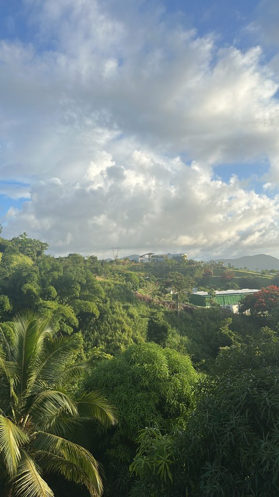
Welcomed by the beautiful trees and forest of Yabucoa behind my grandparents’ house, this view never gets old. This image captures the lush, layered beauty of Puerto Rico’s eastern countryside. The landscape stretches out in vibrant greens—palm trees, thick tropical foliage, and rolling hills—showing just how alive and abundant the environment is. Soft sunlight warms the treetops, giving the scene a gentle glow and highlights the textures of the plants that define the region’s natural identity.
In the distance, a few homes and rooftops peek through the greenery, reminding of the quiet coexistence between daily life and the island’s overwhelming natural presence. Altogether, the image feels peaceful, grounded, and deeply connected to the place—reflecting both the beauty of Yabucoa and the personal significance of seeing it from my grandparents’ home.
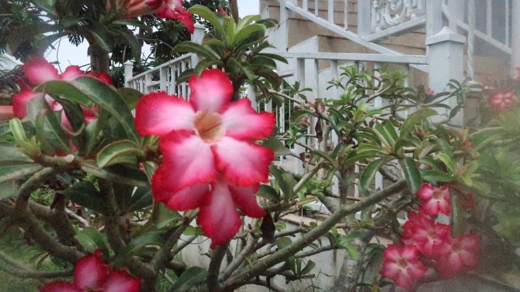
Later identified (by AI of course) as a desert rose flower, this flower grows outside my grandparents’ house in their garden. This close-up photo of the flower captures a moment of quiet beauty rooted in place and memory. The flower’s vivid pink-and-white petals stand out sharply against the soft greens of the surrounding leaves, making it the natural focal point of the image. Its brightness and symmetry create a sense of vibrancy and resilience—qualities often associated with tropical plants that thrive under intense sun and shifting weather.
The elements of this flower and the blurred steps leading into the house create an intimate and nostalgic feeling; a small but meaningful detail from a place connected to heritage, comfort, and care.
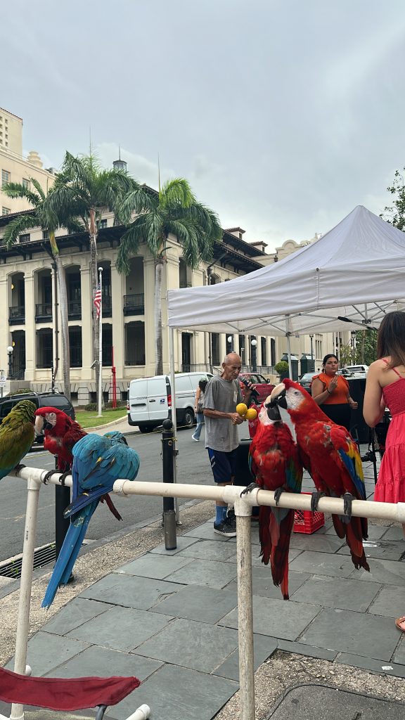
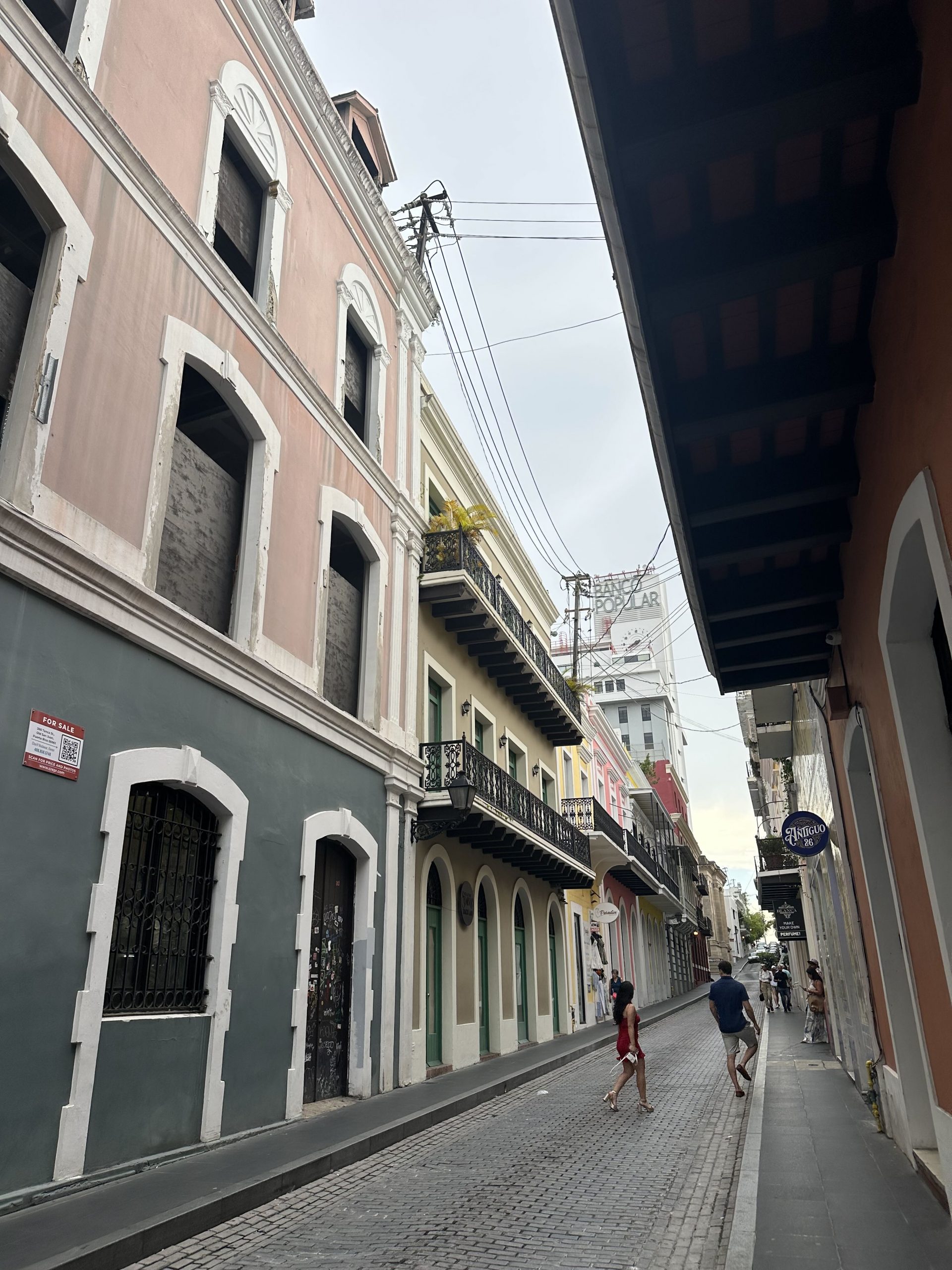
This image, taken on a visit to Old San Juan, captures the very lively, layered character of Old San Juan, where the city’s colonial architecture and everyday street life blend with bursts of tropical color. In the foreground, five beautifully-colored parrots perched on a simple stand becomes the focal point, symbolizing the island’s lively natural spirit and the way local culture often spills out into public spaces. Behind them, a small gathering under a white tent of tourists waiting to take a picture with them adds a sense of casual community and movement. The older building, framed by tall palm trees and a muted gray sky, grounds the scene in Old San Juan’s historic past, creating a contrast between the permanence of its architecture and the immediacy of its street life. Altogether, the image reflects how the city seamlessly intertwines history, culture, and tropical vibrancy in a single moment.
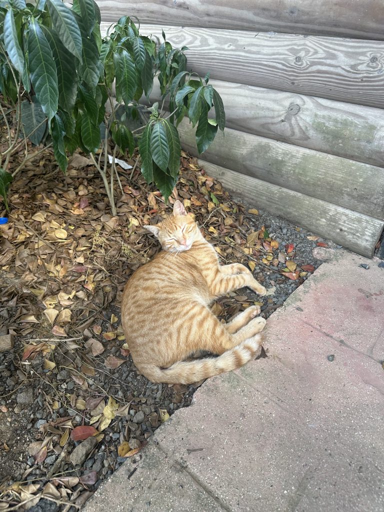
This photo gently captures a moment of calm amid the rugged setting of an ATV adventure park in Luquillo. The ginger stray cat, curled comfortably on a bed of dry leaves and warm soil, seems entirely at peace despite the bustle such places usually host. Its relaxed posture and half-closed eyes suggest a creature that has learned to carve out pockets of tranquility wherever it can. The contrast between the rough ground, scattered foliage, and the soft fur of the cat adds texture to the scene, while the wooden wall and nearby plant create a sheltered, almost homelike corner. Altogether, the image highlights the quiet resilience of the island’s many stray animals—finding rest and comfort in unlikely places, and becoming small, tender reminders of life’s gentler moments.
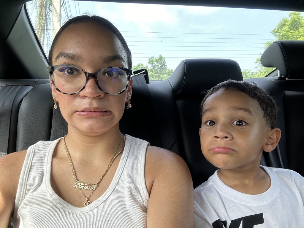
This photo captures a lighthearted, in-the-moment snapshot that feels both playful and intimate. My nephew and I sit side-by-side in the back seat, each making an exaggerated, unsure expression that gives the image a candid charm. How close we are highlights our connection, with our faces mirroring each other’s mood in a funny, spontaneous way. Soft daylight filters through the car windows, illuminating our features and adding a natural warmth to the scene. Altogether, it’s a tender, goofy pause during a tiring day’s adventure—one of those small, shared moments that ends up becoming more memorable than the destination itself.
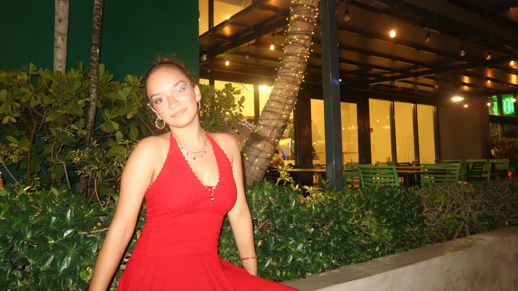
There is a relaxed and radiant feel in this nighttime photo at Distrito T-Mobile. The vibrant red halter dress stands out beautifully against the greenery and warm lights around me. The string lights wrapped around the palm tree and the softly lit outdoor seating area creates a cozy, lively atmosphere. This image has a a stylish, confident, and genuinely warm vibe, similar to how the memory felt in real time.
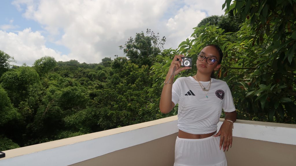
Ending with my grandparents’ view once again, this image captures a calm, summery moment the balcony surrounded by lush green trees and a bright sky. The white Inter Miami jersey and matching white bottoms gives the picture a sporty, clean aesthetic. Holding up the camera with a relaxed face, this image feels comfortable, stylish, and gives the feel of enjoying the peaceful nature around me.
Conclusion
Overall, creating this photoessay was a new and enjoyable experience. Looking through pictures from my recent trips, I kind of already knew which images I wanted to include and talk about. My goal for this project was to highlight the beauty of Puerto Rico, as well as taking a look at everything around you. While you may see it often, views like these are extremely beautiful and shouldn’t be taken for granted! I categorized my pictures through the order in which they were taken, and carefully analyzed them as if I saw them for the first time. Using Gestalt principles, rules of composition, and more, these images all somewhat followed a narrative arc, as they went in the order of my trip.
Proximity, simplicity, and other Gestalt principles were seen throughout these images. The image of my nephew and I show proximity and highlight our close relationship, while the image of the flower can show simplicity and proximity, as the plethora of flowers show how close they are to one another.
The idea of color theory is also shown throughout these images. For example, the images of the vibrant birds with a somewhat grayish highlight the placement of the island’s natural wildlife in such a public setting. Other images, such as me in my red dress or the vibrant flowers show brighter pops of color, and contrast from their duller backgrounds.
Rules of composition can also be applied to these images! The rule of thirds, explained in Tom Schroeppel’s The Bare Bones Camera Course for Film and Video places subjects on certain third lines to allow viewers’ eyes to roam around the image. I personally love this rule, and now use it for a lot of my pictures after learning about it. The last image shows me on the right, placed right on the guided line, and shows viewers more of my beautiful background and blue cloudy sky. A contrasting image, however, of the cat in the middle of the picture is an example of balance. Right in the center of the image, the image seems more comfortable and the colors go well with one another.
Beyond the technical aspects, this project also helped me connect more deeply with the emotional meaning behind my photos. Each image represents a small moment in time that felt ordinary when it happened, but looking back, I can see how meaningful those moments truly were. Whether it was spending time with my nephew, admiring local wildlife, or taking in the natural scenery from my grandparents’ house, these photos remind me of the importance of slowing down and appreciating experiences as they come. Photography allows us to freeze these moments so we can re-experience them, reflect on them, and share them with others long after they’ve passed.
Additionally, this project encouraged me to be more intentional with how I approach photography in the future. Instead of just taking pictures randomly, I now think more about the story behind each shot and how visual elements—such as color, framing, and composition—can shape the emotion or meaning of an image. Creating this photoessay made me realize that photographs are more than just images; they are narratives that combine technical skill with personal perspective. I’ve gained a greater appreciation for how the visual choices we make influence the viewer’s experience, and how even the simplest details can contribute to the overall message. This assignment didn’t just deepen my understanding of visual storytelling—it also strengthened my connection to Puerto Rico and the memories I made there.