Author: admin

  • Ideation Techniques, and How I Use Them

    Ideation Techniques, and How I Use Them

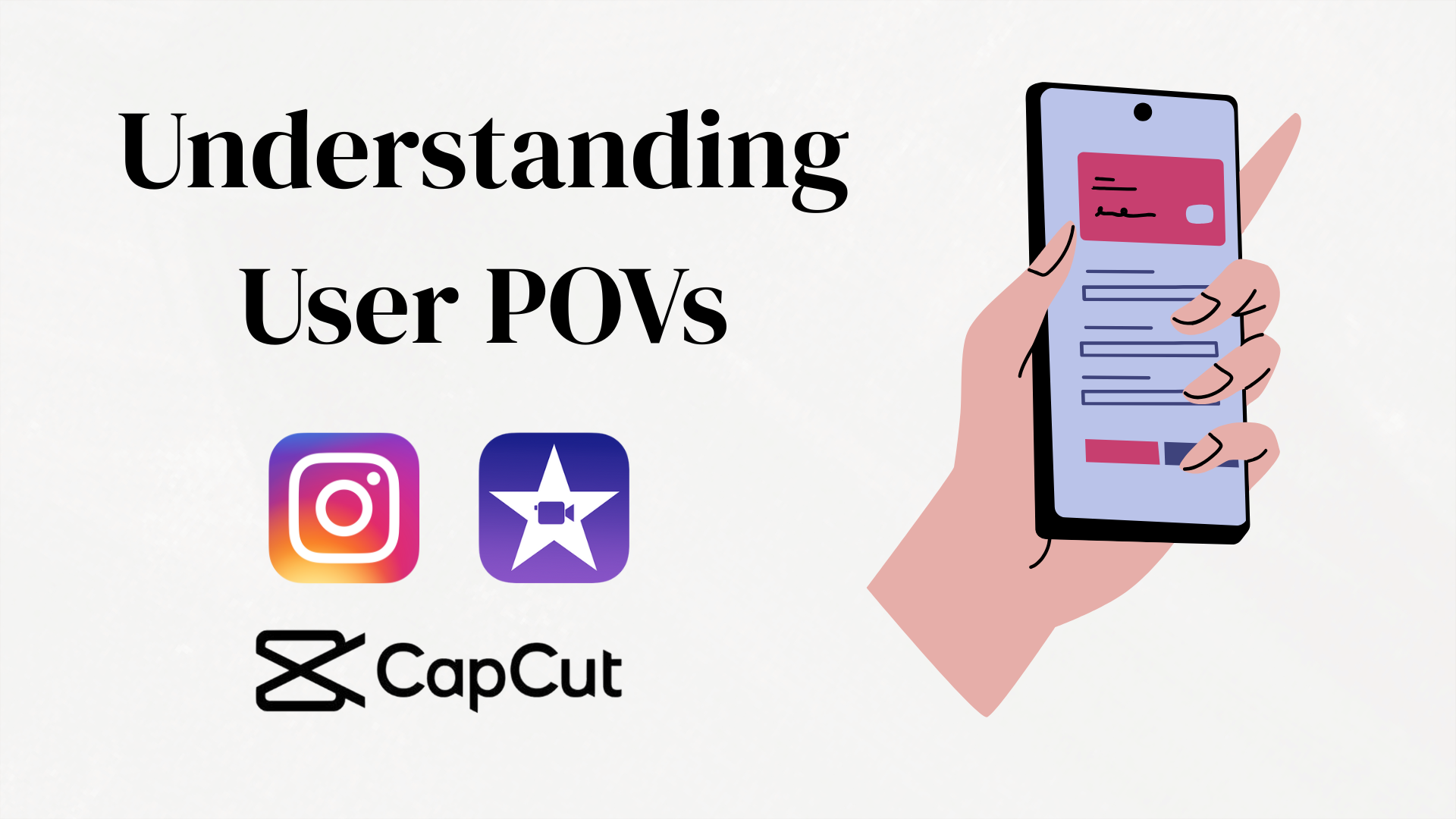
    Ideation is a crucial part of the design thinking process, allowing designers to generate a wide range of possible solutions for user problems (Interaction Design Foundation). In this exercise, I explored ideation techniques to address six POV statements related to iMovie, CapCut, and Instagram. My approach focused on using at least two different ideation techniques per problem statement, generating as many solutions as possible, and evaluating which methods were most useful.

    Last week, I created six POV statements for the apps Instagram, iMovie, and CapCut based on real user reviews to get a better understanding of the apps. To get an even better understanding of various ideation techniques, I will apply them to my POV statements.
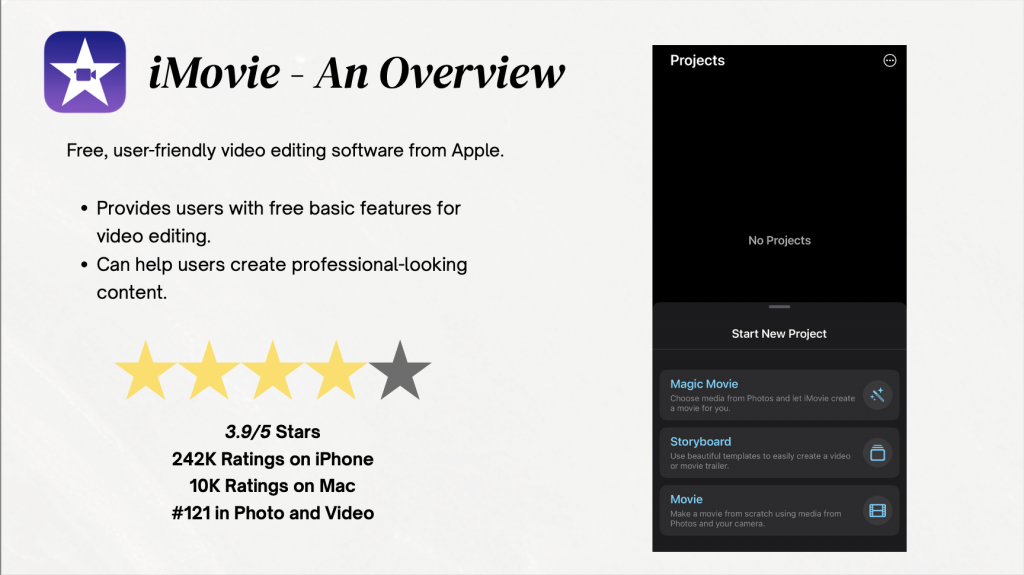
    The mentioned POV statements for iMovie, CapCut, and Instagram.

    Looking Into iMovie

    My previous POV statements include:

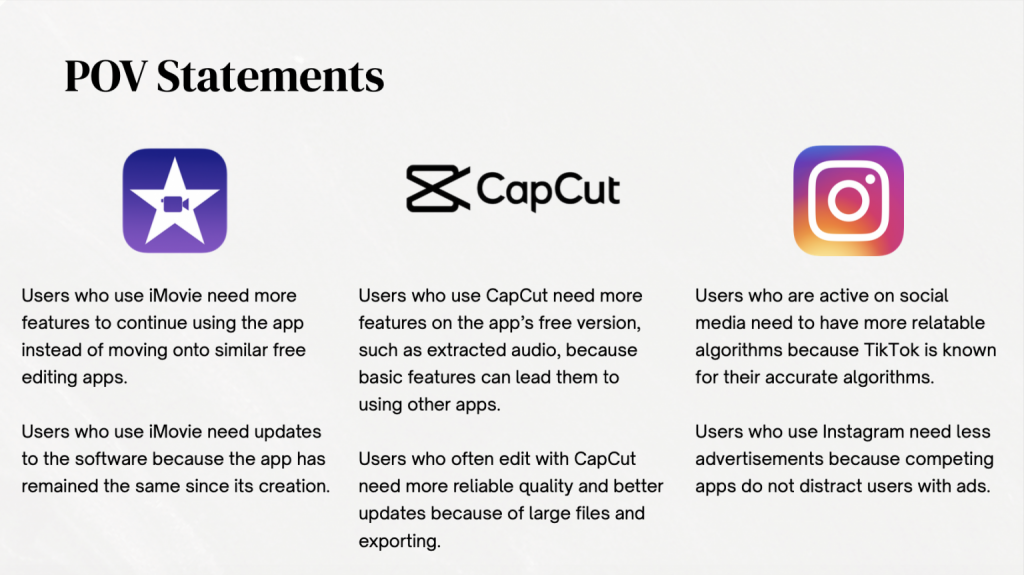
    • Users who use iMovie need more features to continue using the app instead of moving onto similar free editing apps.
    • Users who use iMovie need updates to the software because the app has remained the same since its creation.

    For users who use iMovie and need more features to stay loyal to the app, I applied brainstorming and brainwriting, mentioned by the Interaction Design Foundation. Defined by the IDF, brainstorming is a method used to “generate ideas to solve clearly defined design problems”, mainly used in the ideation phase of design thinking. With this, brainstorming helped me quickly generate ideas such as introducing AI-assisted editing, customizable templates, and integrated stock media. While these were quick ideas, I will be able to further define them as I continue to brainstorm.

    Brainwriting, on the other hand, allowed me to quietly jot down ideas before building on them. Defined by the IDF, brainwriting, while pretty similar to brainstorming, involves writing these quick ideas down on paper, and after a few minutes, passing their paper to another participant who can further expand on the ideas. I found that this idea works pretty well for me, as I enjoy writing things down in one place, even if the fellow participant is me 🙂 In the end, I resulted in additional solutions like collaborative editing and advanced color grading, to further engage and attract new users, as well as keeping current users interested in iMovie.

    Final brainwriting exercise! Shows my thought process for creating potential solutions to this issue. I first named potential issues within this issue, then looked back a couple of minutes later to create solutions with a fresh mind.

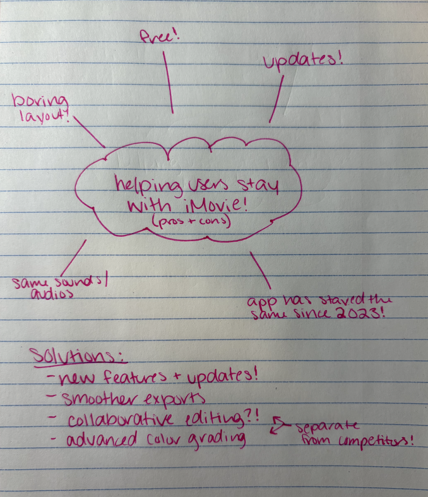
    For users who need updates to iMovie due to its stagnation, I used SCAMPER and mind mapping.

    SCAMPER (Substitute, Combine, Adapt, Modify, Put to another use, Eliminate, Rearrange), encourages you to ask different questions to create new solutions. Asking seven different types of questions, SCAMPER can help you further understand how you can improve existing products or services. In a guide given by the IDF, SCAMPER encouraged me to systematically reimagine iMovie’s capabilities, such as adapting mobile features for desktop or combining editing with social media sharing tools. I definitely enjoy using SCAMPER, as it truly helps me further understand my issue at hand, as well as how to better solve it for everyone!

    Mind mapping, for me, visually connected ideas like performance optimization, UI redesigns, and enhanced export options. These techniques were particularly useful because they helped me see both incremental improvements and entirely new directions for the app. Defined by the IDF, mindmapping can help designers “build a web of relationships”, to help better solve these issues at hand. While I created my mind map mentally, I first thought of my overall solution, then was able to get more specific. This technique reminded me of brainwriting, as they both require writing down your thoughts and getting more specific. I do prefer mindmapping, however, because it is a technique I’ve used in the past, and I enjoy how it keeps me organized with my thoughts.
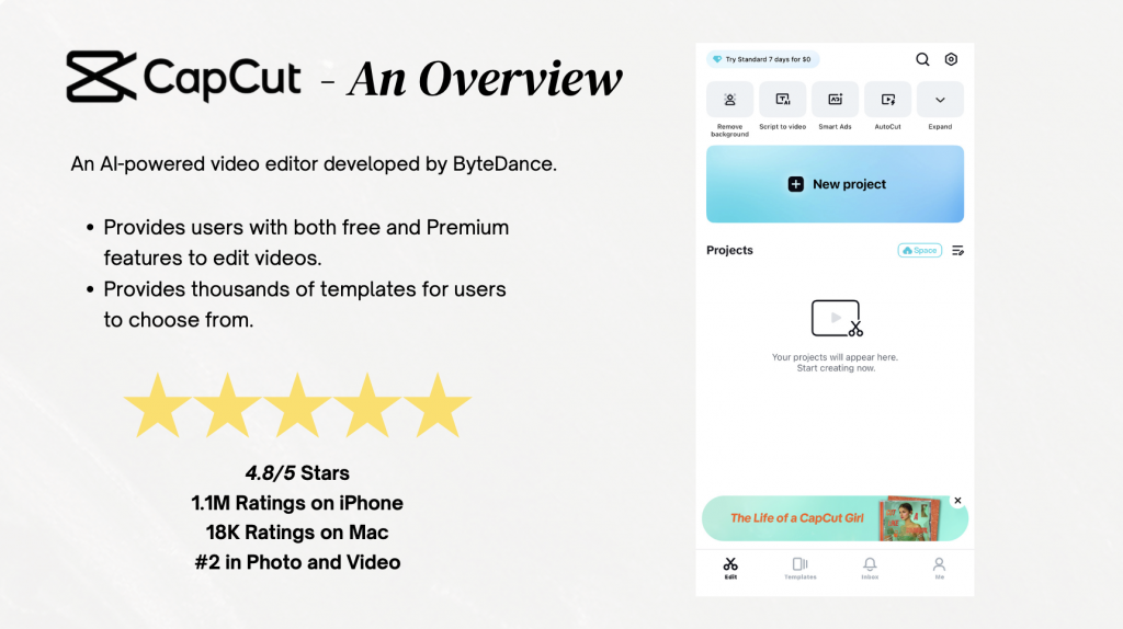
    Getting Into CapCut

    For this app, my previous POV statements include:

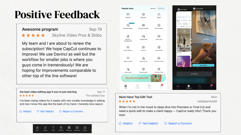
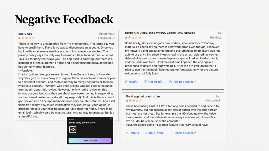
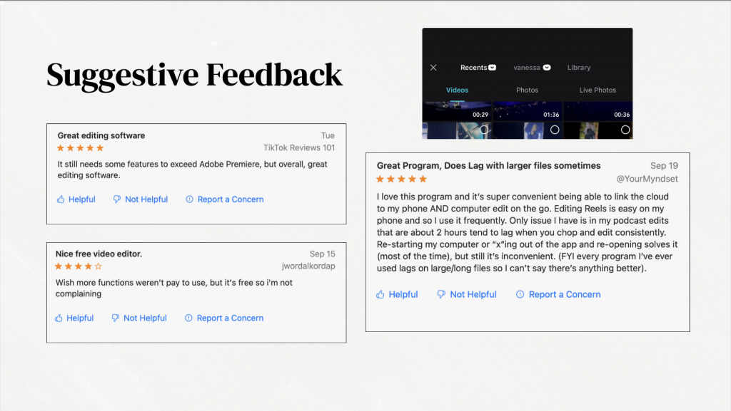
    • Users who use CapCut need more features on the app’s free version, such as extracted audio, because basic features can lead them to using other apps.
    • Users who often edit with CapCut need more reliable quality and better updates because of large files and exporting.

    To expand on these issues, I used the ideation techniques role-playing and affinity diagramming.

    Role-playing helped me step into a user’s shoes and imagine frustrations with missing audio extraction or watermarks, leading to creative solutions like free limited-use advanced features or AI-assisted sound editing. When researching, I learned that role-playing can help with “coming up with ideas or solving problems {in which} different participants adopt different roles, personas, or perspectives, thereby providing a broader and more complete range of potential solutions”, (Farrar, 2024). With this technique, I was reminded of my previous exercise from last week, when I was able to immerse myself fully into the world of reviews, and understand users’ concerns with apps that I currently use.

    Affinity diagramming is defined by the NN Group as “organizing related observations, ideas, concepts, or findings into distinct clusters” (Krause & Pernice, 2024). This easy-to-use technique helped me organize these ideas into categories such as usability, functionality, and monetization, making it easier to identify which concepts had the most impact.

    For users who edit large files in CapCut and need reliable updates, I applied brainwalking and storyboarding. Brainwalking, similar to brainwriting, allowed me to move physically while thinking (a technique I enjoyed), while generating ideas like cloud-based project saving, batch rendering, and incorporating faster export options. Storyboarding allowed me to visualize the user journey and see pain points in real time, revealing opportunities for improving stability and performance.
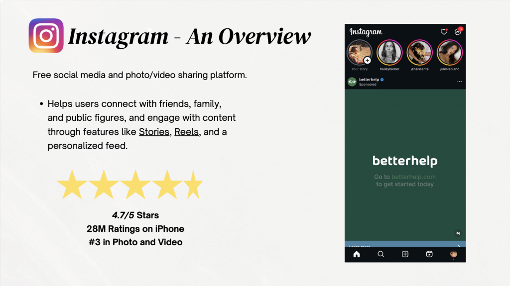
    Finally… Instagram!

    For Instagram, my previous POV statements include:

    • Users who are active on social media need to have more relatable algorithms because TikTok is known for their accurate algorithms.
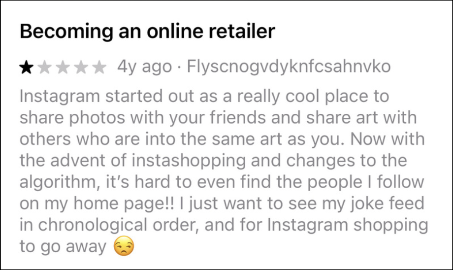
    • Users who use Instagram need less advertisements because competing apps do not distract users with ads.

    For social media users who need less advertisements on their timeline, I utilized crowdstorming and Mash-Up.

    I mainly used crowdstorming during last week’s exercise, when looking at current user reviews of these apps. Many of Instagram’s reviews mentioned the app’s overuse of advertisements on timelines, which have stirred users away from the app. Thanks to this exercise, I generated ideas such as ad-free subscription tiers and native sponsored content labeling, which can help both users and developers with this issue.

    Real negative review left from Instagram user!

    Mash-up pushed me to consider what would make an algorithm worse, which in turn inspired solutions to avoid those pitfalls and create a more engaging experience for users all around, including gamifying ad-free experiences or integrating sponsored content into story templates creatively, and urging companies to do so.

    Lastly, to address the unrelatable algorithms that users may face, I utilized brainstorming and creative pause. Brainstorming allowed me to generate ideas for users such as personalized content filters or adjustable recommendation settings to help manually set their algorithms. Creative pause, letting me take a break and step back for a second, allowed me to come back with a fresh mind to this issue at hand, and generate ideas such as brand-focused initiatives to create better content for algorithms, and even creating influencer-run programs to help newer creators with creating engaging content for algorithms.

    All in all, my favorite techniques to use were brainwriting, brainwalking, and SCAMPER, as they encouraged independent visual, and physical thinking. With these ideation techniques, these solutions directly address user pain points while promoting engagement and satisfaction across platforms. By using a variety of ideation methods, I was able to generate innovative, actionable ideas that can enhance user experience and keep these apps competitive in the rapidly evolving digital landscape.

    I strongly urge you to try them in your next project!

    Below is a PDF of my notes and overall findings using ideation techniques. Feel free to. check it out!

  • Understanding the POVs of App Users

    Understanding the POVs of App Users

    No one usually thinks to dive deep into popular apps’ ratings and reviews on the app store. So that’s exactly what I did 🙂

    Digging into these reviews, I realized how much this user feedback can actually teach us about defining design problems. This project walked me through that process, from collecting raw comments to writing meaningful POV statements that could inspire real design solutions. Looking at positive, negative, and suggestive comments can all benefit your project!

    Step One: Listening to the Users

    I chose three apps (CapCut, iMovie, and Instagram), and gathered three positive, three negative, and three suggestive comments for each. These apps are all pretty popular for beginner editors (such as myself), and I have used all three of these apps in the past. All of these apps are also categorized under Photo & Video in the App Store. The mix was important because, as the Prototypr article reminds us, defining a problem means balancing what’s working with what isn’t — otherwise you risk designing for just one side of the story. One quote that stuck with me from that reading was:

    “To avoid wasted effort, define the problem, then the goal, then the solution.” That idea helped me slow down and not jump right into “fixing.”

    What stood out right away was how patterns started forming. For example, when examining CapCut, many positive reviews praised the accessibility and beginner-friendly features, but many negative ones kept mentioning crashes. Suggestive reviews often fell somewhere in between, like asking for a new feature while still appreciating the basics.

    Step Two: Making Sense of It All

    After getting an overall idea of how users felt, I began to group comments by positive, negative, and suggestive. This felt a lot like what the Interaction Design Foundation describes as “saturating the space and clustering” — basically, putting all the sticky notes on the wall and letting connections emerge. For me, the “wall” was my PDF slides, where I mapped similar issues together.

    This stage was honestly where the assignment clicked. Instead of seeing nine random comments per app, I started to notice bigger problem areas: onboarding confusion, unclear pricing, or a lack of customization. Suddenly, the comments weren’t just feedback — they were design clues.

    Step Three: Writing POV Statements

    The next step was crafting POV (point of view) statements for each app, to summarize my findings. This helped make the statements feel grounded in real people instead of abstract design jargon.

    In creating these statements, I was able to better understand and summarize the thoughts of many users among these apps. Through making these statements, right away you can begin to imagine design directions: maybe an update that allows for more free features or allow for larger videos and files to be imported or exported. That is the power of POVs — they may push you toward solutions without being solutions themselves.

    Final Thoughts

    This project taught me that defining the problem isn’t just an academic exercise — it’s a mindset shift. Instead of treating user reviews as scattered opinions, I started to see them as puzzle pieces. Grouped together, they revealed themes. Framed as POVs, they turned into design challenges worth solving.

    If I were to take this further, I would definitely run small prototypes for each POV and test them with a handful of users. Even simple changes, like switching around pro features, could make a measurable difference for each and every user.

    You can check out my full PDF — which includes all comments, groupings, and POV statements — here:

    PDF Link: file:///Users/vanessadejesus/Desktop/De%20Jesus%20App%20Point%20of%20Views.pdf

  • Creating Personas To Better Understand Users

    Creating Personas To Better Understand Users

    When moving along the design thinking process, many designers turn to creating ‘personas’ to help better understand their potential users. Defined by the Interaction Design Foundation,

    Personas are fictional characters, which you create based upon your research to represent the different user types that might use your service, product, site, or brand in a similar way,”

    Creating personas will help you understand your users’ needs, experiences, behaviors and goals.”

    To put it simpler, personas are compact, human-shaped maps of real user needs. They aren’t stereotypes — they are research-backed sketches that help teams make decisions with empathy, not guesswork.

    I followed I followed the Persona Notepad method (the great guide is here) to build two real worksheets for Instagram: one of me and one of Jason Diaz, a 32-year-old dad who loves hiking and golf. Both of my filled worksheets will be attached at the bottom of this page.

    Sooo… Why Bother?

    A persona can easily turn vague ideas like “people want privacy” or “users enjoy posting” into specific problems we can solve. For example, my personal (Vanessa) persona, in a wrap, shows a 21-year-old grad student who loves photography but gets stuck deciding on an aesthetic and sometimes doom-scrolls instead of posting. That tells a product team very different things than Jason’s profile, which highlights privacy worries (his wife prefers fewer kid photos online), low tech confidence, and a desire to preserve family memories. Those differences can directly suggest product features: presets and scheduling for Vanessa; simple privacy controls, private-family albums, and better photo-backup tools for Jason.

    Personas help in three concrete ways:

    First, they prioritize features. If your primary persona wants curated aesthetics, then tools that surface filters, presets, or in-app grid previews should get priority. If another persona values privacy and control, then family-safe sharing flows and clearer account settings should make your roadmap!

    Second, personas can guide UX language and tone: a tech-shy user needs plain language and big tap targets, while a frequent poster might welcome advanced editing tools.

    Jason’s ‘Motivation & Behavior’: shows his lack of confidence with Instagram, and can easily show developers what to do next for users like Jason!

    Third, personas can reveal edge cases — things like “wife disagrees with posting kids” aren’t just moral notes; they become design constraints (e.g., friction before public sharing, consent prompts, or clearer audience selectors). In Jason’s case, these design constraints can likely save him an argument or two with his wife, and make his mother-in-law quite happy 🙂

    When creating my personas, the guide I used also mentioned using context: when and where they’re using the app, what sparks them to log in, and what usually gets in their way. That’s why the Persona Notepad can be so helpful: it goes beyond surface-level traits and captures things like daily routines, emotional triggers, and pain points. For example, Jason might be scrolling in the evening after work, motivated by wanting to share family updates, but blocked by privacy concerns. I, on the other hand, might open Instagram during a study break, inspired by creativity, but get stuck choosing an aesthetic. When designers and developers have these details, they can quickly test features that respond directly to those needs — like trying out a one-tap “save to private family album” for Jason, or prototyping a “feed aesthetic assistant” for users like me who want help curating a look.

    At the end of the day, personas are just a way to turn vague assumptions into real empathy. They’re not meant to replace user testing or data, but they do point you toward the right questions to ask. And honestly, when you’re working on something like Instagram — or any product people use every day — it’s easy to forget that every “user” is actually a real person with their own goals, frustrations, and motivations. Personas can be that little reminder to design with people first, which is what makes products actually connect and last.

    I strongly urge you to try out this method when designing your own product or service, and let me know what you think!

  • Reviewing Empathic Research Methods

    Reviewing Empathic Research Methods

    One thing I’ve learned in design and media is that empathy isn’t just about being “nice” or “understanding.” It’s about actually putting yourself in someone else’s shoes so you can design things that work for them—not just what you think they need. And honestly, that’s harder than it sounds. That’s why empathy research is such a big deal in design thinking!

    There are tons of ways to do it, but here are four methods I think are super practical (and actually kind of fun).

    Empathy Mapping

    If you’ve ever been in a brainstorming session with a giant board covered in sticky notes, you’ve probably seen an empathy map in action. Basically, it’s a tool where you break down what your user says, thinks, does, and feels.

    Empathy Map created by NNGroup.com. Shows the thinking process using the empathy map method!

    It’s not just about writing down quotes—it’s about capturing emotions, frustrations, and even contradictions. For example, a user might say they love online shopping, but when you map it out, you notice they feel anxious during checkout. That insight? Pure gold for designers.

    One of my favorite methods, the empathy map helps make it easy to jot down all of your thoughts into one place. It helps keep me organized, as well as think ahead of my project!

    Asking “What-How-Why”: The Question Ladder

    This one is simple but powerful. Mentioned in an article written by Ale Wiecek on the Medium, when you’re interviewing someone, don’t just stop at “What did you do?” Keep digging:

    • What happened? (the action)
    • How did you do it? (the process)
    • Why did you choose that way? (the motivation)

    It feels a little like being a detective, but it gets you past surface-level answers. For example, someone might say, “I always use PayPal.” You ask “How?” and “Why?” and suddenly you learn it’s not about convenience—it’s about feeling safer putting money online. That “why” is the real design insight

    Photo & Video Journals — Catching Glimpses of Life

    This one is another one of my favorites. Instead of asking users to explain everything in an interview, you hand the camera over to them. Ask them to take quick photos or videos of their daily routines that connect to your topic.

    It’s amazing how much you can learn just from seeing people in their own space. For example, a commuter might snap a photo of the messy coffee cup balancing act they do every morning on the bus. Suddenly, you’re not just designing for “commuters”—you’re designing for that exact moment of stress and chaos.

    It can be quite risky but beautiful to have someone trust you enough to capture their personal lives. Using this method means the topic being covered must be crucial in their lives enough to share everything!

    4. Story Share & Capture — Having Real Talks

    Humans love telling stories, and sometimes you learn the most when you let people talk about a real experience. Ask them to share a time when something went really well (or really badly) with a product or service.

    The best part about story capture is that you get the emotional arc—the highs, lows, frustrations, and even little wins. And when you bring those stories back to your team, they hit harder than stats or charts ever could. It’s like, “Oh wow, this is why we need to fix this.”

    Conclusion

    Empathy research isn’t just an academic exercise—it’s how you get to the heart of what people actually need. Whether you’re mapping feelings, digging with “Why” questions, asking for photos, or listening to stories, the goal is the same: to design with real people in mind.

    An article published by the IDEO Journal states that,

    “The impact of design work must have staying power far beyond its final presentation, implementation, and market adoption.”

    To me, this means that the impact of your work using design thinking should far exceed putting it into action, but should last and help others for as long as possible.

    An image, courtesy of IDEO, of designers inserting themselves into the issue at hand. Empathic research doesn’t have to be this extreme, but does involve trying to put yourself into someone else’s shoes to really understand their issues!

    All in all, once you try one or all of these methods, you’ll start to notice how much richer (and more human) your projects can become.

  • Scrolling with Feelings: What Instagram vs. Pinterest Teaches Us about UX/UI

    Scrolling with Feelings: What Instagram vs. Pinterest Teaches Us about UX/UI

    As an avid social media user, have you ever thought about why you enjoy your favorite apps? Is it accessibility? It’s features? The visually-appealing layouts?

    These ideas heavily relate to User Experience (UX) and User Interface (UI), with UX relating to one’s emotional experience and attitudes relating to a product or service, and UI referring to the look or feel of the same product or service.

    In an effort to further understand these concepts, I did an in-depth analysis of two websites: Instagram and Pinterest. Two of social media’s largest apps for visual content, I set out to see which app was more engaging and beneficial for users.

    A Bit of Background

    Both apps are built on images, but they’re designed for different jobs. Instagram is social-first: it bundles Stories, Reels, DMs, Shopping, and profiles into one glossy surface meant to keep you engaged with people and creators. Pinterest is discovery-first: it’s a visual search engine where you save ideas to boards and return when you’re ready to act. Homepages can make that split pretty clear.

    From a UI standpoint, Instagram nails brand consistency—bold story rings, crisp type, immersive video—and that polish fuels inspiration. But the UX can feel noisy when competing surfaces (Feed, Reels, Stories, Shop) all want attention, which can raise cognitive load and choice paralysis.

    Pinterest’s minimalist grid and generous whitespace do just the opposite: the interface gets out of the way so you can scan quickly and file ideas into boards—clean, calm, and searchable.

    Psychology can help explain why they feel so different. Instagram leans on variable rewards—fresh social feedback, unpredictable recommendations—which are great at holding attention but can leave you feeling “always on.” Pinterest, meanwhile, reduces friction for goal-driven tasks (plan a room, a look, a party) with classification, filters, and retrieval cues via boards. These are classic behavior and cognition moves: design that tunes motivation, attention, and memory creates stickier experiences. Said by Megha Goyal, “humans are motivated by intrinsic and extrinsic factors. That means we can be driven to do things depending upon either external factors like rewards or internal factors like enjoyment,” (Medium).

    Emotionally, both apps prove a point made by Harvard Business Review: when products connect to deep motivators (self-expression, belonging, aspiration, progress), users return and spend more. Instagram hits belonging and identity—posting, reacting, being seen. Pinterest hits progress and possibility—collecting, organizing, and moving toward a project. Both platforms have different motivators, yet the same endgame: sustained engagement!

    To analyze these websites, I created FEEL/NEED statements to extract some of their pros and cons:

    Instagram

    • Instagram’s features of likes, comments, and stories make me feel connected because my need of social connection to stay engaged with friends and creators is met.
    • I feel overwhelmed by the constant ads and sponsored posts, as my need for a cleaner experience without so much interruption is not met.
    • I feel annoyed by the constant appearance of Threads’ suggestions, as my need for an easy, smooth scrolling experience was not met.
    • I feel satisfied by smooth scrolling and quick loading, as my need for a smooth performance for a positive experience is met.
    • I feel manipulated by infinite scrolling, because my need for freedom from social media is not met within the app.

    Pinterest

    • I feel inspired by the endless amount of pins, as my need for discovering new ideas and interests is met.
    • I feel relieved by the organized grid layout, because my need for clarity to browse without overwhelm is met.
    • I feel empowered by customizable boards, as my need for control over my selected content is met.
    • I feel motivated and sometimes shocked by Pinterest’s personalized feeds, as my need for efficiency when browsing is definitely met!
    • I feel satisfied that search and filter tools are intuitive, as my need for high functionality within the app is met.

    View all of my statements here!

    So, how did these statements shake out? To summarize, on Instagram, we felt connected but sometimes overwhelmed, we need more control over content ranking and interruptions, and would prefer a lighter cognitive load. On Pinterest, we felt inspired and organized; we need stronger link integrity and richer media when we want more than static images.

    If you’re grading UX/UI, here’s my takeaway: A beautiful UI isn’t enough; the experience has to match the psychology of the task! Use aesthetics where they support the user’s emotional goals (identity, belonging, progress), and use structure where they need clarity (labels, filters, information scent). Or in short: design for how people feel in the flow, and what they need to finish. For deeper dives, Joe Leech’s talk and UX psychology primers translate these ideas into practical patterns you can reuse:

    All in all, analyzing a website’s UX and UI an only benefit when creating your own. After analyzing these websites, I was able to jot down even more ideas I had for my own website! I would highly recommend this practice, and even pitch your ideas to the companies themselves!

  • Design Sprints: A New Experience

    Design Sprints: A New Experience

    I just recently learned about design thinking, an innovative way of thinking about user experience.

    Now, when I first heard the term design sprint for an assignment, I’ll admit I felt a little intimidated. The idea of compressing brainstorming, problem-solving, and prototyping into such a short amount of time sounded like a challenge. But once I actually went through the process with my partner, I realized how powerful and energizing it can be.

    Our assignment was simple in theory: schedule a two-hour block, print out the worksheet, and work through the sprint together. But what unfolded during that time was an exciting deep dive into creativity, collaboration, and problem-solving.

    Our assigned steps for this exercise!

    Step One: Defining the Problem

    First, we began by mapping out common college issues. From dining to overwhelming workloads, in just five minutes we dived into as many topics as we could think of. In a second interview, we decided to dig deeper into the issues we talked about, to which I chose my issue, commuter struggles. While distance wasn’t an issue, social connection was. Many commuters have trouble making friends, since most clubs start late in the evening (9–11 p.m.), when many are already headed home. Balancing a heavy workload, internships, and commuting time also means there’s less energy for late-night events. The core problem we defined was simple but important: commuters struggle to connect and form relationships on campus due to conflicting schedules and limited opportunities.

    Diving into the problem even further, I brainstormed any potential issues and findings to think of potential solutions. This is when I created my problem statement:

    Making friends and connecting with fellow students is a challenge for commuters because of conflicting schedules, late clubs, and not enough time spent on campus.

    As well as my HMW statement, which overall defines my problem:

    How might we ensure commuters gain an overall positive experience at QU, ones similar to living on campus?

    Creating both my problem question and HMW statement allowed me to clearly define my problem, and move onto the next step!

    Step Two: Ideating Solutions

    In this step, I was able to further define my solutions for the selected issue. I first began researching inspiration to find previous examples of potential solutions for this issue. After 10 minutes of researching, I came across many solutions made by universities to help elevate commuter experiences; from dedicated lockers and lounges to networking events to mentorship opportunities, universities have incorporated many initiatives in helping commuters enjoy their college experiences.

    My next step was to create concept sketches of my potential solutions, all based on my HMW, lightning demos, and ideas.

    Concept sketches, drawn by me!

    These sketches mainly focused on a section within the QU app, that allows commuter students to find all commuter-related resources, as well as take a quiz to connect commuter students with one another based on their interests.

    Step Three: Decide

    In this step, we presented our concept sketches to each other, to receive feedback and any potential newer ideas. My partner enjoyed the solution, as she said it was effective for solving this issue. She also expressed some small feedback to enhance the experience, like adding more general questions to the quiz, such as asking for majors and the days or times available on campus. She also asked me about what happens after completing a quiz, which I hadn’t thought of yet!

    Now, it was time to refine our ideas, and generate new or revised concepts based on the test feedback.

    Step Four: Prototype

    When revising, I made sure to include all of my partner’s feedback. Ultimately, using Figma, I ended up creating much more refined sketches, and showed exactly how the section and quiz would look in the QU app.

    Step Five: Test

    Now, it was time to present our prototypes, and receive feedback from one another.

    In this step, my partner expressed her agreement towards my idea, as it was “very easy to follow along and very straightforward”. When sharing our feedback, she noted how the first screen invites the user to talk with other commuters, but the final screen says you’ll be paired with just one. She also noted how putting commuters together in a chat with a handful of other commuters could be more beneficial instead of just one on one, for both the commuters and their busy schedules. Besides that, she really enjoyed the idea!

    Some of the final revisions I made included:

    • Added questions to the quiz section.
    • After the quiz is sent, commuters are put into a small chat with other commuters, all based on their information, availability, and interests.
    • Students will also be put into a large group chat with the Commuter Student Union Club (to boost the club’s numbers!)

    All in all, this fast-paced sprint showed me how valuable structured design thinking can be, especially when tackling real student challenges. In just a few hours, we went from a broad problem to a tested prototype with clear revisions. Most importantly, the process underscored that small design changes—like tweaking an existing app—can have a big impact on inclusion and campus life. For commuters, a digital hub could make the difference between feeling isolated and truly belonging.

    Look at my final design sprint here!

  • What Even is Design Thinking?!

    What Even is Design Thinking?!

    Once a complete stranger to the world of design thinking, I did a bit of research to familiarize myself with this new term.

    I am inviting you to watch this Ted Talk of Tim Brown, the godfather of design thinking. The CEO of IDEO talks about the difference between design and design thinking, and just how far design thinking can bring you. From global warming to education to clean water, we have used design thinking to address and inform others on these issues.

    To start off: what even is design thinking? Well, Fast Company called it “a proven and repeatable problem-solving protocol” that anyone in any field can use to get extraordinary results. In simpler terms: a method that helps us move beyond just fixing the obvious.

    Now, the Interaction-Design Foundation (IxDF) lays out five core stages of design thinking: Empathize, Define, Ideate, Prototype, and Test. These steps, however, aren’t in order. Think of these as modes you can bounce around in – you can start empathizing, jump to prototyping early, then loop back to define again.

    Let’s break them down!

    • Empathize: diving into understanding real people—their motivations, frustrations, quirks. It’s much more than a survey; it’s stepping into someone’s shoes!
    • Define: Next, you take those raw insights and frame the right problem. Not to “make things cheaper”, but instead “how might we…”
    • Ideate: It’s time to brainstorm! With wide-open thinking, let you imagination roam, and start to filter what might really work.
    • Prototype: Building something, even just a sketch or wireframe, to test in the real world.
    • Test: Try it out! See where it breaks, ask people what they think, and be ready to go back and iterate.

    IxDF also notes that design thinking is best when tackling “ill-defined or complex problems“, not ones we already know how to solve! Design thinking also encourages both divergent and convergent thinking, opening our brains up to multiple processes of thinking!

    While researching, I also came across a newer perspective: while design thinking has been everywhere for a while, its corporate love affair might be cooling. Fast Company recently shared that mentions of “design thinking” in job posts have dropped significantly in some fields—and that maybe a new mindset, like “community-powered transformation,” is emerging.

    But here’s the thing: regardless of the label’s popularity, the spirit of design thinking—deep empathy, creativity, iteration, and staying human-centered—is still golden! Many top designers today have built real results by immersing teams in herds of ideas, prototyping fast, using sticky notes, and collaborating beyond hierarchy. It’s the way creative teamwork becomes structured yet playful, and helps companies succeed!

    And beyond media and tech, the approach is influencing areas like legal services—making contracts more user-friendly, designing for accessibility, and transforming how people interact with systems, according to Financial Times!

    So, bottom line—if you ask me, design thinking isn’t just for designers – it’s for anyone tackling messy challenges, wanting to connect with real human needs, and eager to keep learning by doing. It’s messy, iterative, and a bit chaotic—but that’s where the breakthroughs hide.

    I tried it myself in a fast-paced design sprint I did with a partner, which you can view here.

    I would highly recommend to give design thinking a try, and let me know how it unfolds for you!

  • “Style Files” – How I Created a Short Video Series for the First Time

    “Style Files” – How I Created a Short Video Series for the First Time

    In the span of seven weeks, I created my own mini video series called “Style Files”; consisting of three ten-minute videos, each covering a timeless fashion piece. Explaining their histories, how they’re typically styled, and who wore them best, this series aims to inform my viewers on how these pieces survived through history.

    How Did I Do It?!

    Creating this series was truly an amazing learning experience. With tons of planning and organization, I was truly ready for anything to happen. The first steps in creating this series were research, as well as writing down all of my ideas through a project proposal.

    In this proposal, I explained my reasoning for creating this series, as well as outlined my project’s deliverables and goals. As someone who has always had interests in content creation but never really got around to do it, this project was the perfect excuse. Creating this proposal was incredibly helpful in solidifying my thoughts, and gave me a very solid foundation for Style Files. In a blog post I created called “‘Style Files’: Creating A Video Series Proposal”, I go into much more detail about the overall thoughts I had for my project. For a high-stakes project or even a personal project, I highly recommend implementing project proposals into the beginning of your process! YouTubers such as Nick Metzger give very insightful tutorials on video project proposals, and why they’re so important!

    Moving on, the next step of my process was project management. A practice I highly recommend, project management involves organizing all of the tasks to be done in just one place. Using Notion, I organized every single task I needed to complete in order for this project to succeed. From figuring out lighting to setting down which times to edit the videos, every detail was planned out.

    As someone who avidly uses Notion, this process came very quick to me. In my recent blog post called “Project Management… Let’s Try It Again!“, I explained my process of creating these ultra-specific tasks, and why they’re so important in this process!

    Next, it was time to get into pre-production. I started creating weekly production journals to track my time spent on the project. With my initial plans written out in Notion, my production journals truly showed me how much of it was getting done.

    In pre-production is where I created my scripts, as well as did some research production-wise.

    scripts 1, 2, & 3!

    Research on my planned editing software, Capcut, definitely saved me lots of time when actually editing. I researched various background music websites for the series, and also how to best utilize my Canon G7X Mark 2 camera. All in all, this research truly helped me in both saving time and planning in accordance with the rest of my tasks.

    Now, I feel like is everyone’s favorite part: PRODUCTION! (and post production.)

    With everything already planned beforehand, production came pretty easily. In a blog post I made called “Ready to Launch! In 5… 4… 3…“, I went into heavier detail regarding my filming and editing process. When filming, having my scripts to guide me and my outfits already planned out saved so much time for editing! I felt so prepared coming in and out of this video series, and definitely recommend the same if not more planning for any upcoming projects. From editing with Capcut to uploading to YouTube, the post-production process was incredibly easy, thanks to YouTube tutorials such as Ben Claremont’s or Peanut Butter’s.

    All in all, as you can tell from what I’ve said around 1000 times in this page, the majority of this project was thanks to heavy project management implemented in the beginning.

    What Comes Next?

    With this experience now under my belt, I definitely plan on continuously uploading to YouTube with similar content! I really enjoyed filming, editing, and planning this project, and can’t wait to incorporate what I learned from this project onto newer ones. Although this was an assignment, the creative freedom and independence made this project extra personal, and something I am extremely proud of.

  • Writing for Social Media

    Writing for Social Media

    How writing for interactive media can differ from platform to platform.

    When posting on social media, how would you describe the way you caption your posts or talk to your audiences? Is it conversation-like? Serious? This may also depend on the social media platform you use. To give examples, I drafted three posts on three different social media platforms: LinkedIn, Instagram, and TikTok. The writing styles for these platforms are very different, as one platform may require you to engage audiences much quicker than others. All in all, it is important to understand these differences in writing styles for different platforms, to help audiences engage in your content and enjoy it across platforms.

    The content I chose to share across platforms is my long form article, titled “Digital Media is Killing the Traditional Fashion Industry”. In the article, I discuss how digital media has led to many declines in the fashion industry; from the decline of print publications to fashion-related careers, and how the print industry struggles to keep up with digital media.

    Writing for LinkedIn

    LinkedIn, a much more professional-like platform, aims to promote leadership and help professional individuals connect with one another. With that being said, promoting special projects or long works would be perfect for this platform. When explaining writing for different social media platforms, Anastasia at SocialBee encourages readers to “use LinkedIn to spread your knowledge. Whether through a text post or by linking to articles from your blog, this can help position you as an authority in your niche” (2024). When writing on LinkedIn, I’ve come to realize how conversational the platform is, despite its professional reputation. As a result, a lot of emoticons and hashtags are used to promote the work towards the end of the post, and help the post reach the right audiences.

    As an example, here is a post I wrote on LinkedIn promoting my work. While the link to the article itself is not visible, I did link it to the post using LinkedIn’s link feature. To the left is the image I attached to the post, and the right is what I wrote:

    As you can see, posting on LinkedIn can be much more conversational, like you are pitching the article to someone in the industry. Though it is important to not get too conversational, as overly casual tones may not be taken seriously on LinkedIn. When writing the post, I pretty much felt like I was writing a blog post. The audience I aimed for were individuals in the fashion magazine industry, as this is a career I am aiming for in the future. When selecting my content, I chose the same image I used for my article. I really liked how this image captured the main point of my article, and fits pretty well with the post itself.

    Writing for Instagram

    When writing for Instagram, it is entirely up to the author how conversational the post should be. Instagram is known for its many “sides” of the platform – comedy, business, personal, and more. I realized it was important to share my article on this platform, as Instagram is heavily used in the fashion world. When creating a post for Instagram, I decided to create a collage for the post itself, as Instagram is a very creative platform.

    To the left is the image I made and posted, and to the right is my caption for the post:

    As Instagram is known as more of a creative outlet, I decided to get a bit more creative in my post. I put together a collage of various fashion influencers, and mixed in some magazine covers. In the middle, I put “the fashion industry is dying. thanks social media.” to give a main message to my article, and lure readers to my work. After giving a main summary, I informed readers that the article will be linked in my bio, where they can find on my account page. In the same article mentioned previously by SocialBee, Anastasia mentioned how writing for Instagram can include all types of interactive content, like tagging or using Instagram Stories. Using Instagram Stories can also help my content reach newer audiences, by incorporating polls, questions, or quizzes to encourage readers to view and interact with my content.

    Writing for TikTok

    Writing for TikTok can be much more challenging. TikTok is known and loved for their short form content, where users can enjoy copious amounts of information dialed down into 15-30 seconds. In turn, this has destroyed our attention spans. According to SG Analytics, in 2023 our attention span has reduced to only eight seconds. As a result, businesses are learning to adapt and create new business models because of this. Ultimately, writing for TikTok means capturing audiences as soon as you can. This would have to be through the content itself, as viewers’ eyes don’t tend to go towards the caption until after viewing the content. For more informational content, you would have to get really creative to capture your viewers.

    Here’s what I wrote for TikTok:

    I unfortunately could not include the content itself, but I would’ve posted multiple images for viewers to scroll through, starting at vintage magazines then transitioning to influencer-made fashion. In the last image, I would ask which was their favorite, gathering opinions in the comments. I used the title feature to hopefully grab readers’ attention for the caption, using a pretty dramatic caption. Then, in the smaller caption, I would inform readers of various facts surrounding the decline in the print industry and of my writing. I also used multiple popular hashtags on the fashion side of TikTok, to hopefully get the content on everyone’s algorithm.

    Normally, lowercase letters are a big no in writing. There has, however, been a huge trend recently with using lowercase letters everywhere (which I have ultimately fallen victim for). I believe using lowercase letters can ultimately help me reach more audiences, as it seems a bit personal and stands out from other informational content. When writing for social media and short-form content, it is important to stand out and capture viewers in your writing. In just eight seconds or even shorter, viewers can easily skip to the next video.

    Conclusion

    Learning how to write for different social media platforms can be crucial to finding your right audiences. Understanding the specific tones that should be used for different platforms can help readers take your content seriously. Writing on TikTok, for example, is very different from writing on LinkedIn – TikTok is much less serious, more conversational, and many times comedic. Promoting professional work, no matter the platform, doesn’t have to be difficult. Understanding the platforms being used are crucial in knowing how or what to write, as platforms and the average attention spans tend to vary. Overall, as digital media continues to rise, being able to write for different social media platforms is crucial in successfully promoting any projects, and can be a very crucial skill to have.

    Works Cited:

    Anastasia. (2024, May). Social Media for Writers: Best Platforms and Strategies. SocialBee. https://socialbee.com/blog/social-media-for-writers/#linkedin-for-writers

    SG Analytics. (2023, August 11). TikTok Scrolling Has Shortened the Attention Span of Students: How Can EdTech Help Solve the Crisis? Www.sganalytics.com. https://www.sganalytics.com/blog/tiktok-scrolling-has-shortened-the-attention-span-of-students-how-can-edtech-help-solve-the-crisis/

  • AI: Blessing or a Curse?

    AI: Blessing or a Curse?

    AI has shown as a helpful tool for many professional in varying fields, though has raised questions of its intentions. As someone who doesn’t use AI, I have never quite understood how the use of it is getting so popular today. So I decided to experiment on it. Prompting ChatGPT to write a blog post about my disconnection from home was such a weird feeling. How would AI know how I feel? How specific can they get?

    To my surprise, AI succeeded in sounding exactly like me. I found it a bit creepy how many experiences it spoke about that I thought were very personal, such as the internal guilt and the effort of staying connected to my family. After my second prompt and providing the technology with a bit of my blog post to give an example of how I write, AI managed to record all of my personal experiences in moving away from home for college.

    Some advantages of the technology include its speed for content, and consistency shown throughout the work. These advantages make it much easier for writers and other professionals to generate and expand on new ideas. A disadvantage may be the lack of personal touch, to where I had to edit the content to fit my personal life. This likely could’ve been due to me not being specific enough, and not the technology at all.

    In the future, AI, if used in a beneficial way, can be a great tool or assistant in writing and generating ideas. It is important to create a balance between assisting and completely creating, so the technology doesn’t take your voice away. Ultimately, through this experiment, I was able to learn about AI’s abilities to create such unique content, and plan on using the technology in the future to assist myself in my ideas.

    Thanks, AI!

    Link to the AI discussion: https://chatgpt.com/share/67acf36f-c624-8008-937f-c553d1f666de

    Here is the final prompt, given to me by artificial intelligence, but revised by me:

    “Feeling Disconnected from Family After Moving to College”

    Living in a world where we’re always connected through social media, FaceTime, and endless group chats, you’d think that moving to college wouldn’t make me feel so disconnected from my family. But here I am, a junior in college, only 45 minutes from home, and still feeling like there’s an emotional distance that wasn’t there before.

    When I first moved into my dorm freshman year, I expected some changes. I knew I wouldn’t see my family every day, but I figured I’d visit home all the time. Forty-five minutes isn’t that far, right? I imagined weekend trips, home-cooked meals, and keeping up with everything like I never left. But now, three years in, I’ve realized that physical distance isn’t the only thing that creates space between people. Life moves on—for them and for me.

    The Growing Disconnect

    At first, it didn’t hit me. I was too busy adjusting to college life—meeting new people, navigating classes, and learning how to “adult” (kind of). But slowly, I started noticing the little things. My family’s routines changed without me. My younger siblings had new jokes I didn’t get. My mom started watching new shows that I never even heard of.

    When I go home now, it doesn’t always feel the same. The house looks the same, smells the same, and the people are the same, but there’s this invisible gap that I can’t quite put into words. It’s like I’m visiting rather than returning. It’s not intentional, but it stings.

    The Guilt of Growing Up

    The weirdest part of all of this? The guilt.

    I know my family misses me, and I miss them too. My mom still sends me texts asking how my classes are going, and my dad reminds me to call if I ever need anything. My sibling will send me a meme here and there, but our conversations aren’t like they used to be. And I hate that.

    I feel guilty when I take too long to respond, but I also feel guilty when I don’t have much to say. “How’s school going?” is such a loaded question when every day feels like a chaotic mix of assignments, stress, and figuring out life one step at a time. And when they tell me about what’s going on at home, I sometimes feel like I’m listening in on a life that doesn’t quite include me anymore. It’s a strange feeling—being a part of something, yet distant from it at the same time.

    Trying to Stay Connected

    Even though I’ve been feeling this disconnection for a while, I’ve realized that I have to put in the effort to maintain my relationships. Staying connected isn’t just about proximity—it’s about making time and being intentional.

    I’ve been trying to call home more often, even if it’s just for a quick check-in. I send random texts when something reminds me of them. When I visit, I try to be present—actually engaging in conversations instead of scrolling on my phone. It’s not perfect, and I know I could do better, but it’s a start.

    I’ve also started to accept that change is normal. My family isn’t moving on without me; they’re just living life, just like I am. And even though it feels weird to not be as involved in their daily routines, I know that our bond is still there. It’s just evolving, just like everything else in life.

    Finding a New Normal

    Being in college—especially now, as a junior—has taught me that growing up comes with a lot of unexpected emotions. Feeling disconnected from my family wasn’t something I thought I’d struggle with, but here I am. And while it’s been tough, I know that this isn’t the end of anything—it’s just a new phase.

    At the end of the day, my family is still my family. The love is still there, even if things feel a little different. And no matter how far life takes me, I know home will always be just a phone call (or a drive) away.”