Have you ever walked into a room and instantly felt calm? Or clicked on a website and felt energized before reading a single word? That’s color psychology at work – the invisible force shaping how we feel before we even think about it.
Color psychology is essentially the study of how colors influence perception, mood, and even behavior – whether we’re aware of it or not. Colors affect our emotions, our decisions, and our sense of trust and energy in ways that are deeply rooted in both culture and human biology.
At its core, color psychology blends psychology with design: it’s not just about pretty hues but about meaning. In marketing, designers choose colors intentionally to influence how people feel about a brand or product. For example, a brand might use blue to evoke security and trust, or red to create excitement and urgency. It completely depends on the emotions that the brands want their consumers to feel!
But before you can use colors with intention, it helps to understand color theory itself. At the heart of color theory is the color wheel, a simple visual tool that maps how hues relate to one another. Imagine the wheel as a rainbow circle where primary colors like red, blue, and yellow sit as the foundational building blocks. From there, mixing these creates complementary colors like green and orange, and then tertiary hues that bridge those gaps.
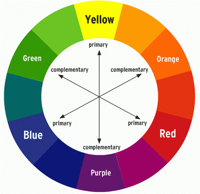
Color theory is about relationships: how colors contrast, complement, or harmonize with one another. Complementary colors (those opposite on the wheel) can make a design pop, while analogous colors (those next to each other) feel harmonious and soothing (Decker, 2023). Learning these relationships lets designers craft palettes that tell a story — visually and emotionally.
Once you understand the wheel, you can start interpreting color meaning. While these interpretations aren’t set in stone, general psychological associations do exist, and are widely used in UX, branding, and marketing. For instance:
- Red often signals energy, urgency, or passion, and grabs attention quickly.
- Blue tends to be calming and trustworthy, which is why we see it so often in technology and health companies.
- Green conjures nature, growth, and stability – think health, refreshment, and wellness contexts.
- Yellow radiates warmth and happiness but can lead to negative emotions like anxiety and uneasiness.
Information from “Color Psychology: How To Use it in Marketing and Branding” by Bailey Maybray.
This really important graphic shows every color and their meanings!
.png?width=1302&height=8956&name=Color%20Psychology%20-%20Complilation-72%20(1).png)
These associations come from cultural conditioning, shared symbolism, and the way our brains interpret visual information. Color can even bias decision‑making: people make first impressions about products based on color alone, long before text or layout comes into play.
Of course, color psychology isn’t totally universal — individual and cultural differences matter. What feels peaceful in one context might feel cold or distant in another. That’s why good designers learn not just theory, but empathy: testing, experiencing, and refining based on how everyone reacts.
So next time you choose a palette — whether for a room, a brand, or a poster — it may be fun to ask: What am I trying to communicate? Because behind the aesthetics lies a powerful psychological tool that can shape feeling, focus, and emotional connection — all through the simple brilliance of color.
Leave a Reply