Category: Visual Design

  • How I Redesigned a Brand

    How I Redesigned a Brand

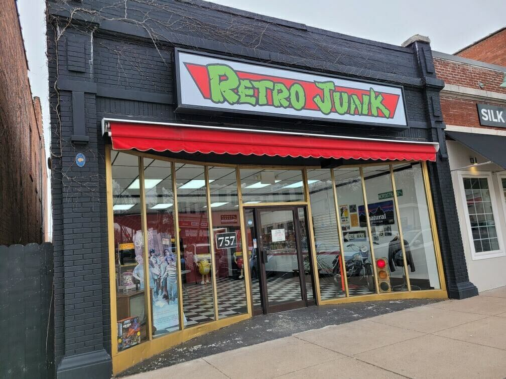
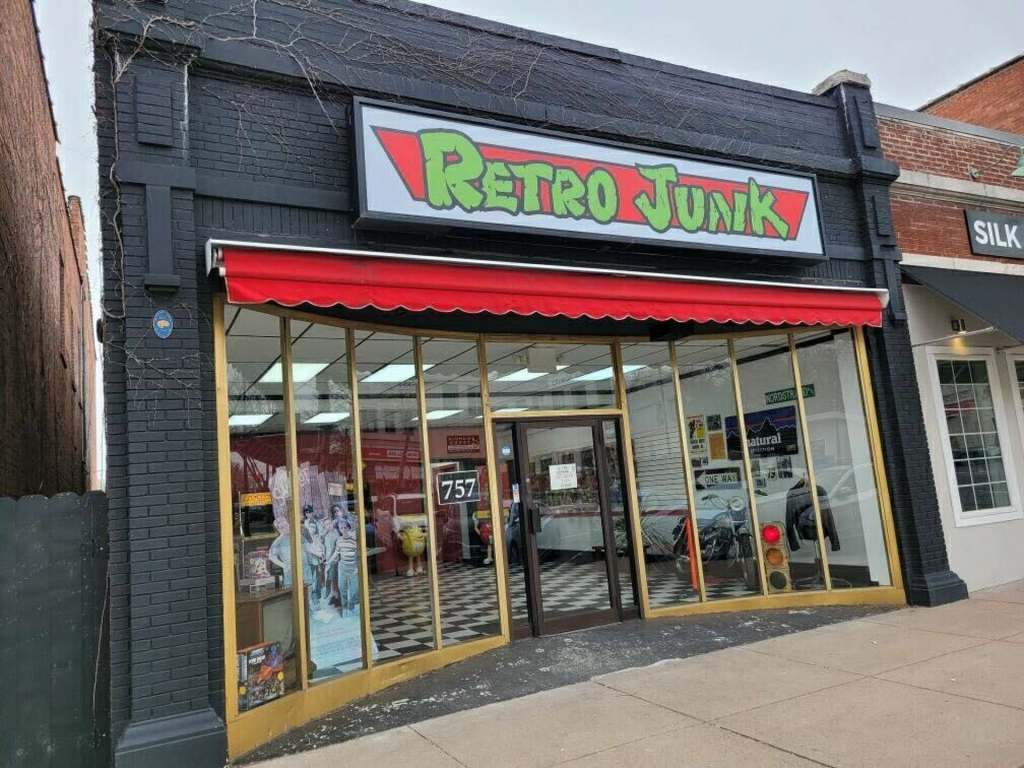
    When I first looked at Retro Junk, a collectibles and retro gaming store based in Manchester, CT, I immediately saw its potential. The store already has a strong identity rooted in nostalgia and gaming culture, but its branding doesn’t fully capture how fun, inclusive, and engaging the experience actually is. From the outside, I actually never knew it was a collectibles store! Let’s go through how I fully redesigned their brand!
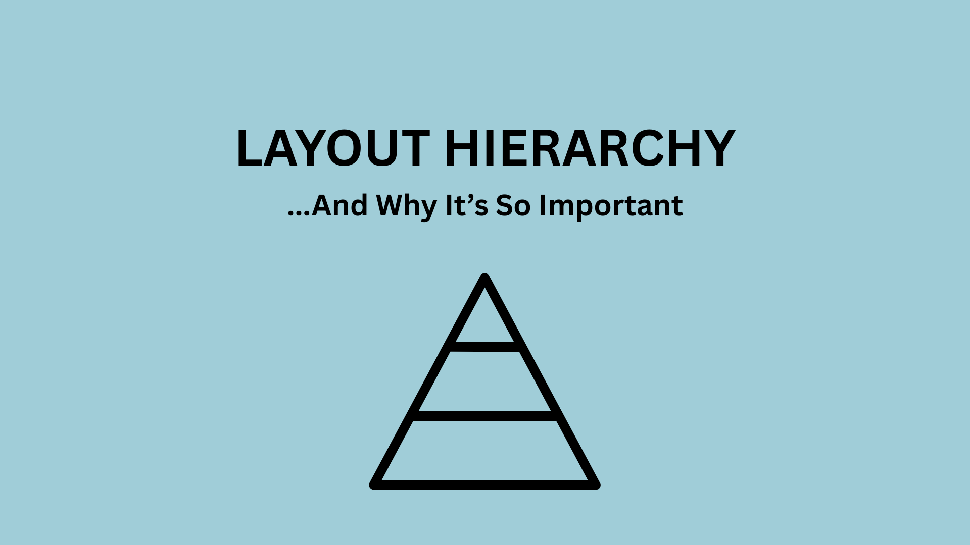
    Image of the outside of the store! From CTInsider.

    Rationale

    Right now, Retro Junk’s brand feels a little disconnected. While the store itself is welcoming, fun, and immersive, its visual identity comes across as outdated and easy to overlook, especially online. There’s also a gap in communication: people don’t always realize they can actually hang out, play games, and explore!

    My redesign focuses on modernizing without losing nostalgia. I wanted to highlight what already makes Retro Junk special: its inclusivity, fun personality, and retro charm, while making it more visually engaging and easier to recognize.

    Research

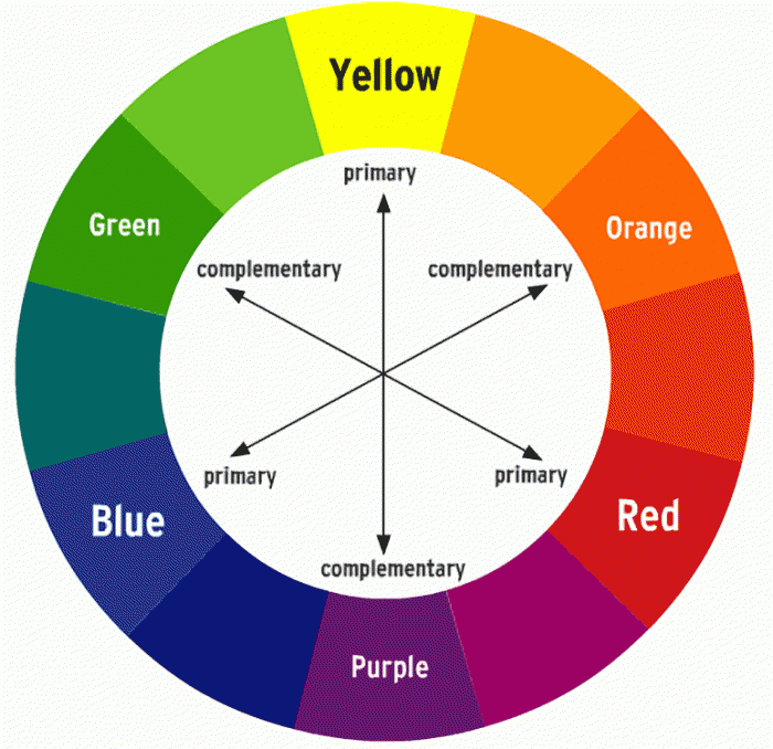
    The target audience for Retro Junk is primarily young adults (16–30), along with nostalgic gamers and collectors of any age. This audience tends to prefer bold, visually engaging designs, like neon colors, pixel-inspired graphics, and clean but playful typography.

    Looking at popular competitors like Retro Games Plus and Stateline Video Games, I noticed three main approaches:

    • Some use minimal, clean branding, which feels clear, but also a bit dated.
    • Others go for graffiti-style or chaotic fonts, which can feel expressive but inconsistent.
    • A few brands lean into bright, fun visuals, but lack structure.

    With all of this in mind, this gave me an opportunity: create a brand that’s fun and cohesive!

    New Brand Proposal

    The name Retrojunk stays – it’s memorable and fits perfectly. I introduced the slogan:
    “Retro Finds, Endless Memories.”

    The brand voice is friendly, informal, and inclusive, like talking to a friend. It emphasizes that everyone is welcome, no matter their level of gaming knowledge.

    The brand story focuses on creating a space where people can relive their childhood, discover new treasures, and just enjoy being there.

    Visual Brand

    This is where things really started coming to life!

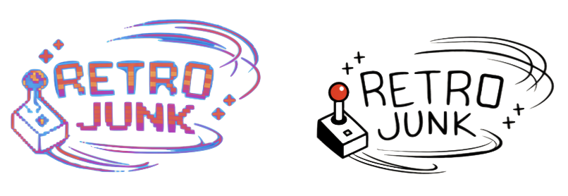
    I created two logos to use consistently for the brand:

    • A bold, neon, nostalgic version to grab attention.
    • A cleaner, more minimal version for professional use.

    The color palette mixes dark bases with vibrant accents like neon pink, teal, and yellow, capturing the retro arcade energy.

    Typography leans into pixelated, 8-bit-inspired fonts for headings, paired with simpler fonts for readability.

    Brand In Action

    I designed a full identity system to make the brand feel immersive everywhere:

    • GameBoy-inspired business cards that double as collectibles.
    • Retro-style receipts with phrases like “Continue?” and “Final Score” to show the total!
    • Rarity tags (Common, Rare, Epic, Legendary) to gamify shopping

    For marketing:

    • Posters and brochures use the same bold visuals and tone.
    • The website comps focus on being clean, interactive, and easy to navigate while still feeling fun.
    • A newsletter helps build community and keep customers engaged beyond the store!

    Final Thoughts

    This redesign isn’t about changing Retro Junk, but about amplifying it! By combining its nostalgic design with modern clarity, the brand becomes more engaging, more accessible, and more competitive.

    Because at the end of the day, Retrojunk isn’t just selling products, it’s selling memories. And now, the brand finally shows that!!

    From looking at my redesign, I hope you can learn and also help a small business in need of a rebrand! Thanks for reading!

    View a full deck of my rebrand below!

  • Designing Your Outfit Like a Brand: What Fashion Can Learn from Visual Design

    Designing Your Outfit Like a Brand: What Fashion Can Learn from Visual Design

    When we think about visual design, we usually picture websites, logos, or apps – not the outfit we throw on before leaving the house. But the more I’ve learned about design processes, the more I’ve realized something kind of funny: getting dressed is basically the same thing as building a brand.

    Think about it. Every time you put together an outfit, you’re making choices about colors, layout, balance, and the overall “vibe.” That’s not just fashion – that’s visual design.

    In digital design, I’ve learned that everything starts with structure. Designers don’t jump straight into colors and fonts – they plan first. This is where concepts like wireframes and mockups come in. A wireframe is like a rough outline, focusing on layout and function before anything looks polished. A mockup comes next, where the visuals – colors, typography, and details – start to take shape. According to CareerFoundry, this process helps designers organize ideas and create a clear user experience before finalizing a product.

    Now we can apply that to fashion. Your base outfit – the jeans and a plain top, for example – is your “wireframe.” It’s the structure. It might not be exciting yet, but it sets the foundation. Then comes the “mockup”: layering pieces, adding color, experimenting with textures, and incorporating accessories. Suddenly, the outfit has personality. By the time you’re done, you’ve created a finished “design” that expresses you!

    This is where branding really comes in. Strong brands are consistent. They have a recognizable identity – specific colors, styles, and messaging that make them stand out. The same idea applies to personal style. Whether you realize it or not, you probably gravitate toward certain silhouettes, color palettes, or aesthetics. That’s your visual identity.

    For example, someone who constantly wears neutral tones and structured pieces might be communicating minimalism and professionalism. Someone else who mixes bold prints and layered accessories might come across as creative and expressive. These choices aren’t random – they’re design decisions.

    Tools matter here, too. In web design, programs like Adobe Illustrator are used to create clean visuals and experiment with different compositions before finalizing a design. In fashion, your “tools” might be your closet, Pinterest boards, or even trying on multiple outfits before settling on one. You’re still going through a process of testing and refining until everything feels right.

    What’s interesting is how often people skip the “planning” stage in both design and fashion. In web design, jumping straight into visuals without structure can lead to confusing, ineffective layouts. In fashion, throwing on random pieces without thinking about balance or cohesion results in an outfit that can feel… off.

    This is why understanding basic visual design principles like balance, contrast, and hierarchy can completely change how you approach getting dressed. A statement jacket creates hierarchy by drawing attention. A mix of fitted and oversized pieces creates balance. A pop of color adds contrast and visual interest. These are the same principles designers use to guide how people experience a website or brand.

    At the end of the day, fashion isn’t just about following trends, but about communication. What do you want your outfit to say for you? When you start thinking of your style as a form of visual design, getting dressed becomes less about guessing and more about intention.

    So next time you’re standing in front of your closet, think like a designer. Start with your “wireframe,” build your “mockup,” and refine your final look. This is such a fun way to look into both designing and picking an outfit, since the two can be pretty similar!!

  • Hierarchy in Layout – And Why It’s So Important

    Hierarchy in Layout – And Why It’s So Important

    Have you ever glanced at a poster and instantly known where to look first? That’s not an accident – it’s the image’s layout hierarchy. In design, hierarchy refers to the arrangement of elements in a way that guides the viewer’s eye, making information easy to process and visually engaging. Whether you’re creating an event flyer, a movie poster, or a social media graphic, hierarchy is what transforms content clutter into clear information.

    Typically, visual hierarchy answers one simple question: what matters most? Designers achieve this by manipulating size, color, contrast, spacing, and placement. Larger elements tend to grab attention first, followed by bold colors or high-contrast visuals. For example, in many event posters, the event title is the largest element, followed by the date and location, and finally supporting details. This structure ensures that viewers quickly understand the key message without feeling overwhelmed (Piktochart, 2026).

    Here is an infographic I wanted to point out from FreeLogoServices, showcasing the path readers usually take when things like typography, logo, and size are manipulated.

    Movie posters are one of the best examples of hierarchy done right. They often prioritize a central image – usually the main character – paired with a bold title and minimal text. According to research, “the best movie poster designs balance a unique and innovative concept with some inherited elements of genre-specific design,” typically to guide the viewer’s attention step by step (TutsPlus, 2023). Without this structure, even the most visually stunning poster can feel confusing or forgettable.

    Hierarchy isn’t just about aesthetics, it’s also about communication. Think about event promotion graphics. These designs need to convey information quickly because viewers often only glance at them for a few seconds. Successful event graphics emphasize the most important details first, such as the event name and date, before leading the viewer to secondary information like sponsors or additional descriptions (SharperNet). This layered approach ensures that even a quick glance delivers value to anyone reading.

    Something I found interesting was that not all hierarchy follows the same rules. Some designs intentionally break traditional structure to stand out. Polish movie posters, for example, are known for their unconventional layouts and artistic interpretations. Rather than clearly presenting actors or scenes, they often rely on abstract imagery and experimental typography. While this approach may seem chaotic, it still uses hierarchy, just in a more expressive way. The focal point might be symbolic rather than literal, encouraging viewers to think more deeply about the message (Sabukaru, n.d.).

    Examples of Polish movie posters that have led audiences to deeper thoughts about these films and projects.

    Digital platforms like Dribbble and GraphicRiver showcase how modern designers experiment with hierarchy in event promotion. Many designs use bold typography layered over images, vibrant color gradients, and asymmetrical layouts to create movement and interest. Despite these creative risks, the most effective designs still maintain a clear visual path. Your eye knows where to start and where to go next, even if you don’t understand visual layout.

    Ultimately, hierarchy is what makes a design “sticky.” It captures attention, holds it, and delivers information efficiently. Without it, even the most creative ideas can fall flat. But with it, your designs can communicate clearly, look professional, and leave a lasting impression on your audiences.

  • Color Psychology

    Color Psychology

    Have you ever walked into a room and instantly felt calm? Or clicked on a website and felt energized before reading a single word? That’s color psychology at work – the invisible force shaping how we feel before we even think about it.

    Color psychology is essentially the study of how colors influence perception, mood, and even behavior – whether we’re aware of it or not. Colors affect our emotions, our decisions, and our sense of trust and energy in ways that are deeply rooted in both culture and human biology.

    At its core, color psychology blends psychology with design: it’s not just about pretty hues but about meaning. In marketing, designers choose colors intentionally to influence how people feel about a brand or product. For example, a brand might use blue to evoke security and trust, or red to create excitement and urgency. It completely depends on the emotions that the brands want their consumers to feel!

    But before you can use colors with intention, it helps to understand color theory itself. At the heart of color theory is the color wheel, a simple visual tool that maps how hues relate to one another. Imagine the wheel as a rainbow circle where primary colors like red, blue, and yellow sit as the foundational building blocks. From there, mixing these creates complementary colors like green and orange, and then tertiary hues that bridge those gaps.

    Color theory is about relationships: how colors contrast, complement, or harmonize with one another. Complementary colors (those opposite on the wheel) can make a design pop, while analogous colors (those next to each other) feel harmonious and soothing (Decker, 2023). Learning these relationships lets designers craft palettes that tell a story — visually and emotionally.

    Once you understand the wheel, you can start interpreting color meaning. While these interpretations aren’t set in stone, general psychological associations do exist, and are widely used in UX, branding, and marketing. For instance:

    • Red often signals energy, urgency, or passion, and grabs attention quickly.
    • Blue tends to be calming and trustworthy, which is why we see it so often in technology and health companies.
    • Green conjures nature, growth, and stability – think health, refreshment, and wellness contexts.
    • Yellow radiates warmth and happiness but can lead to negative emotions like anxiety and uneasiness.

    Information from “Color Psychology: How To Use it in Marketing and Branding” by Bailey Maybray.

    This really important graphic shows every color and their meanings!

    These associations come from cultural conditioning, shared symbolism, and the way our brains interpret visual information. Color can even bias decision‑making: people make first impressions about products based on color alone, long before text or layout comes into play.

    Of course, color psychology isn’t totally universal — individual and cultural differences matter. What feels peaceful in one context might feel cold or distant in another. That’s why good designers learn not just theory, but empathy: testing, experiencing, and refining based on how everyone reacts.

    So next time you choose a palette — whether for a room, a brand, or a poster — it may be fun to ask: What am I trying to communicate? Because behind the aesthetics lies a powerful psychological tool that can shape feeling, focus, and emotional connection — all through the simple brilliance of color.

  • Why Brand Identity Is More Than Just a Logo

    Why Brand Identity Is More Than Just a Logo

    When I first started thinking about brand identity, I’ll be honest – I thought it was mostly about logos. Colors, fonts, maybe a cool aesthetic if you’re lucky. But the more I’ve been learning, the more I’m realizing that brand identity is really about perception. It’s how people feel when they interact with something, not just how it looks.

    One idea that stuck with me from Graphic Design Is for Everyone is that design isn’t just decoration – it’s communication. That completely changed how I look at branding. A logo isn’t just a symbol; it’s a shortcut to meaning. It tells you what a brand stands for before you even read a single word.

    A really interesting example of this is the evolution of Mastercard. If you look at their older logos, they were much darker – text-heavy, outlined shapes, very “of their time.” But over the years, they simplified everything. Now it’s just two overlapping circles. No extra clutter. No explanation needed. And somehow, it feels more recognizable, not less.

    That shift says a lot about modern branding. Simplicity isn’t boring – it’s strategic. It makes a brand more flexible, more digital-friendly, and honestly, more memorable. It also shows confidence. The Mastercard logo doesn’t need words – everyone already knows who it is.

    This idea of brand identity has been really relevant in my rebrand for Retro Junk, a local collectibles store near me. Originally, Retro Junk had more of a nostalgic, almost cluttered feel – which made sense for the “retro” vibe – but now I’m trying to balance that with something cleaner and more intentional. Something that still feels fun and gamer-inspired, but also current.

    Retro Junk, a collectibles store in Manchester, Connecticut.

    And that’s where brand strategy really comes in. It’s not just about making something look good, it’s about deciding which direction you want to go in. Who is this for? What do I want people to associate with this brand? What makes Retro Junk different from everything else out there?

    For Retro Junk, I’ve been thinking a lot about audience. Instead of designing for “everyone,” I’m leaning into a Gen Z, gaming-adjacent audience – people who like thrift culture, nostalgia, but also modern internet aesthetics. That changes everything. It affects the tone, the visuals, even the potential name ideas I’ve been brainstorming.

    I think that’s something people underestimate about branding: it’s deeply tied to identity, not just visually but conceptually. You’re not just designing a logo – you’re building a personality.

    Another important factor I’ve been thinking about is consistency. A strong brand isn’t just one good design – it’s a system. Colors, typography, voice, imagery… everything working together. When brands like Mastercard simplify their identity, they’re not losing meaning – they’re making it easier to apply that meaning across everything, from apps to ads to physical cards.

    As I keep working on my rebrand, I’m realizing that the hardest part isn’t designing – it’s deciding. Deciding what to keep, what to cut, and what actually matters. It’s super easy to add more, but much harder to refine these choices.

    Overall, this week really shifted how I see branding, and brands in general. It’s not just a visual task—it’s an entire thinking process. A strategy. And honestly, it makes me more excited about what I’m creating, because now it feels less like I’m just “making something look cool” and more like I’m building something with purpose.