As a beginner editor and project-maker, my ICM508 Audio and Visual Design course helped so much in understanding editing and composition. Before I reflect, I wanted to reference a quote from Tom Schroeppel’s book The Bare Bones Camera Course for Film and Video:
“Making moving pictures is a subjective art. There are no absolute rights and wrongs.”
– Tom Schroeppel, The Bare Bones Camera Course for Film and Video
This book, which I’ve been following this course through, helped me understand so much about composition, audio, editing, and more. Schroeppel’s visual representations, as a visual learner, truly helped me in further understanding these topics and trying them for myself. In the last chapter of the book, “Some Final Words”, Schroeppel lists some final advice to readers before signing off. I enjoyed his point of welcoming criticism, as any criticism can improve your work. Another point I enjoyed was starting off with the basic sequence ““before going all out artsy-craftsy”. This is definitely something I’ve tried before knowing all of these techniques, which led to many of my past projects failing.
Before this course, I considered myself a beginner editor and director, but now consider myself as intermediate after this course. With so much creative freedom and no restrictions, I was able to create fun projects in just a seven-week course. The most useful things I learned was definitely the rules of composition. Although I had a bit of an idea from previous courses, teachings from this module and the textbook really helped me in understanding techniques such as the rule of thirds, balance, leading lines, framing, backgrounds, and more. Now I can’t even take a picture without placing it on one of the guided third lines, which have helped in aesthetic photos a lot! I didn’t really have any struggles in this course, although I definitely want to improve my understanding and execution of continuity. In future projects, I definitely plan on using all of this newly-learned knowledge to improve my work, and get more creative!
J-Cuts in Film
This scene, starting as a conversation between Baby and Joseph, blends into the next scene by introducing the sound and horn of the car pulling up to the diner. The use of the J-cut helps create a smooth, emotionally grounded transition between scenes. As the visuals shift away from the conversation, the ambient sounds of the car continue briefly over the next shot, allowing the audio to lead the edit before the image fully changes. This J-cut softens what could have been an abrupt jump between locations, maintaining narrative continuity while subtly guiding the viewer forward. Rather than feeling like a hard stop or reset, the overlapping sound keeps the scene flowing naturally, reflecting Baby’s internal thoughts as he moves from a conversation with Joseph into a more personal, romantic storyline. The technique works especially well here because it prioritizes character and mood over strict visual continuity, making the transition feel intentional and emotionally connected to Baby’s thoughts rather than purely functional.
L-Cuts on Film
In this scene where Luis (Michael Peña) launches into his fast-paced, comedic story is a strong example of an L-cut used for both humor and clarity for viewers. As Luis continues speaking, the visuals cut away from him and illustrate the events of his story, while his voice carries over uninterrupted. This L-cut allows the audience to stay anchored in Luis’s narration even as the scene jumps across different locations, characters, and moments in time. By letting the audio from the previous shot continue into the next, the edit creates a seamless flow that prevents the sequence from feeling choppy or confusing. The technique also enhances the comedy: the contrast between Luis’s expressive voice and the exaggerated visual reenactments heightens the joke, making the story feel energetic and cohesive rather than fragmented. Overall, the L-cut works especially well here because it prioritizes storytelling rhythm and comedic timing, turning what could be a long exposition into one of the film’s most memorable scenes.
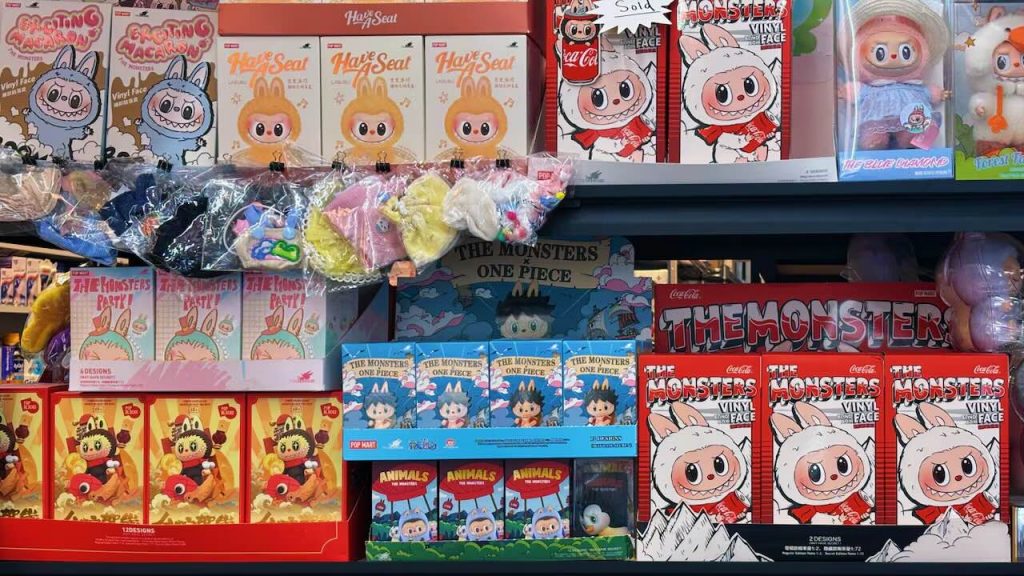
Generation Z’s voracious appetite for collecting — from blind-box toys and limited-edition sneakers to photocards and vintage comics — reflects more than nostalgic hobbyism; it’s a consumer behavior shaped by deliberate design and psychological levers. This paper explores why collecting has become a distinctive cultural practice for Gen Z by bringing together frameworks from behavioral economics (scarcity, loss aversion, and variable rewards), Gestalt principles of perception (figure/ground, closure, and grouping), and multisensory design (tactile, visual, and auditory cues that heighten perceived value). Contemporary product and experience designers intentionally craft emotional and sensory decision pathways — using affordances, depth cues, and surprise mechanics — that turn ordinary purchases into identity-weighted rituals and status signals. Drawing on class readings and additional scholarly and industry sources, this exploratory study will map how these design strategies interact to create compulsive, community-oriented collecting practices among Gen Z.
At its core, the act of collecting taps into fundamental psychological drives that shape how consumers interact with objects, structure, and identity. Recent research in the Journal of Consumer Research shows that one of the most powerful motivations for collecting is a desire for control, as individuals seek structure and order in their possessions by building coherent sets of related items; the closer a collection is to completion, the stronger the motivational pull toward acquiring additional pieces becomes, because completing the set reinforces a sense of mastery over one’s environment and goals (Cao et al., 2025). The article also identifies multiple psychological drivers of collecting behavior: some individuals collect for identity expression, using items to signal personal history or group belonging, while others derive joy, nostalgia, or pleasure from the pursuit itself. These motives underscore that collecting is more than mere acquisition — it involves emotional reinforcement, cognitive fulfillment, and social meaning, making the act of acquiring and organizing objects deeply intertwined with human psychology.
Entire set of POPMART’s Hirono Shelter Series
Getting into behavioral economics, these concepts further amplify these psychological tendencies by shaping the conditions under which Gen Z encounters collectible products. Many contemporary collectibles — from blind boxes to limited sneaker drops — are engineered around scarcity, variable-reward schedules, and anticipatory dopamine cycles, all of which nudge consumers toward repeated purchases. Scarcity operates as a powerful cognitive bias: when an item is framed as rare or part of a finite series, its perceived value increases, and the urgency to act outweighs rational decision-making. Variable rewards, commonly seen in game design and gambling, appear in blind-box culture, where the uncertainty of which item is inside triggers a reward-prediction loop that encourages “just one more” purchase. Loss aversion also plays a role, as consumers fear missing out on a drop or failing to complete a set — a design tactic that pushes them toward quicker, less deliberative choices. As Bridgeable’s design principles highlight, these behavioral levers aren’t accidental; they are strategically embedded in product ecosystems to guide emotional and impulsive decision-making (Bridgeable). In the context of Gen Z, a generation already accustomed to algorithmic personalization and micro-rewards in digital spaces, these mechanisms create a seamless bridge between psychological desire and economic behavior, transforming collecting into a sustained, self-reinforcing cycle.
Intense line for sneaker release!
Another reason behavioral-economic strategies are so effective on Gen Z is that they align with the generation’s broader relationship to uncertainty, reward, and digital culture. Growing up in an environment shaped by algorithmic feeds, micro-trends, and constant content refresh cycles, Gen Z is already conditioned to respond to intermittent reinforcement, a core principle in behavioral economics that increases the likelihood of repeated engagement. Collecting systems — whether in apps like Pokémon Go, K-pop photocard trading, or limited-run fashion drops — mirror the same mechanics: rewards arrive unpredictably, and the “near miss” feeling of almost completing a set keeps users invested. Social proof, another behavioral-economic principle, magnifies this effect. When influencers, friends, or online communities display sought-after items, the perceived value of these objects rises, and individuals become more willing to take economic risks to avoid the social cost of being “left out.” The combined force of digital visibility, reward uncertainty, and community comparison means that the decision to collect is rarely an individual choice; it is a behavior reinforced by everyone around them that was designed to maximize engagement. As a result, Gen Z’s collecting habits cannot be fully understood without acknowledging how behavioral-economic design intersects with their digital upbringing and value systems.
Surprised reactions to blind box openings on social media.
Gestalt principles also play a crucial role in shaping the appeal of collectible items, particularly in how brands design visual systems that emphasize unity, pattern, and completion. In foundational Gestalt theory, the human perceptual system instinctively organizes visual information into meaningful wholes rather than isolated parts — a process driven by principles such as similarity, proximity, and closure. When collectible series use consistent color schemes, repeated character forms, and numbered sequences, they leverage similarity to signal that each piece belongs to a unified whole, making incomplete sets feel visually and emotionally disjointed rather than discrete (Canva Learn). Clusters of items displayed together exploit proximity, leading viewers to perceive grouped objects as belonging together, while closure—our tendency to mentally “fill in missing pieces”—creates internal pressure to complete an unfinished collection (thoughtbot). Even affordances like stackable packaging or interlocking shapes communicate how items relate to one another, further reinforcing the perceptual pull toward collection completion. By tapping into these innate visual tendencies, brands craft collectible ecosystems that feel naturally compelling, making the desire to “finish the set” as much a perceptual instinct as an economic choice.
POPMART “Exciting Macaron” Labubu series, one of their most popular sets!
Beyond basic grouping laws like similarity and proximity, Gestalt theory has a rich empirical foundation showing how perceptual organization deeply influences how consumers interpret and emotionally respond to visual forms. A study looking into Gestalt psychology demonstrates that the human visual system automatically organizes elements into coherent wholes, meaning that figure-ground relationships, continuity, and Prägnanz (simplicity and good form) shape not only what we see but how we interpret object sets as unified and meaningful. These perceptual processes operate rapidly and unconsciously, with grouped items capturing attention more effectively and enhancing memory for those visual patterns (Wagemans et al., 2012). Research from Cambridge University shows that Gestalt principles can predict aesthetic preferences for product form — for example, symmetry, parallelism, and continuity each contribute to how consumers judge the harmony and attractiveness of objects in three-dimensional space (Valencia-Romero et al., 2017). These findings go to show that the very structure of collectible sets — from how items are visually related to one another to how they are presented in space — can enhance their appeal and the psychological satisfaction consumers get from assembling them.
While Gestalt principles explain how visual organization drives the desire to complete collections, multisensory design expands this influence beyond sight, engaging the body and emotions more fully in the collecting experience. Collectibles are rarely experienced as purely visual objects; instead, they are designed to be touched, opened, displayed, and even heard. Research on multisensory design emphasizes that engaging multiple senses simultaneously enhances emotional attachment and perceived value, as sensory cues work together to create richer, more memorable experiences. Texture-heavy packaging, the resistance of sealed blind boxes, the sound of foil wrappers, and the weight of a sneaker box all contribute to anticipation and reward, transforming acquisition into a ritual rather than a transaction. These sensory layers reinforce behavioral-economic mechanisms like anticipation and reward prediction, while also strengthening emotional bonds between consumers and objects. For Gen Z, a generation that values experience as much as ownership, multisensory design helps explain why collecting feels immersive and meaningful — not simply because of what the item is, but because of how it is felt, handled, and experienced in the moment of acquisition.
Blind boxes found in a store. Shows the packaging of blind boxes.
Multisensory design heightens the appeal of collectible culture by engaging consumers beyond visual perception, transforming acquisition into an embodied and emotionally charged experience. While speaking about a TED Talk by Jinsop Lee, Akna Marquez explains how “many of life’s greatest pleasures (like eating and sex) are enjoyed deeply because of the presence of multiple senses interacting at the same time,” and that effective design intentionally activates multiple sensory channels to create stronger emotional responses (Marquez, 2025). This principle is especially evident in collectible products, where texture, weight, sound, and even resistance play key roles in shaping anticipation and reward. Similarly, research by creating agency Astriata emphasizes that “Beyond engaging solely through visual elements, we can also stimulate the auditory, olfactory, gustatory, and tactile senses to evoke emotion and improve the user experience,” (Astriata, 2024). For Gen Z collectors, the crinkle of packaging, the smooth finish of a photocard, or the ritualistic act of opening a blind box are not incidental details but central components of value creation. These sensory cues heighten emotional investment at the moment of purchase, reinforcing behavioral-economic mechanisms like anticipation and perceived reward while turning collecting into a ritualized experience. In this way, multisensory design bridges perception and emotion, ensuring that collectibles are not only seen as desirable objects but felt as meaningful experiences.
To get specific, Pop Mart’s rise from niche art-toy maker to a global collectible powerhouse illustrates how multisensory design — combined with psychological and cultural strategies — can turn otherwise “useless” objects into deeply engaging experiences. Central to Pop Mart’s appeal is the blind-box format, where customers don’t know which figure is inside until after they open it, turning the act of unboxing into a moment of suspense, tactile engagement, and emotional payoff that drives repeat behavior and social sharing. The brand’s founder captured this feeling, even saying that “if we make dolls useful, our sales are bound to decline…If the dolls have practical attributes, the next time you feel the desire to buy something, you won’t be so impulsive; instead, you’ll think about whether you already have one at home,” suggesting that the emotional and experiential qualities of the unboxing moment are the real product (D, 2025). This aligns with research showing that blind-box products create “special shopping experiences” that appeal particularly to young consumers through uncertainty, surprise, and emotional gratification, key components of multisensory engagement (Lin, 2023). Pop Mart’s use of vibrant character IPs, tactile packaging, and virality around unboxing turns a simple purchase into a multi-sensory event — one that is seen, touched, and performed publicly on platforms like TikTok and Instagram, where unboxing content acts as user-generated marketing (Jeyaretnam, 2025). The result is a consumer experience that feels playful, personal, and socially rewarding — a powerful combination that has helped Pop Mart transform blind boxes into emotional artifacts of Gen Z culture.
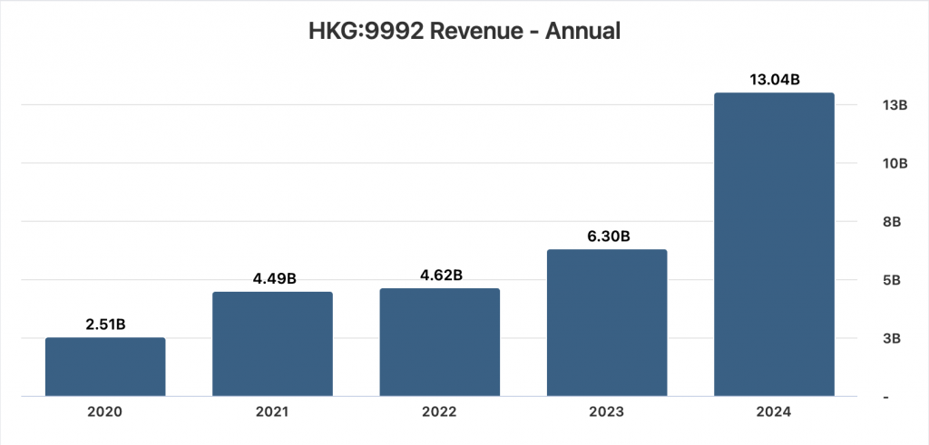
POPMART’s Revenue Annual Chart, StockAnalysis.com
Like Pop Mart’s blind-box collectibles, Pokémon cards rely heavily on multisensory and emotional design to sustain long-term engagement, though they operate through a different material and cultural logic. Pokémon cards, around much longer than Labubus, activate sensory experience through the ritual of pack opening: the tactile resistance of foil wrappers, the distinct smell of freshly opened cards, and the practiced hand motions used to reveal rare cards in a specific order all heighten anticipation and emotional payoff. This sensory choreography transforms each pack into a suspenseful moment, mirroring Pop Mart’s emphasis on surprise while grounding it in nostalgia and familiarity. Emotionally, Pokémon cards differ in that they connect present-day collecting to childhood memory, allowing Gen Z collectors to re-engage with a franchise they encountered early in life while reframing it as an adult hobby, investment, or social performance. Visual design further reinforces this attachment: holographic finishes, rarity symbols, and evolving card aesthetics signal value instantly, guiding emotional response before rational evaluation occurs. While Pop Mart leans into novelty and character IP discovery, Pokémon cards thrive on emotional continuity, blending surprise with nostalgia and long-term brand trust. Together, these phenomena show that successful collectible ecosystems do not rely on randomness alone, but on carefully designed sensory rituals that transform opening, revealing, and owning into emotionally resonant experiences.
Rare collection of Pokémon cards.
While multisensory design explains how collectibles feel, affordances and interaction design explain how collectors intuitively know what to do with these objects — how to open them, handle them, trade them, and display them. Affordances refer to the perceived actions an object suggests to a user, shaping behavior without the need for explicit instruction. As the Interaction Design Foundation explains, affordances signal the possible actions users can take with an object based on its appearance, meaning that design subtly guides interaction before conscious thought occurs (Interaction Design Foundation). In collectible culture, affordances are deliberately embedded into packaging and product form: tear tabs invite slow reveals, resealable sleeves encourage preservation, and rigid boxes signal value and permanence. Pokémon card packs, for example, afford careful opening and sorting, while Pop Mart boxes afford shaking, stacking, and display. These interaction cues transform collectibles into objects meant to be handled repeatedly rather than consumed once, reinforcing emotional attachment and prolonged engagement. By designing for intuitive interaction, brands reduce friction while increasing ritual, ensuring that collectors not only desire the item but understand how to engage with it in socially and culturally meaningful ways.
Websites offer cases for Labubu dolls, after trends surged on social media.
Affordances intersect powerfully with Gestalt principles and visual depth cues to shape how collectors perceive and interact with objects in ways that feel intuitive and meaningful. In design theory, an affordance is understood as a signal that suggests how an object may be used — “a perceived signal or clue that an object may be used to perform a particular action,” whether physical or digital, and it relies on perceptual cues to communicate possibilities to the user (Postolovski, 2014). These perceived action cues are effective when they align with familiar visual organization rules: depth cues like shadows, perspective, and layering create a sense of hierarchy and prominence that helps users see which parts of a product or interface are interactive or important. Depth cues are especially relevant in physical packaging and digital displays alike, where contrast, shading, and perspective build a sense of form that attracts attention and suggests how to engage with an object. At the same time, Gestalt principles — such as proximity and similarity — organize elements into visually meaningful groups, so that related affordances appear unified and easy to understand without conscious thought. For example, affording a pull or push action through design features like raised edges or overlapping layers is more effective when those cues are grouped and visually ordered, reducing cognitive load and creating a seamless interaction experience. Together, affordances, Gestalt organization, and depth cues create a perceptual ecosystem where how an object looks and where it appears in space both guide collectors toward intended sensory and emotional engagements, making collectible interactions feel intuitive, satisfying, and instinctive.
Altogether, behavioral economics, Gestalt perception, multisensory design, and affordances reveal that Gen Z’s collecting habits are less about ownership and more about emotional meaning-making and social positioning. Behavioral economics explains why scarcity, uncertainty, and loss aversion motivate repeated purchases, while Gestalt theory explains how visual systems frame collections as incomplete wholes that demand closure. Multisensory design deepens this pull by turning acquisition into ritual, engaging touch, sound, and anticipation in ways that strengthen memory and emotional attachment. Finally, affordances guide interaction intuitively, teaching collectors how to open, handle, preserve, and display items without explicit instruction. Together, these frameworks show that collecting is not a passive response to trends, but an active, embodied experience shaped by design decisions that prioritize feeling over function. For Gen Z, whose consumption habits are deeply intertwined with digital culture and identity performance, collectibles become tools for self-expression — objects that communicate taste, belonging, and emotional resonance rather than practical utility.
Neat collection of collectibles.
Importantly, these design strategies never act alone. Instead, they are amplified by platforms where visibility, community, and performance matter. As explored in discussions of multisensory experience and interaction design, emotionally resonant objects gain value when they are shared, displayed, and validated by others. A newer synthesis in UX and emotional design research argues that products succeed when they support more meaningful experiences that align with users’ values and identities rather than purely functional outcomes — a framework that maps closely onto Gen Z’s relationship with collectibles (Interaction Design Foundation). Collecting, then, becomes a social language: Pop Mart figures on a shelf, Pokémon cards in protective sleeves, or photocards arranged in binders all signal care, intention, and cultural literacy. By designing for perception, sensation, and interaction simultaneously, brands transform collectibles into emotional artifacts — objects that feel personal, communal, and worth protecting. Ultimately, Gen Z’s obsession with collecting is not irrational; it is the logical outcome of design systems that skillfully align psychology, perception, and emotion with the social desire to belong and be seen.
This paper has explored Gen Z’s obsession with collecting not as a fleeting trend, but as a carefully constructed interaction between psychology, design, and emotion. Through the lenses of behavioral economics, Gestalt perception, multisensory design, and affordances, collecting emerges as an experience engineered to feel intuitive, rewarding, and socially meaningful. Scarcity and uncertainty activate emotional decision-making; Gestalt principles frame collections as incomplete wholes that invite completion; multisensory cues transform purchasing into ritual; and affordances guide interaction in ways that feel natural rather than imposed. Together, these strategies reveal that contemporary collectibles are not valued for utility, but for the emotional, sensory, and social narratives they enable. For Gen Z, collecting becomes a way to externalize identity, participate in community, and create moments of control and pleasure within an otherwise unstable economic and digital landscape.
Ultimately, the success of collectible culture underscores a broader shift in design priorities: from function to feeling, from ownership to experience, and from products to stories. As Ellen Lupton says in Design Is Storytelling, “design embodies values and illustrates ideas. It delights, surprises, and urges us to action,” (Lupton, 2017). Collectibles exemplify this shift perfectly — each blind box, card pack, or display shelf tells a story shaped by anticipation, discovery, and belonging. Understanding Gen Z’s collecting practices, then, is not simply about consumer behavior; it is about recognizing how design leverages perception, sensation, and emotion to create meaning in a culture where experience is often more valuable than possession.
Cao, C. C., Brucks, M., & Reimann, M. (2025). Seeking Structure in Collections: Desire for Control Motivates Engagement in Collecting. Journal of Consumer Research, 52(3), 480–501. https://doi.org/10.1093/jcr/ucae071
Lin, Z. (2023). Exploring Pop Mart Marketing Mechanics and Related Effects. Highlights in Business, Economics and Management, 7, 415-420. https://doi.org/10.54097/hbem.v7i.7004
Wagemans, J., Elder, J. H., Kubovy, M., Palmer, S. E., Peterson, M. A., Singh, M., & von der Heydt, R. (2012). A century of Gestalt psychology in visual perception: I. Perceptual grouping and figure-ground organization. Psychological bulletin, 138(6), 1172–1217. https://doi.org/10.1037/a0029333
Assigned a final project, I now get to create my own mini documentary about any topic of my choosing. With so much to choose from, I wanted to do some final research before narrowing down some topic ideas.
The Bare Bones Camera Course for Film and Video by Tom Schroeppel
Chapter Seven: Lighting
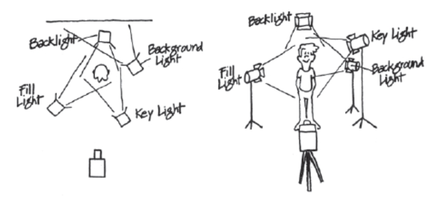
In this chapter, Schroeppel gives readers the best tips on shooting at the right times and getting the right lighting system for your shot. The four-point lighting system (key light, fill light, backlight, background light) is crucial for getting the right lighting for your subject, and was very helpful for a beginner director like myself.
Small excerpt from The Bare Bones Camera Course for Film and Video by Tom Schroeppel, shows efficient four-point lighting system.
I definitely plan on using this system for this project and all future projects, and other advice Schroeppel gave, such as:
Reflectors and fill lights can brighten up shadows cast by backlight and sidelight.
Focusing quartz, broads, and softlights can all help in fixing interior lighting.
Keeping the light high and subjects away from walls can avoid unnatural-looking shadows on walls.
Film shows more shadow detail than video. (WHAT?!)
Chapter Nine: Doing It
This chapter really gives me the confidence to go out and commit to future projects. Schroeppel motivates his readers by guiding them through
By going through each step of the production process such as planning a shoot, creating storyboards, and even working in uncontrolled situations, Schroeppel really sets his readers off with everything they should know! I really liked his point of working in uncontrolled situations when things don’t go according to plan, as he mentions how you can still get great shots by hustling even more to get them, and these situations can actually be even more fun knowing you have working footage. As a person who stresses themselves out easily, this advice definitely calms my nerves for this project, and makes me excited for production!
After researching, here are some examples I found of video storytelling I’ve seen recently:
Up (2009) – “Married Life” Opening Scene
When talking about storytelling, this scene always comes to my mind. With no narration or dialogue at all, this scene takes viewers through the couple’s entire married life, all the way to the end. Through ambient sounds and the fun music turning sad as the scenes go along, viewers can feel so many emotions throughout just this opening scene. One of my favorite storytelling scenes, this scene was incredibly well produced, as it tells a story of a couple’s entire marriage in just a five minute clip.
Piece By Piece Movie Clip – I Loved Music (2024)
This entire movie was incredibly well produced and took a new turn on biopics, as the entire movie showcased Pharell William’s life in Lego. Even interviewed guests, such as Pusha T, Snoop Dogg, and Kendrick Lamar were all Lego pieces telling his story. This scene in particular was when Pharrell Williams talked about his synesthesia, and how he can see colors through his mind’s eye. I love how visual and colorful they ended up making the scene, by letting the song fade in and take over his room. This really shows how music took over in this moment, and they took the time to show viewers how synesthesia may look in a Lego world. Overall, this movie is incredible to watch (highly recommend!) and this scene captures one important part of his life in an amazing way.
I didn’t really want to include a scene from this show because of how vulgar some language and scenes were, but “The Idol” written by Abel Tesfaye (The Weeknd), Sam Levinson, and Reza Fahim became a flop in 2023 after its release. Viewers complained of the show being too explicit, but also had confusing writing and awkwardness surrounding the acting. The show attempted to combine pop-star fantasy with a dark psychological descent, but its storytelling ultimately ruined everything. The characters were pretty inconsistent throughout and the show lacked a clear narrative arc with scenes often jumping around one another. Many viewers also noted how many of the more provocative scenes were made just to add in more provocative scenes, not to serve the show’s purpose at all. For a project with huge hype among Gen Z, “The Idol” became a prime example of how writing without structure leads to a storytelling failure.
Creating My Own Documentary: Pre-Production
In creating my own documentary, I already had some ideas in mind. I’ve always wanted to create a ‘mockumentary’, similar to the style of the hit show The Office. In doing so, I am attempting to create a mockumentary of my cat, and his daily activities. Since all he does is sleep, I thought adding my own narration and interview would spice up the video. All in all, I am planning to utilize everything I’ve used in this semester to create this documentary, and make it engaging for viewers.
View my planning document here (and please note, details may change!!).
This week, I will be going over everything I learned involving continuity editing, defined by Adobe as using “a variety of classic film editing techniques to blend multiple camera shots — some taken at different times or even different locations — into a seamless, consistent narrative” (What is continuity editing in film?).
In an effort to learn more, I read chapters three and four of Tom Schroeppel’s The Bare Bones Camera Course for Film and Video, learning about both basic sequence and screen directing when shooting.
The Bare Bones Camera Course for Film and Video
Chapter Three: Basic Sequence
This chapter really breaks down the “basic sequence” — that familiar progression from a wide shot to a medium to a close-up. It’s so common you barely notice it, but once Schroeppel lays it out, you realize how much deliberate planning sits behind something that feels so effortless. The wide shot grounds the viewer in the space, the medium pulls you closer into the action, and the close-up zeroes in on the emotional or informational details that matter most. Schroeppel makes it clear that good sequencing isn’t about shooting pretty angles—it’s about building a logical visual flow. That’s why matching action from shot to shot is such a big deal. When movement carries cleanly across cuts, the story feels like it’s unfolding in real time, even if you’re jumping between lenses and camera positions. After reading this chapter, I may never watch some of my favorite films the same!!
Chapter Four: Screen Directing
This chapter digs into screen direction—one of those concepts that seems invisible until someone finally points it out. Schroeppel breaks down how consistent left-to-right or right-to-left movement anchors the viewer’s sense of where characters are in relation to each other, which I thought was really interesting. When someone walks across the frame or turns their head, they need to maintain the same directional flow in the next shot; otherwise, the audience feels an instant, almost subconscious jolt of confusion. That’s where the 180-degree rule comes in. By staying on one side of the imaginary line between subjects, filmmakers preserve eyelines, geography, and the sense that everyone is actually occupying the same space. Even a small, accidental shift can make a character look like they’re suddenly facing the wrong way, which is why this rule is such a staple in both filming and editing.
But the chapter also makes it clear that screen direction isn’t just about avoiding mistakes—it’s a tool that can be bent or broken for effect. Filmmakers can intentionally cross the line to signal a shift in energy or perspective, as long as the audience is guided through the transition with a neutral shot, a motivated camera move, or a cutaway that resets spatial logic. Great examples of this show up in tense scenes where directionality shapes mood: medium shots ground us in the physical layout of a cramped space, while careful cutaways and sound design hint at action just outside the frame. Nothing feels decorative; every shot is chosen to control attention, guide emotion, and maintain clarity. By the end of the chapter, it becomes obvious that screen direction isn’t just a technical rule—it’s a subtle, powerful way to make movement readable and storytelling intentional.
Here are some examples of smoother continuity editing seen throughout projects:
The Hunger Games: Catching Fire – Katniss Training Scene
In general, Catching Fire uses smooth continuity when showing Katniss moving through the Training Center. In this scene, the editors match her movement across angles so each cut feels like a natural continuation of her actions. Wides establish the space, mediums highlight strategy or tension, and close-ups capture emotional beats. It’s a clean example of how continuity keeps large environments understandable. Keeping close to Katniss in this scene, we can feel how intimidating or important this drill must be, while also seeing her perfect accuracy with her bow from farther shots.
Stranger Things: Season Four, Episode Four – Max’s Song Scene
This scene cuts between wide shots of Max in the Upside Down, close-ups of her terrified expressions, and medium shots following her as she runs. Even though the angles shift constantly, the motion stays smooth and aligned with the music. That continuity keeps the tension rising without confusing the viewer, and it shapes a clear emotional narrative — Max fighting for her life, her friends fighting for her, and the desperate countdown created by the beat of the song.
Crazy Rich Asians – Wedding Scene
This beautiful, emotional wedding scene uses both wide and medium shots to establish the scale of the ceremony, then close-ups to highlight character reactions and the moment’s intimacy. Every cut aligns with the movement of the bride or the flow of the water down the aisle. Combined, everything is smooth, romantic, and visually coherent — perfect for showing continuity in a non-action context.
Editing My Own Tutorial
When creating my own tutorial using continuity editing, I wanted to make sure I had an engaging, fun idea. Since I’m into fashion, I thought a styling video would fit well! For this tutorial, after a cold day trip to New York I thought tying a scarf would be fun, since there’s so many ways to do so. Using two different angles, I was able to show my audience how to tie a scarf three different ways, all pretty simple. In the end, I really liked how this tutorial came out, and using multiple angles really helped in assisting my ideas!
Every year I have the chance to visit my grandparents in the beautiful island of Puerto Rico. Visiting every year, I have grown to become more and more comfortable here. While I often took these visits for granted in the past, I recently went and captured so many great memories.
These images reflect some of my favorite moments in Puerto Rico; with family, sightseeing, or just walking around, Puerto Rico is too beautiful of an island to not see!
Welcomed by the beautiful trees and forest of Yabucoa behind my grandparents’ house, this view never gets old. This image captures the lush, layered beauty of Puerto Rico’s eastern countryside. The landscape stretches out in vibrant greens—palm trees, thick tropical foliage, and rolling hills—showing just how alive and abundant the environment is. Soft sunlight warms the treetops, giving the scene a gentle glow and highlights the textures of the plants that define the region’s natural identity.
In the distance, a few homes and rooftops peek through the greenery, reminding of the quiet coexistence between daily life and the island’s overwhelming natural presence. Altogether, the image feels peaceful, grounded, and deeply connected to the place—reflecting both the beauty of Yabucoa and the personal significance of seeing it from my grandparents’ home.
Later identified (by AI of course) as a desert rose flower, this flower grows outside my grandparents’ house in their garden. This close-up photo of the flower captures a moment of quiet beauty rooted in place and memory. The flower’s vivid pink-and-white petals stand out sharply against the soft greens of the surrounding leaves, making it the natural focal point of the image. Its brightness and symmetry create a sense of vibrancy and resilience—qualities often associated with tropical plants that thrive under intense sun and shifting weather.
The elements of this flower and the blurred steps leading into the house create an intimate and nostalgic feeling; a small but meaningful detail from a place connected to heritage, comfort, and care.
This image, taken on a visit to Old San Juan, captures the very lively, layered character of Old San Juan, where the city’s colonial architecture and everyday street life blend with bursts of tropical color. In the foreground, five beautifully-colored parrots perched on a simple stand becomes the focal point, symbolizing the island’s lively natural spirit and the way local culture often spills out into public spaces. Behind them, a small gathering under a white tent of tourists waiting to take a picture with them adds a sense of casual community and movement. The older building, framed by tall palm trees and a muted gray sky, grounds the scene in Old San Juan’s historic past, creating a contrast between the permanence of its architecture and the immediacy of its street life. Altogether, the image reflects how the city seamlessly intertwines history, culture, and tropical vibrancy in a single moment.
This photo gently captures a moment of calm amid the rugged setting of an ATV adventure park in Luquillo. The ginger stray cat, curled comfortably on a bed of dry leaves and warm soil, seems entirely at peace despite the bustle such places usually host. Its relaxed posture and half-closed eyes suggest a creature that has learned to carve out pockets of tranquility wherever it can. The contrast between the rough ground, scattered foliage, and the soft fur of the cat adds texture to the scene, while the wooden wall and nearby plant create a sheltered, almost homelike corner. Altogether, the image highlights the quiet resilience of the island’s many stray animals—finding rest and comfort in unlikely places, and becoming small, tender reminders of life’s gentler moments.
This photo captures a lighthearted, in-the-moment snapshot that feels both playful and intimate. My nephew and I sit side-by-side in the back seat, each making an exaggerated, unsure expression that gives the image a candid charm. How close we are highlights our connection, with our faces mirroring each other’s mood in a funny, spontaneous way. Soft daylight filters through the car windows, illuminating our features and adding a natural warmth to the scene. Altogether, it’s a tender, goofy pause during a tiring day’s adventure—one of those small, shared moments that ends up becoming more memorable than the destination itself.
There is a relaxed and radiant feel in this nighttime photo at Distrito T-Mobile. The vibrant red halter dress stands out beautifully against the greenery and warm lights around me. The string lights wrapped around the palm tree and the softly lit outdoor seating area creates a cozy, lively atmosphere. This image has a a stylish, confident, and genuinely warm vibe, similar to how the memory felt in real time.
Ending with my grandparents’ view once again, this image captures a calm, summery moment the balcony surrounded by lush green trees and a bright sky. The white Inter Miami jersey and matching white bottoms gives the picture a sporty, clean aesthetic. Holding up the camera with a relaxed face, this image feels comfortable, stylish, and gives the feel of enjoying the peaceful nature around me.
Conclusion
Overall, creating this photoessay was a new and enjoyable experience. Looking through pictures from my recent trips, I kind of already knew which images I wanted to include and talk about. My goal for this project was to highlight the beauty of Puerto Rico, as well as taking a look at everything around you. While you may see it often, views like these are extremely beautiful and shouldn’t be taken for granted! I categorized my pictures through the order in which they were taken, and carefully analyzed them as if I saw them for the first time. Using Gestalt principles, rules of composition, and more, these images all somewhat followed a narrative arc, as they went in the order of my trip.
Proximity, simplicity, and other Gestalt principles were seen throughout these images. The image of my nephew and I show proximity and highlight our close relationship, while the image of the flower can show simplicity and proximity, as the plethora of flowers show how close they are to one another.
The idea of color theory is also shown throughout these images. For example, the images of the vibrant birds with a somewhat grayish highlight the placement of the island’s natural wildlife in such a public setting. Other images, such as me in my red dress or the vibrant flowers show brighter pops of color, and contrast from their duller backgrounds.
Rules of composition can also be applied to these images! The rule of thirds, explained in Tom Schroeppel’s The Bare Bones Camera Course for Film and Video places subjects on certain third lines to allow viewers’ eyes to roam around the image. I personally love this rule, and now use it for a lot of my pictures after learning about it. The last image shows me on the right, placed right on the guided line, and shows viewers more of my beautiful background and blue cloudy sky. A contrasting image, however, of the cat in the middle of the picture is an example of balance. Right in the center of the image, the image seems more comfortable and the colors go well with one another.
Beyond the technical aspects, this project also helped me connect more deeply with the emotional meaning behind my photos. Each image represents a small moment in time that felt ordinary when it happened, but looking back, I can see how meaningful those moments truly were. Whether it was spending time with my nephew, admiring local wildlife, or taking in the natural scenery from my grandparents’ house, these photos remind me of the importance of slowing down and appreciating experiences as they come. Photography allows us to freeze these moments so we can re-experience them, reflect on them, and share them with others long after they’ve passed.
Additionally, this project encouraged me to be more intentional with how I approach photography in the future. Instead of just taking pictures randomly, I now think more about the story behind each shot and how visual elements—such as color, framing, and composition—can shape the emotion or meaning of an image. Creating this photoessay made me realize that photographs are more than just images; they are narratives that combine technical skill with personal perspective. I’ve gained a greater appreciation for how the visual choices we make influence the viewer’s experience, and how even the simplest details can contribute to the overall message. This assignment didn’t just deepen my understanding of visual storytelling—it also strengthened my connection to Puerto Rico and the memories I made there.
To create a video montage, I first wanted to understand both pre and post-production to the best of my ability before starting the project. While my previous blog post covered all kinds of information regarding pre-production, this post will cover post-production: my challenges, the editing process, and my overall thoughts on creating this project.
The Bare Bones Camera Course for Film and Video
Chapter 10: After the Shoot – Editing
In this chapter, Tom Schroeppel discusses how editing should feel: fun! Besides giving readers advice such as pacing the video shots without distractions or making sure every shot is different, Schroeppel makes sure to let his audience know that this is their project. While it is important to keep track of the pacing, matching the music, checking the sounds, etc., it all really depends on how you want to relay your message to your audience. I took this point away from the chapter because of how different it can make a shot. There can be the same exact event in front of you, but no shot will ever be the same! Same with directing, every director can have a different vision for the same exact shot. It all depends on who is shooting it!
I wanted to show some examples of various editing styles:
Euphoria S2E1 – New Year’s Party
Euphoria S2E1 – New Year’s Party (2022)
Of course, when mentioning editing Euphoria should always come up. Sam Levinson, the director of the show, knew exactly how to capture emotion through both camera movements and editing. The slow motion zoom to the main characters with such a busy background show the intensity of their situation, with a fade to black when transitioning to each character. The music matching the transitions perfectly also ties into the intensity of the scene, and the slower pacing shows the characters’ thoughts vividly on their faces. All in all, Euphoria is one of my favorite shows to talk about when mentioning editing, because of how vivid and real the scene becomes with the right scenes, music, etc.
Attack on Titan S3E2 – Levi vs. Kenny Squad
Attack on Titan S3E2 – Levi vs. Kenny Squad
This scene, known to be on of the most iconic scenes in Attack on Titan and is admired for its animation, shows a more personal attack on Levi, the Survey Corps’ Special Operations Squad captain. His childhood mentor, Kenny, was hired to take out the team, including Levi. This betrayal and anger was shown perfectly throughout this scene, through super fast pacing as they swing around and faster transitions when a gun or ODM grappling hook fires. The SFX mixed with the fast-paced animation added to the intensity of the scene, and was able to show Levi’s nerves, something he usually doesn’t show. The added-in flashback of Levi (01:39 second mark) shows the audiences Levi’s thoughts, and adds in even more context to the intense scene. This scene, besides it’s insane animation, gives the audience a new perspective of the captain through the intense editing of this moment.
Tangled (2010) – “I See The Light”
Tangled (2010) – “I See The Light”
Now for a calmer scene, this scene captures a beautiful moment for Rapunzel as she finally sees the lanterns for the first time after such a long journey. There is medium pacing in this scene, around 3-5 seconds per shot, some even slower for emotional beats. The super smooth pacing and transitions heighten the romance between the couple, and the glow of the lanterns and their reflections in the water matches the scene perfectly. There are even dissolves and crossfades to move between Rapunzel and Flynn’s perspectives, then zooms back out to emphasize shared moments between the two. One of my favorite Disney movies, this scene shows a new perspective of both the characters, as they finally realize their feelings.
Editing My Own Montage
Now it’s my turn! In creating a montage, I wanted to capture a moment in my everyday life. With the falling leaves and autumn weather, this is the perfect time to capture my morning walk around my neighborhood. Already finished with my pre-production planning from my previous blog, I had everything I needed to begin production.
Now, it was time for me to get comfortable bringing a tripod around my neighborhood. On a mission to not get any houses or people in my video, I did my best with what I could capture. In the end, to avoid any misunderstandings, I created a montage of my backyard, a place that has captured many of my favorite childhood memories. Using various composition techniques and angles, I tried my best to capture the relaxing feeling of my backyard. With slower pacing and relaxing music, the montage gives a small glimpse into my backyard. Enjoy!
Brands today have unlocked new ways of engaging newer audiences and luring them into buying products that they’ve never seen before. How do they do it? Well, besides the power of social media, the power of behavioral economics has constantly been proven to persuade customers into buying newer products!
Behavioral economics studies how people actually behave — which is often messy, biased, and satisficing — rather than how they’d behave if perfectly rational. Designers translate those predictable biases into tools: defaults, framing, anchors, scarcity cues, and social proof are all ways to shape choice architecture so users make better (or at least more desirable) choices. In an article, Bridgeable collects practical BE “principles” for designers and show how anchoring, default settings, and loss aversion can be applied in real product flows and capturing newer consumers.
Gestalt Principles
Two psychological toolkits designers rely on heavily are Gestalt principles and affordances. Gestalt gives us laws of perceptual organization — proximity, similarity, figure–ground, etc. — that help users analyze visual information immediately. Let’s name a few!
Similarity: Do the elements look alike?! Same colors, font, size, texture?!!
Simplicity: Our minds perceive everything in it’s simplest form.
An example I’ve used before of simplicity: making everything easy-to-use and accessible for users! All elements are simple in design.
Proximity: We perceive elements as belonging to the same group if they are closer together.
The good use of Gestalt’s principles reduces cognitive load on consumers: group related controls, make the primary action pop, let the eye follow natural continuity. Canva’s summary on Gestalt offers great visual entry point for these ideas.
Affordances are the cues that tell a user how to interact with an object (a button that looks pressable, a slider that looks draggable). When affordances align with user expectations, decisions are frictionless; when they don’t align, users hesitate, make errors, or abandon tasks. The Interaction Design Foundation’s article explains why designing obvious affordances is crucial when designing.
Creating Emotional and Sensory Decisions
Behavioral economics also reminds designers that decisions are emotional and sensory, not just rational. Multi-sensory design (sound, motion, haptics, even smell in physical environments) creates stronger memories and shapes preferences. Digital designers are now bringing subtle sound cues, motion, and tactile feedback into interfaces to make experiences stickier — not as tricks, but as an extension of the brand’s personality and affordances.
“Every experience in design is multi-sensory, whether we want it or not.”
Behavioral economics gives designers the power to shape decisions, but the best designs aren’t about forcing behavior—they’re about guiding it. Thoughtful nudges, clear affordances, and perceptually intuitive layouts help users move through an experience effortlessly, leaving them feeling confident, informed, and in control.
Every click, scroll, or swipe is a tiny moment where design meets human psychology. By understanding how perception, emotion, and bias influence decisions, designers can craft experiences that feel natural and satisfying. The subtle science behind our choices isn’t just a tool, it’s a bridge between human behavior and genuine, meaningful design.
The Bare Bones Camera Course for Film and Video, Tom Schroeppel
Chapter One: Basics
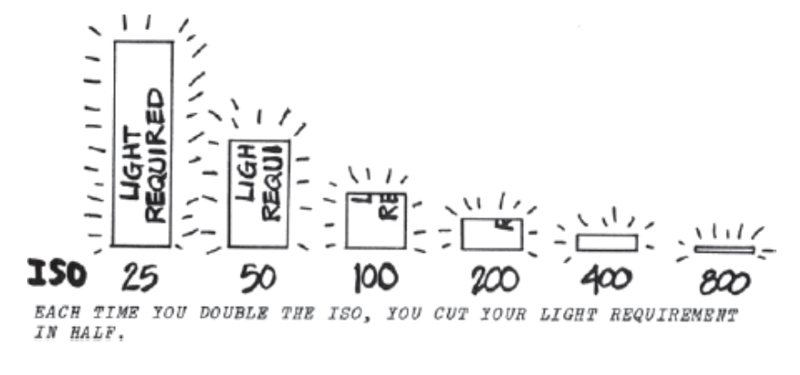
In the opening chapter, Schroeppel lays out the essential building blocks of filmmaking—exposure, lenses, and depth of field. He compares the camera to the human eye, showing how it can move beyond simple observation to become a tool for storytelling. I gained a clearer understanding through images and demonstrations of how aperture, shutter speed, and ISO work together to shape an image’s brightness, sharpness, and overall mood, while depth of field controls what draws the viewer’s attention within the frame.
Images from Tom Schroeppel’s “The Bare Bones Camera Course for Film and Video” Chapter 1; left image explaining ISO and right image explaining aperture.
Chapter Two: Composition
This chapter shifts from the more technical aspects of filming to the artistic decisions that define visual storytelling. Schroeppel explores the importance of composition—using the rule of thirds, balance, and leading lines to guide the viewer’s eye and convey meaning. I learned how choices in framing and camera angles can shape the audience’s perception and emotional response. Every shot becomes a conscious decision, whether in journalism or film, to express a narrative, create a metaphor, or evoke a specific mood—all without relying on dialogue or sound. I wanted to point out Schroeppel’s point of a shaky camera ruining the viewer’s ‘illusion’ of what should be a steady shot using a tripod. It is just so interesting how a camera can give almost any illusion; a shaky camera can give a sense of urgency, while a steady shot can be more calm. An unusual angle can highlight an unusual situation, while a regular angle shows the viewers exactly what is going on.
Chapter Five: Camera Movements
In this chapter, Schroeppel explains that camera movement builds on composition by adding rhythm and energy to the visual story, which I feel is similar to composition. Schroeppel explains that movements such as zooms, pans, tilts, and tracking shots aren’t just stylistic choices; they serve clear narrative purposes for a story. A simple MOTION can reveal important key details. I found it interesting, similarly to composition, how even subtle camera shifts can dramatically influence a scene—whether in a film, documentary, or any other production project. The way the camera moves ultimately determines how the viewer experiences the story.
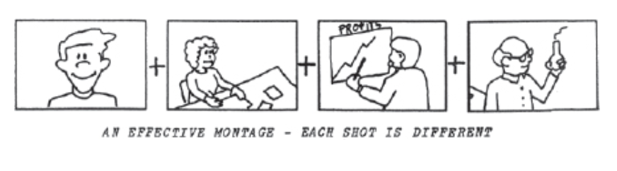
Chapter Six: Montages
Montages, usually used in TV commercials or documentaries, condense time and distance for viewers. A series of shots, depending on the content, can set a mood or summarize information, making montages an easier way to relay a message. Schroeppel made sure to note, however, that it is crucial to make each shot of a montage different. If not, it can look like a “bad cut between two similar shots of the same thing”. Schroeppel. recommends shooting a variety of different angles and image sizes to create a successful montage, and switch things up.
Image from Tom Schroeppel’s “The Bare Bones Camera Course for Film and Video” Chapter 6, Montages.
In this article by Jacob Trussel, we are given 15 things to do during video production. Different tasks include defining your goals, writing your script, creating storyboards, and much more. We are given step-by-step instructions in video production, and this checklist doesn’t miss a step. Things like selecting the type of video or creating a schedule aren’t things I would’ve thought of before, but now will as I get into production.
This article, written by Amanda Athuraliya, explains the concept of storyboards, and how beneficial they are to successful projects. Storyboards involve sketching out the scenes you plan on creating, kind of like a comic strip. This idea can help list out any ‘inconsistencies’ in your idea, and can help in avoiding shooting any unnecessary scenes. The four steps to creating a storyboard include planning your video, visualizing your script, adding a script and additional notes, and collaborating or revising with others. These steps help greatly in finalizing a story before actually shooting, and can help so much in production.
Miles Morales Jumps / A leap of Faith – 4K HDR – Spider-Man (2018), starts at 0:36
To show some examples of successful uses of visual composition techniques, I felt that this movie was a perfect example. Known as a movie that breaks the rules of animation, Spider-Man: Into the Spider-Verse also uses many unique techniques that make the movie special. In this scene, Miles is swinging around New York after taking a leap of faith. The camera leaves open space ahead of where Miles is swinging, giving him “lead room.” This creates a sense of motion and anticipation for viewers, and gives the illusion that the city is endless. Leading lines and rule of thirds are also used, as the city’s lines and angles draw the eye toward Miles while he is swinging and some angles show Miles on the third lines. All in all, this movie, one of my favorites, provides many different techniques to give viewers a unique look into Miles’ thoughts and show different perspectives throughout both movies.
Of course I had to use my favorite movie 🙂 This scene alone, from the beginning gives viewers context of the character’s location using rule of thirds. The scene starts with the peach tree and Oogway on the right third line, and uses the rule of thirds to help viewers see both characters in the frame. As for the location, the rule of thirds allows viewers to see how isolated and high this peach tree is, with the stars behind them. All in all, this rule, widely used by directors, can give viewers much more to look at than the center of the screen, and give newer perspectives on scenes depending on what you’re shooting.
Dune: Part Two – Riding the Sandworm- (HDR – 4K – 5.1), starts at 0:20
Both Dune and Dune: Part Two provide unique camera techniques for such a unique concept. This scene in particular from Dune: Part Two gives viewers a great perspective on depth. We are shown just how big the desert around them is, and also a perspective on the sandworm’s size. In such a big desert and a pretty far away angle, the sandworm is still pretty large on the screen, which is bigger than they expected. This also shows viewers how Paul overcame such a big obstacle, riding a sandworm and fulfilling his prophecy. Viewers in the comments of this video also talk about the intensity of this scene, feeling like they were riding the sandworm with him. This shows how depth gave viewers perspective on such an intense obstacle, and pulled them in even more.
To get used to the camera and some newly-learned techniques, I will be creating a project of my own. I will be creating a montage, with many clips of one location compiled into a one-minute video. For this project I wanted to create a montage of my morning neighborhood walk, as my neighborhood can be quite beautiful around this time of year. With the leaves falling, birds chirping, and decorated houses, I’m sure I can make a cozy autumn video. I personally love content like this, so I decided to make one of my own. Using my iPhone and tripod, I will film my next morning walk and compile the videos into one montage. Using new angles and composition rules can make the video much more engaging and give viewers new perspectives.
In an economy where consumers increasingly pay for experiences rather than just goods or services, design has quietly become one of the most powerful value creators. Designers, now, can be seen as architects of value, not just aesthetics.
Design creates value through emotional connection. Don Norman’s ideas of emotional design helps explain why: great experiences operate at three levels — visceral (instant sensory reaction), behavioral (usability and pleasure in use), and reflective (meaning and identity tied to the product). When a product scores on all three, it doesn’t just satisfy a need — it becomes memorable and preferred. This is why a designer item or a warm coffee shop visit can feel like an emotional purchase compared to a transactional one.
Design Tactics That Speak Emotion
Practical tactics designers use to evoke emotion include color, typography, and interaction choreography. Color is one of the fastest emotional shortcuts: marketers and designers use red for urgency or passion, blue for trust and calm, and green for growth and health. Thoughtful color systems can surely increase recognition and nudge choices at the point of sale or sign-up.
Typography matters too! Typeface choices carry personality: serifs can signal tradition and credibility, sans-serifs feel modern and clean, and script or display faces can feel playful or luxurious, or even romantic. Recent neuroscience and UX research shows that letter shapes and readability influence not only comprehension but also emotional response and trust — meaning typography can be a design tool for shaping how someone feels about a brand before they even read a word.
Some of the most successful brands use design to stage emotional experiences. Apple is a master of visceral delight — its minimal product design, clean typography, and gallery-like stores make every interaction feel intentional. The company also delivers behavioral satisfaction through intuitive interfaces and reflective value through brand identity; owning Apple products can signal creativity and design awareness for consumers.
Barnes & Noble takes a similar approach through sensory design with their cafes. The cafe’s lighting, music, and books all around work together to create comfort and familiarity, turning an ordinary coffee run into a ritualized experience for readers. Both brands demonstrate that emotion, not just function, can drive loyalty and premium pricing.
Using Design Tools to Map Emotion
Designers also use emotional models to be intentional. Tools like Plutchik’s Wheel of Emotions help teams map which emotions (joy, trust, surprise, anticipation) they want to trigger and then choose design elements accordingly — for example, using warm tones and rounded shapes to evoke comfort and trust, or contrast, motion, and surprise to evoke excitement. This moves design from “making things pretty” to a strategic role in experience engineering.
Plutchik’s Wheel of Emotions helps match primary emotions to corresponding colors. His theory has helped all kinds of designers when creating projects.
Finally, measurable ROI (return-on-investment) follows emotional connection. Experiences that evoke positive emotions drive retention, word-of-mouth, and willingness to pay. The practical takeaway for visual storytellers and product teams is simple: design every touchpoint (visuals, words, interactions, environment) with the emotional arc in mind — stage the visceral, deliver useful behavioral outcomes, and create reflective meaning that customers may want to bring into their identity.
Design in the experience economy should not be skipped — it is crucial! When designers combine evidence (color & type research), models (Norman’s three levels; Plutchik’s wheel), and brand staging (Apple, Starbucks), they do more than shape appearances: they create value that customers emotionally invest in — and gladly pay for.
In so many ways, designers can make any experience memorable through design. Such emotional responses by consumers will encourage them to come back, buy again, and refer the product to others. In my opinion, design can probably attract more consumers than the product itself. It is up to the designer to make the product stand out.
Every time I get into a new project, there is always something new to learn about the production process. Not every project is the same, and some may have to be done differently than others – which is okay!! I’ve done some research on recording and editing audio for my upcoming podcast, Let’s Have a Sleepover!
This blog post focused on how to get the right sound on a tighter budget. One of his tips that resonated with me was being careful when vocal editing. While this may apply more towards music, I think it is also important to remember for podcast editing as well. During post-production, to keep things more natural-sounding for the audience, it is important to keep editing to almost a minimum, besides the added music or sound effects. Depending on different tools to alter or change your voice can easily ruin a podcast if overused.
Another point that I wanted to highlight was the importance of taking several takes to get the right sound. Again, while this mostly applies to music, this is just as valid for podcasting. To get the more natural sound of your voice, several takes must be made to get you more comfortable for the mic.
In this article, Videomaker stresses the importance of audio in video productions. They even encourage readers to think of editing audio first for their next project, as it can “transform” their sound and elevate their projects. From recording extra B-roll footage to post-processing your audio, Videomaker offers many tips to elevate your audio in post-production. I believe the author’s main point to readers is the importance of audio in any production, as it sets the bar for the project’s quality. Bad audio means bad quality, and good audio means… well you get it.
I have a couple of examples of projects that I’ve enjoyed recently with exceptional audio and sound effects:
Via Li, a YouTuber that I watch frequently, has a channel exclusively for journal entries – to share things she has learned, share advice, and update supporters on her life. I enjoy this channel because of how relaxed it is, and how personal the video feels. The audio quality, though she is holding the microphone in her hand (which I’ve heard is a big no-no in audio), is great, and the added in sound effects add a lot of mood to her video. Sound effects, to me, portray a new side of hosts that you may not see in the rough cut of the podcast, when they’re just sitting in front of the microphone. I definitely want to edit my podcast a bit similar to hers, as I like her editing style for both audio and video.
First off, apologies for such a sad scene 😭 Being such a quiet movie with almost no dialogue, this scene does a perfect job at keeping the audience on their toes. I also liked how the audio went super muffled when focusing on the girl, as it shows she is deaf. Hearing the quiet footsteps and then the sound of the toy rocket shows the audience how such a small noise can be much louder in their difficult situation, and keeps the audience engaged yet sympathetic for such a sad situation.
This scene involves the music syncing up perfectly to Baby’s life. Walking listening to Harlem Shuffle by Bob & Earl, the city’s noises sync with the song in his headphones. I love how playful this scene is, and how the music itself is pretty funky. Syncing them allows viewers to think they’re inside the character’s head, which is a pretty unique way to do so!
Through these examples and research of getting the perfect audio, I wanted to try creating a podcast episode for myself.