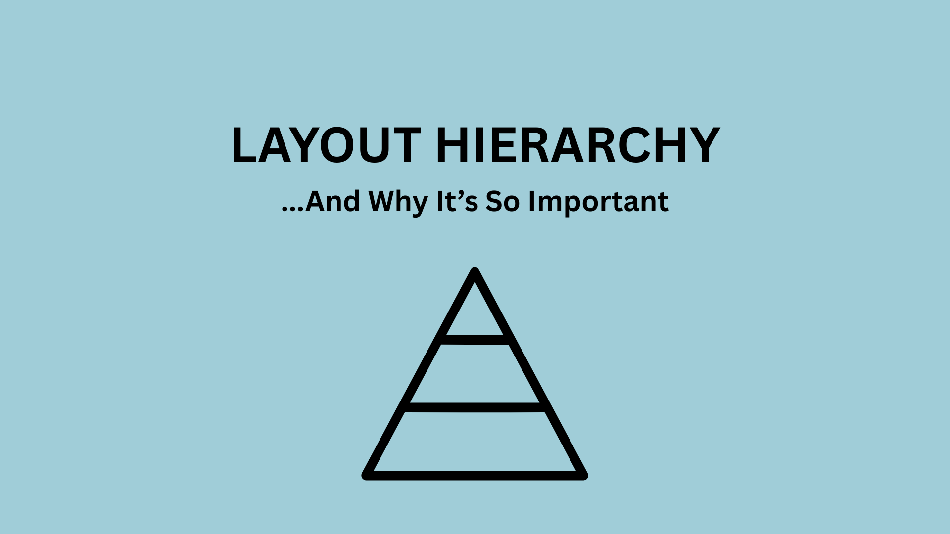
Have you ever glanced at a poster and instantly known where to look first? That’s not an accident – it’s the image’s layout hierarchy. In design, hierarchy refers to the arrangement of elements in a way that guides the viewer’s eye, making information easy to process and visually engaging. Whether you’re creating an event flyer, a movie poster, or a social media graphic, hierarchy is what transforms content clutter into clear information.
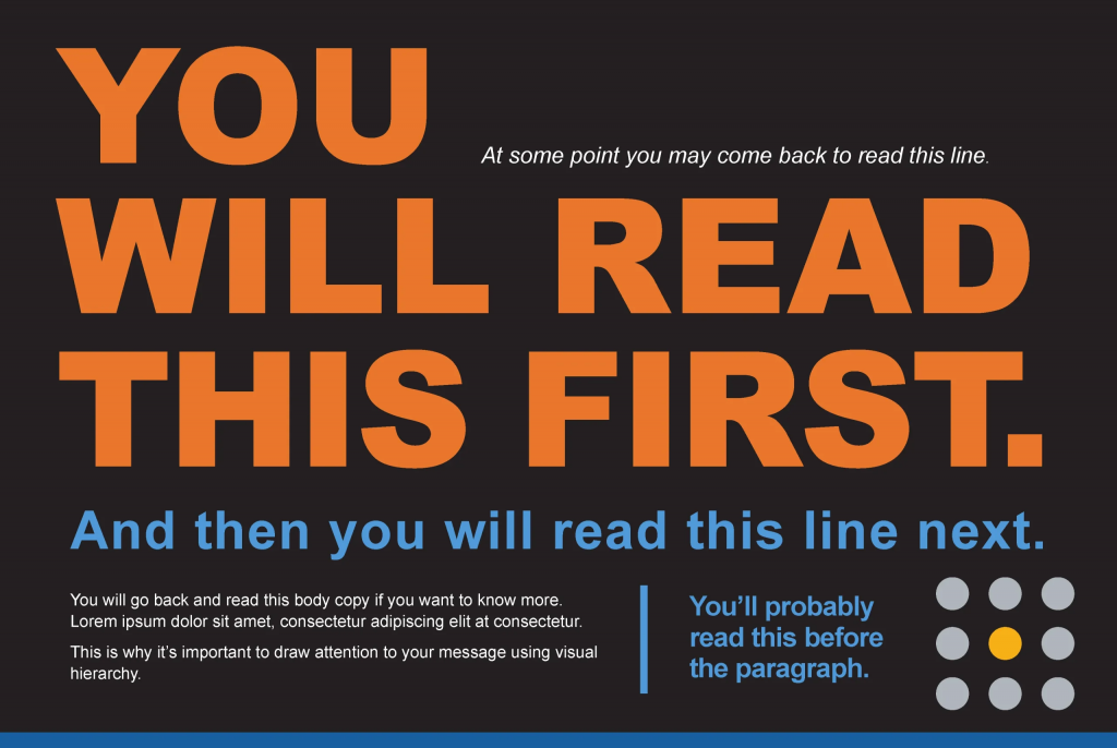
Typically, visual hierarchy answers one simple question: what matters most? Designers achieve this by manipulating size, color, contrast, spacing, and placement. Larger elements tend to grab attention first, followed by bold colors or high-contrast visuals. For example, in many event posters, the event title is the largest element, followed by the date and location, and finally supporting details. This structure ensures that viewers quickly understand the key message without feeling overwhelmed (Piktochart, 2026).
Here is an infographic I wanted to point out from FreeLogoServices, showcasing the path readers usually take when things like typography, logo, and size are manipulated.
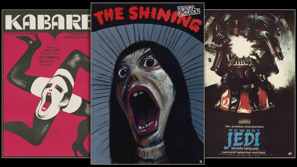
Movie posters are one of the best examples of hierarchy done right. They often prioritize a central image – usually the main character – paired with a bold title and minimal text. According to research, “the best movie poster designs balance a unique and innovative concept with some inherited elements of genre-specific design,” typically to guide the viewer’s attention step by step (TutsPlus, 2023). Without this structure, even the most visually stunning poster can feel confusing or forgettable.
Hierarchy isn’t just about aesthetics, it’s also about communication. Think about event promotion graphics. These designs need to convey information quickly because viewers often only glance at them for a few seconds. Successful event graphics emphasize the most important details first, such as the event name and date, before leading the viewer to secondary information like sponsors or additional descriptions (SharperNet). This layered approach ensures that even a quick glance delivers value to anyone reading.
Something I found interesting was that not all hierarchy follows the same rules. Some designs intentionally break traditional structure to stand out. Polish movie posters, for example, are known for their unconventional layouts and artistic interpretations. Rather than clearly presenting actors or scenes, they often rely on abstract imagery and experimental typography. While this approach may seem chaotic, it still uses hierarchy, just in a more expressive way. The focal point might be symbolic rather than literal, encouraging viewers to think more deeply about the message (Sabukaru, n.d.).
Digital platforms like Dribbble and GraphicRiver showcase how modern designers experiment with hierarchy in event promotion. Many designs use bold typography layered over images, vibrant color gradients, and asymmetrical layouts to create movement and interest. Despite these creative risks, the most effective designs still maintain a clear visual path. Your eye knows where to start and where to go next, even if you don’t understand visual layout.
Ultimately, hierarchy is what makes a design “sticky.” It captures attention, holds it, and delivers information efficiently. Without it, even the most creative ideas can fall flat. But with it, your designs can communicate clearly, look professional, and leave a lasting impression on your audiences.
Leave a Reply