When I first started thinking about brand identity, I’ll be honest – I thought it was mostly about logos. Colors, fonts, maybe a cool aesthetic if you’re lucky. But the more I’ve been learning, the more I’m realizing that brand identity is really about perception. It’s how people feel when they interact with something, not just how it looks.
One idea that stuck with me from Graphic Design Is for Everyone is that design isn’t just decoration – it’s communication. That completely changed how I look at branding. A logo isn’t just a symbol; it’s a shortcut to meaning. It tells you what a brand stands for before you even read a single word.
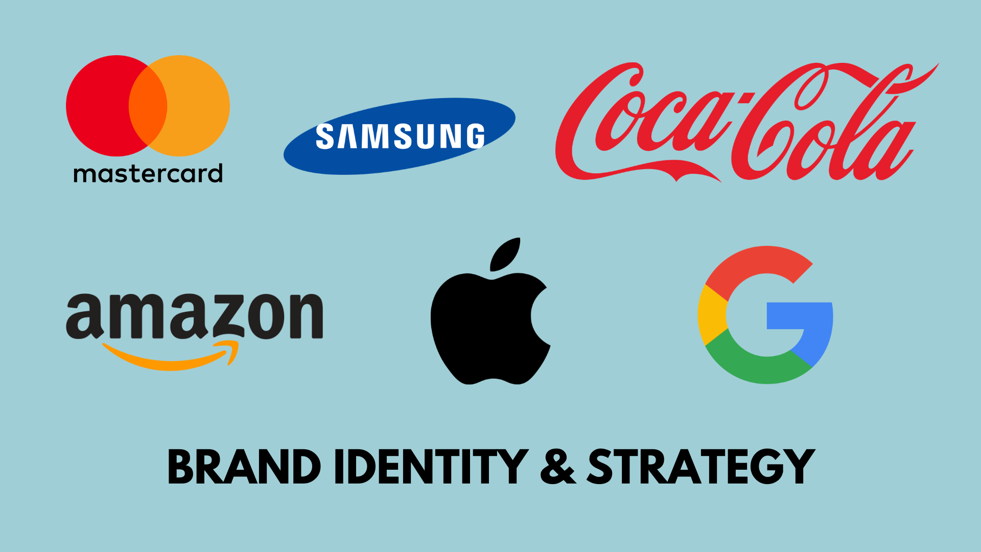
A really interesting example of this is the evolution of Mastercard. If you look at their older logos, they were much darker – text-heavy, outlined shapes, very “of their time.” But over the years, they simplified everything. Now it’s just two overlapping circles. No extra clutter. No explanation needed. And somehow, it feels more recognizable, not less.
That shift says a lot about modern branding. Simplicity isn’t boring – it’s strategic. It makes a brand more flexible, more digital-friendly, and honestly, more memorable. It also shows confidence. The Mastercard logo doesn’t need words – everyone already knows who it is.
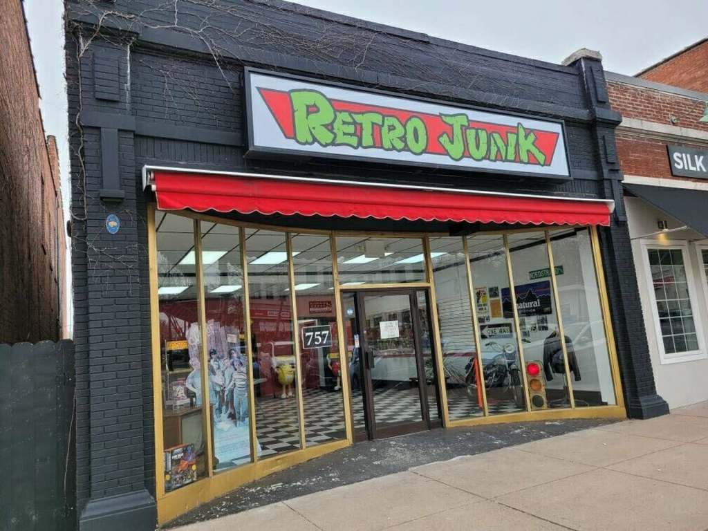
This idea of brand identity has been really relevant in my rebrand for Retro Junk, a local collectibles store near me. Originally, Retro Junk had more of a nostalgic, almost cluttered feel – which made sense for the “retro” vibe – but now I’m trying to balance that with something cleaner and more intentional. Something that still feels fun and gamer-inspired, but also current.
And that’s where brand strategy really comes in. It’s not just about making something look good, it’s about deciding which direction you want to go in. Who is this for? What do I want people to associate with this brand? What makes Retro Junk different from everything else out there?
For Retro Junk, I’ve been thinking a lot about audience. Instead of designing for “everyone,” I’m leaning into a Gen Z, gaming-adjacent audience – people who like thrift culture, nostalgia, but also modern internet aesthetics. That changes everything. It affects the tone, the visuals, even the potential name ideas I’ve been brainstorming.
I think that’s something people underestimate about branding: it’s deeply tied to identity, not just visually but conceptually. You’re not just designing a logo – you’re building a personality.
Another important factor I’ve been thinking about is consistency. A strong brand isn’t just one good design – it’s a system. Colors, typography, voice, imagery… everything working together. When brands like Mastercard simplify their identity, they’re not losing meaning – they’re making it easier to apply that meaning across everything, from apps to ads to physical cards.
As I keep working on my rebrand, I’m realizing that the hardest part isn’t designing – it’s deciding. Deciding what to keep, what to cut, and what actually matters. It’s super easy to add more, but much harder to refine these choices.
Overall, this week really shifted how I see branding, and brands in general. It’s not just a visual task—it’s an entire thinking process. A strategy. And honestly, it makes me more excited about what I’m creating, because now it feels less like I’m just “making something look cool” and more like I’m building something with purpose.
Leave a Reply