No one usually thinks to dive deep into popular apps’ ratings and reviews on the app store. So that’s exactly what I did 🙂
Digging into these reviews, I realized how much this user feedback can actually teach us about defining design problems. This project walked me through that process, from collecting raw comments to writing meaningful POV statements that could inspire real design solutions. Looking at positive, negative, and suggestive comments can all benefit your project!
Step One: Listening to the Users
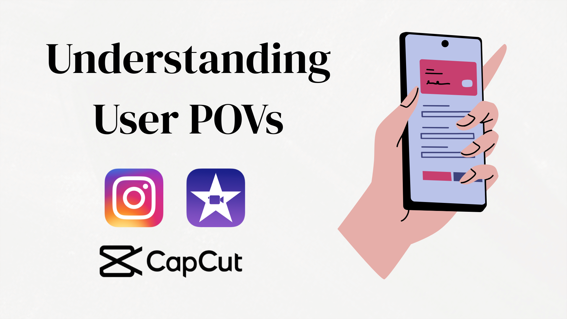
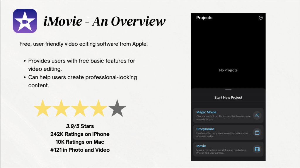
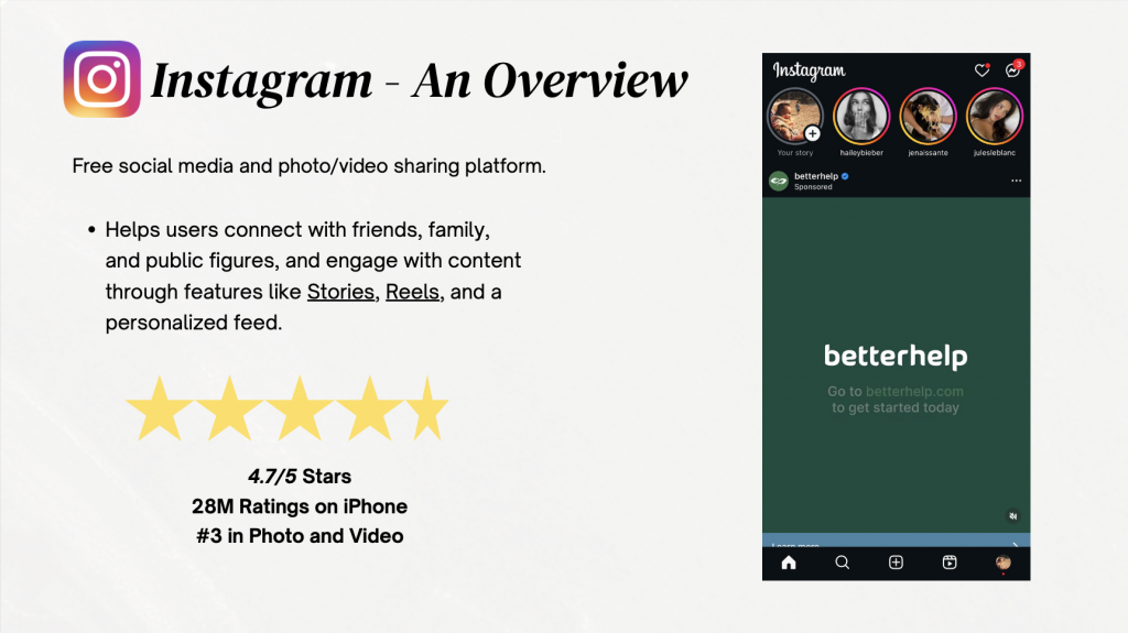
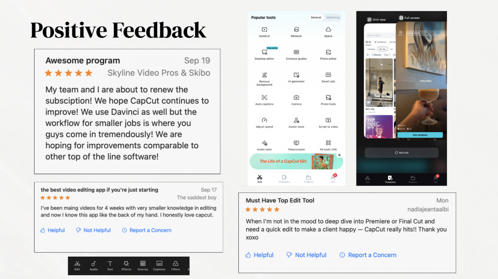
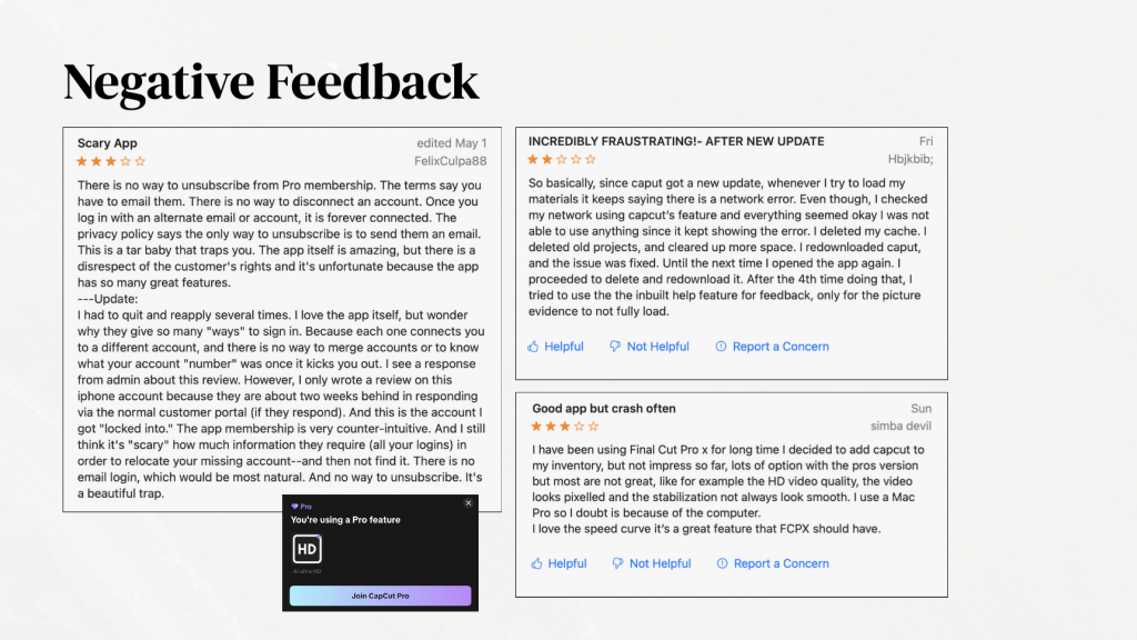
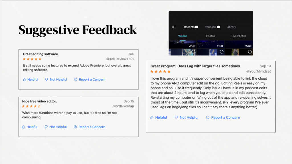
I chose three apps (CapCut, iMovie, and Instagram), and gathered three positive, three negative, and three suggestive comments for each. These apps are all pretty popular for beginner editors (such as myself), and I have used all three of these apps in the past. All of these apps are also categorized under Photo & Video in the App Store. The mix was important because, as the Prototypr article reminds us, defining a problem means balancing what’s working with what isn’t — otherwise you risk designing for just one side of the story. One quote that stuck with me from that reading was:
“To avoid wasted effort, define the problem, then the goal, then the solution.” That idea helped me slow down and not jump right into “fixing.”
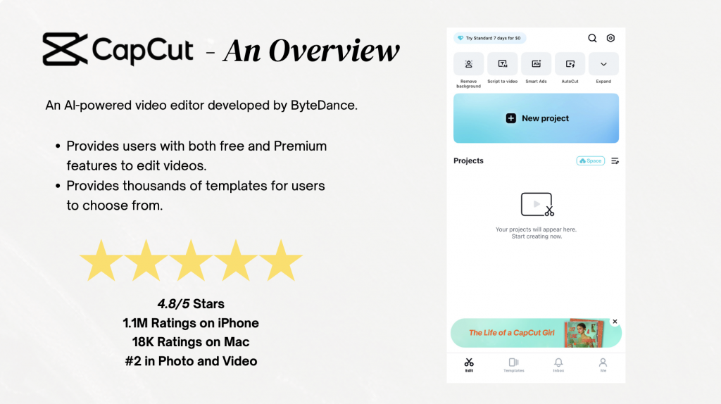
What stood out right away was how patterns started forming. For example, when examining CapCut, many positive reviews praised the accessibility and beginner-friendly features, but many negative ones kept mentioning crashes. Suggestive reviews often fell somewhere in between, like asking for a new feature while still appreciating the basics.
Step Two: Making Sense of It All
After getting an overall idea of how users felt, I began to group comments by positive, negative, and suggestive. This felt a lot like what the Interaction Design Foundation describes as “saturating the space and clustering” — basically, putting all the sticky notes on the wall and letting connections emerge. For me, the “wall” was my PDF slides, where I mapped similar issues together.
This stage was honestly where the assignment clicked. Instead of seeing nine random comments per app, I started to notice bigger problem areas: onboarding confusion, unclear pricing, or a lack of customization. Suddenly, the comments weren’t just feedback — they were design clues.
Step Three: Writing POV Statements
The next step was crafting POV (point of view) statements for each app, to summarize my findings. This helped make the statements feel grounded in real people instead of abstract design jargon.
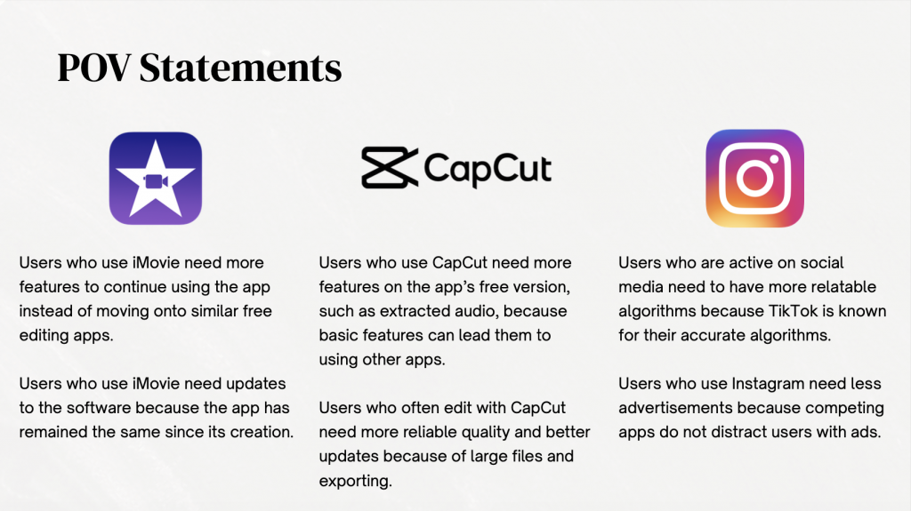
In creating these statements, I was able to better understand and summarize the thoughts of many users among these apps. Through making these statements, right away you can begin to imagine design directions: maybe an update that allows for more free features or allow for larger videos and files to be imported or exported. That is the power of POVs — they may push you toward solutions without being solutions themselves.
Final Thoughts
This project taught me that defining the problem isn’t just an academic exercise — it’s a mindset shift. Instead of treating user reviews as scattered opinions, I started to see them as puzzle pieces. Grouped together, they revealed themes. Framed as POVs, they turned into design challenges worth solving.
If I were to take this further, I would definitely run small prototypes for each POV and test them with a handful of users. Even simple changes, like switching around pro features, could make a measurable difference for each and every user.
You can check out my full PDF — which includes all comments, groupings, and POV statements — here:
PDF Link: file:///Users/vanessadejesus/Desktop/De%20Jesus%20App%20Point%20of%20Views.pdf
Leave a Reply