As an avid social media user, have you ever thought about why you enjoy your favorite apps? Is it accessibility? It’s features? The visually-appealing layouts?
These ideas heavily relate to User Experience (UX) and User Interface (UI), with UX relating to one’s emotional experience and attitudes relating to a product or service, and UI referring to the look or feel of the same product or service.
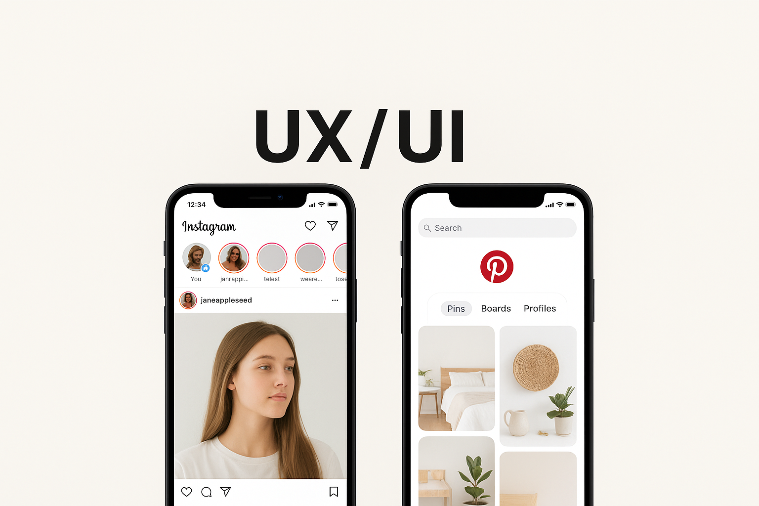
In an effort to further understand these concepts, I did an in-depth analysis of two websites: Instagram and Pinterest. Two of social media’s largest apps for visual content, I set out to see which app was more engaging and beneficial for users.
A Bit of Background
Both apps are built on images, but they’re designed for different jobs. Instagram is social-first: it bundles Stories, Reels, DMs, Shopping, and profiles into one glossy surface meant to keep you engaged with people and creators. Pinterest is discovery-first: it’s a visual search engine where you save ideas to boards and return when you’re ready to act. Homepages can make that split pretty clear.
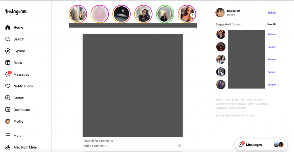
From a UI standpoint, Instagram nails brand consistency—bold story rings, crisp type, immersive video—and that polish fuels inspiration. But the UX can feel noisy when competing surfaces (Feed, Reels, Stories, Shop) all want attention, which can raise cognitive load and choice paralysis.
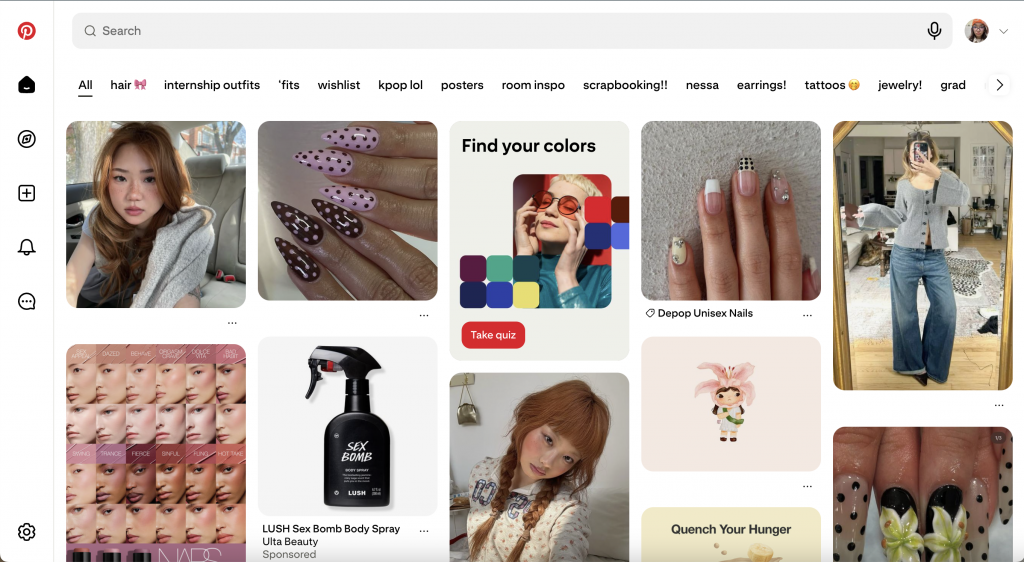
Pinterest’s minimalist grid and generous whitespace do just the opposite: the interface gets out of the way so you can scan quickly and file ideas into boards—clean, calm, and searchable.
Psychology can help explain why they feel so different. Instagram leans on variable rewards—fresh social feedback, unpredictable recommendations—which are great at holding attention but can leave you feeling “always on.” Pinterest, meanwhile, reduces friction for goal-driven tasks (plan a room, a look, a party) with classification, filters, and retrieval cues via boards. These are classic behavior and cognition moves: design that tunes motivation, attention, and memory creates stickier experiences. Said by Megha Goyal, “humans are motivated by intrinsic and extrinsic factors. That means we can be driven to do things depending upon either external factors like rewards or internal factors like enjoyment,” (Medium).
Emotionally, both apps prove a point made by Harvard Business Review: when products connect to deep motivators (self-expression, belonging, aspiration, progress), users return and spend more. Instagram hits belonging and identity—posting, reacting, being seen. Pinterest hits progress and possibility—collecting, organizing, and moving toward a project. Both platforms have different motivators, yet the same endgame: sustained engagement!
To analyze these websites, I created FEEL/NEED statements to extract some of their pros and cons:
- Instagram’s features of likes, comments, and stories make me feel connected because my need of social connection to stay engaged with friends and creators is met.
- I feel overwhelmed by the constant ads and sponsored posts, as my need for a cleaner experience without so much interruption is not met.
- I feel annoyed by the constant appearance of Threads’ suggestions, as my need for an easy, smooth scrolling experience was not met.
- I feel satisfied by smooth scrolling and quick loading, as my need for a smooth performance for a positive experience is met.
- I feel manipulated by infinite scrolling, because my need for freedom from social media is not met within the app.
- I feel inspired by the endless amount of pins, as my need for discovering new ideas and interests is met.
- I feel relieved by the organized grid layout, because my need for clarity to browse without overwhelm is met.
- I feel empowered by customizable boards, as my need for control over my selected content is met.
- I feel motivated and sometimes shocked by Pinterest’s personalized feeds, as my need for efficiency when browsing is definitely met!
- I feel satisfied that search and filter tools are intuitive, as my need for high functionality within the app is met.
View all of my statements here!
So, how did these statements shake out? To summarize, on Instagram, we felt connected but sometimes overwhelmed, we need more control over content ranking and interruptions, and would prefer a lighter cognitive load. On Pinterest, we felt inspired and organized; we need stronger link integrity and richer media when we want more than static images.
If you’re grading UX/UI, here’s my takeaway: A beautiful UI isn’t enough; the experience has to match the psychology of the task! Use aesthetics where they support the user’s emotional goals (identity, belonging, progress), and use structure where they need clarity (labels, filters, information scent). Or in short: design for how people feel in the flow, and what they need to finish. For deeper dives, Joe Leech’s talk and UX psychology primers translate these ideas into practical patterns you can reuse:
All in all, analyzing a website’s UX and UI an only benefit when creating your own. After analyzing these websites, I was able to jot down even more ideas I had for my own website! I would highly recommend this practice, and even pitch your ideas to the companies themselves!
Leave a Reply