Category: Visual Storytelling

  • Collectible Culture 2.0: Why Gen Z Is Obsessed with Owning Little Things

    Collectible Culture 2.0: Why Gen Z Is Obsessed with Owning Little Things

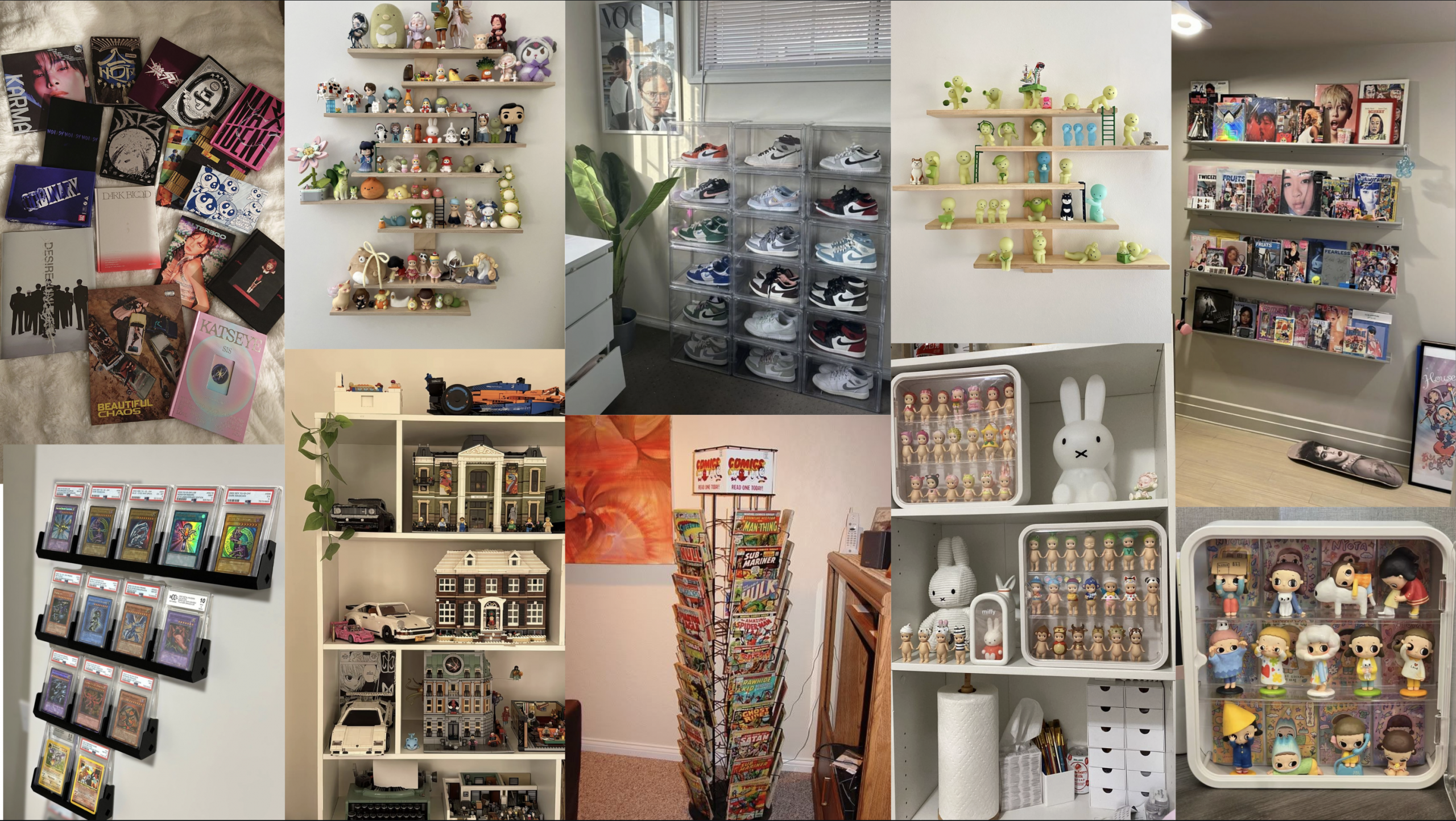
    Generation Z’s voracious appetite for collecting — from blind-box toys and limited-edition sneakers to photocards and vintage comics — reflects more than nostalgic hobbyism; it’s a consumer behavior shaped by deliberate design and psychological levers. This paper explores why collecting has become a distinctive cultural practice for Gen Z by bringing together frameworks from behavioral economics (scarcity, loss aversion, and variable rewards), Gestalt principles of perception (figure/ground, closure, and grouping), and multisensory design (tactile, visual, and auditory cues that heighten perceived value). Contemporary product and experience designers intentionally craft emotional and sensory decision pathways — using affordances, depth cues, and surprise mechanics — that turn ordinary purchases into identity-weighted rituals and status signals. Drawing on class readings and additional scholarly and industry sources, this exploratory study will map how these design strategies interact to create compulsive, community-oriented collecting practices among Gen Z.

    At its core, the act of collecting taps into fundamental psychological drives that shape how consumers interact with objects, structure, and identity. Recent research in the Journal of Consumer Research shows that one of the most powerful motivations for collecting is a desire for control, as individuals seek structure and order in their possessions by building coherent sets of related items; the closer a collection is to completion, the stronger the motivational pull toward acquiring additional pieces becomes, because completing the set reinforces a sense of mastery over one’s environment and goals (Cao et al., 2025). The article also identifies multiple psychological drivers of collecting behavior: some individuals collect for identity expression, using items to signal personal history or group belonging, while others derive joy, nostalgia, or pleasure from the pursuit itself. These motives underscore that collecting is more than mere acquisition — it involves emotional reinforcement, cognitive fulfillment, and social meaning, making the act of acquiring and organizing objects deeply intertwined with human psychology.

    Entire set of POPMART’s Hirono Shelter Series

    Getting into behavioral economics, these concepts further amplify these psychological tendencies by shaping the conditions under which Gen Z encounters collectible products. Many contemporary collectibles — from blind boxes to limited sneaker drops — are engineered around scarcity, variable-reward schedules, and anticipatory dopamine cycles, all of which nudge consumers toward repeated purchases. Scarcity operates as a powerful cognitive bias: when an item is framed as rare or part of a finite series, its perceived value increases, and the urgency to act outweighs rational decision-making. Variable rewards, commonly seen in game design and gambling, appear in blind-box culture, where the uncertainty of which item is inside triggers a reward-prediction loop that encourages “just one more” purchase. Loss aversion also plays a role, as consumers fear missing out on a drop or failing to complete a set — a design tactic that pushes them toward quicker, less deliberative choices. As Bridgeable’s design principles highlight, these behavioral levers aren’t accidental; they are strategically embedded in product ecosystems to guide emotional and impulsive decision-making (Bridgeable). In the context of Gen Z, a generation already accustomed to algorithmic personalization and micro-rewards in digital spaces, these mechanisms create a seamless bridge between psychological desire and economic behavior, transforming collecting into a sustained, self-reinforcing cycle.

    Intense line for sneaker release!

    Another reason behavioral-economic strategies are so effective on Gen Z is that they align with the generation’s broader relationship to uncertainty, reward, and digital culture. Growing up in an environment shaped by algorithmic feeds, micro-trends, and constant content refresh cycles, Gen Z is already conditioned to respond to intermittent reinforcement, a core principle in behavioral economics that increases the likelihood of repeated engagement. Collecting systems — whether in apps like Pokémon Go, K-pop photocard trading, or limited-run fashion drops — mirror the same mechanics: rewards arrive unpredictably, and the “near miss” feeling of almost completing a set keeps users invested. Social proof, another behavioral-economic principle, magnifies this effect. When influencers, friends, or online communities display sought-after items, the perceived value of these objects rises, and individuals become more willing to take economic risks to avoid the social cost of being “left out.” The combined force of digital visibility, reward uncertainty, and community comparison means that the decision to collect is rarely an individual choice; it is a behavior reinforced by everyone around them that was designed to maximize engagement. As a result, Gen Z’s collecting habits cannot be fully understood without acknowledging how behavioral-economic design intersects with their digital upbringing and value systems.

    Surprised reactions to blind box openings on social media.

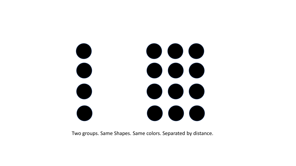
    Gestalt principles also play a crucial role in shaping the appeal of collectible items, particularly in how brands design visual systems that emphasize unity, pattern, and completion. In foundational Gestalt theory, the human perceptual system instinctively organizes visual information into meaningful wholes rather than isolated parts — a process driven by principles such as similarity, proximity, and closure. When collectible series use consistent color schemes, repeated character forms, and numbered sequences, they leverage similarity to signal that each piece belongs to a unified whole, making incomplete sets feel visually and emotionally disjointed rather than discrete (Canva Learn). Clusters of items displayed together exploit proximity, leading viewers to perceive grouped objects as belonging together, while closure—our tendency to mentally “fill in missing pieces”—creates internal pressure to complete an unfinished collection (thoughtbot). Even affordances like stackable packaging or interlocking shapes communicate how items relate to one another, further reinforcing the perceptual pull toward collection completion. By tapping into these innate visual tendencies, brands craft collectible ecosystems that feel naturally compelling, making the desire to “finish the set” as much a perceptual instinct as an economic choice.

    POPMART “Exciting Macaron” Labubu series, one of their most popular sets!

    Beyond basic grouping laws like similarity and proximity, Gestalt theory has a rich empirical foundation showing how perceptual organization deeply influences how consumers interpret and emotionally respond to visual forms. A study looking into Gestalt psychology demonstrates that the human visual system automatically organizes elements into coherent wholes, meaning that figure-ground relationships, continuity, and Prägnanz (simplicity and good form) shape not only what we see but how we interpret object sets as unified and meaningful. These perceptual processes operate rapidly and unconsciously, with grouped items capturing attention more effectively and enhancing memory for those visual patterns (Wagemans et al., 2012). Research from Cambridge University shows that Gestalt principles can predict aesthetic preferences for product form — for example, symmetry, parallelism, and continuity each contribute to how consumers judge the harmony and attractiveness of objects in three-dimensional space (Valencia-Romero et al., 2017). These findings go to show that the very structure of collectible sets — from how items are visually related to one another to how they are presented in space — can enhance their appeal and the psychological satisfaction consumers get from assembling them.

    While Gestalt principles explain how visual organization drives the desire to complete collections, multisensory design expands this influence beyond sight, engaging the body and emotions more fully in the collecting experience. Collectibles are rarely experienced as purely visual objects; instead, they are designed to be touched, opened, displayed, and even heard. Research on multisensory design emphasizes that engaging multiple senses simultaneously enhances emotional attachment and perceived value, as sensory cues work together to create richer, more memorable experiences. Texture-heavy packaging, the resistance of sealed blind boxes, the sound of foil wrappers, and the weight of a sneaker box all contribute to anticipation and reward, transforming acquisition into a ritual rather than a transaction. These sensory layers reinforce behavioral-economic mechanisms like anticipation and reward prediction, while also strengthening emotional bonds between consumers and objects. For Gen Z, a generation that values experience as much as ownership, multisensory design helps explain why collecting feels immersive and meaningful — not simply because of what the item is, but because of how it is felt, handled, and experienced in the moment of acquisition.

    Blind boxes found in a store. Shows the packaging of blind boxes.

    Multisensory design heightens the appeal of collectible culture by engaging consumers beyond visual perception, transforming acquisition into an embodied and emotionally charged experience. While speaking about a TED Talk by Jinsop Lee, Akna Marquez explains how “many of life’s greatest pleasures (like eating and sex) are enjoyed deeply because of the presence of multiple senses interacting at the same time,” and that effective design intentionally activates multiple sensory channels to create stronger emotional responses (Marquez, 2025). This principle is especially evident in collectible products, where texture, weight, sound, and even resistance play key roles in shaping anticipation and reward. Similarly, research by creating agency Astriata emphasizes that “Beyond engaging solely through visual elements, we can also stimulate the auditory, olfactory, gustatory, and tactile senses to evoke emotion and improve the user experience,” (Astriata, 2024). For Gen Z collectors, the crinkle of packaging, the smooth finish of a photocard, or the ritualistic act of opening a blind box are not incidental details but central components of value creation. These sensory cues heighten emotional investment at the moment of purchase, reinforcing behavioral-economic mechanisms like anticipation and perceived reward while turning collecting into a ritualized experience. In this way, multisensory design bridges perception and emotion, ensuring that collectibles are not only seen as desirable objects but felt as meaningful experiences.

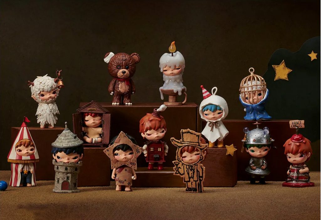
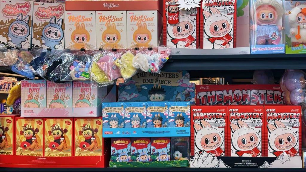
    To get specific, Pop Mart’s rise from niche art-toy maker to a global collectible powerhouse illustrates how multisensory design — combined with psychological and cultural strategies — can turn otherwise “useless” objects into deeply engaging experiences. Central to Pop Mart’s appeal is the blind-box format, where customers don’t know which figure is inside until after they open it, turning the act of unboxing into a moment of suspense, tactile engagement, and emotional payoff that drives repeat behavior and social sharing. The brand’s founder captured this feeling, even saying that “if we make dolls useful, our sales are bound to decline…If the dolls have practical attributes, the next time you feel the desire to buy something, you won’t be so impulsive; instead, you’ll think about whether you already have one at home,” suggesting that the emotional and experiential qualities of the unboxing moment are the real product (D, 2025). This aligns with research showing that blind-box products create “special shopping experiences” that appeal particularly to young consumers through uncertainty, surprise, and emotional gratification, key components of multisensory engagement (Lin, 2023). Pop Mart’s use of vibrant character IPs, tactile packaging, and virality around unboxing turns a simple purchase into a multi-sensory event — one that is seen, touched, and performed publicly on platforms like TikTok and Instagram, where unboxing content acts as user-generated marketing (Jeyaretnam, 2025). The result is a consumer experience that feels playful, personal, and socially rewarding — a powerful combination that has helped Pop Mart transform blind boxes into emotional artifacts of Gen Z culture.

    POPMART’s Revenue Annual Chart, StockAnalysis.com

    Like Pop Mart’s blind-box collectibles, Pokémon cards rely heavily on multisensory and emotional design to sustain long-term engagement, though they operate through a different material and cultural logic. Pokémon cards, around much longer than Labubus, activate sensory experience through the ritual of pack opening: the tactile resistance of foil wrappers, the distinct smell of freshly opened cards, and the practiced hand motions used to reveal rare cards in a specific order all heighten anticipation and emotional payoff. This sensory choreography transforms each pack into a suspenseful moment, mirroring Pop Mart’s emphasis on surprise while grounding it in nostalgia and familiarity. Emotionally, Pokémon cards differ in that they connect present-day collecting to childhood memory, allowing Gen Z collectors to re-engage with a franchise they encountered early in life while reframing it as an adult hobby, investment, or social performance. Visual design further reinforces this attachment: holographic finishes, rarity symbols, and evolving card aesthetics signal value instantly, guiding emotional response before rational evaluation occurs. While Pop Mart leans into novelty and character IP discovery, Pokémon cards thrive on emotional continuity, blending surprise with nostalgia and long-term brand trust. Together, these phenomena show that successful collectible ecosystems do not rely on randomness alone, but on carefully designed sensory rituals that transform opening, revealing, and owning into emotionally resonant experiences.

    Rare collection of Pokémon cards.

    While multisensory design explains how collectibles feel, affordances and interaction design explain how collectors intuitively know what to do with these objects — how to open them, handle them, trade them, and display them. Affordances refer to the perceived actions an object suggests to a user, shaping behavior without the need for explicit instruction. As the Interaction Design Foundation explains, affordances signal the possible actions users can take with an object based on its appearance, meaning that design subtly guides interaction before conscious thought occurs (Interaction Design Foundation). In collectible culture, affordances are deliberately embedded into packaging and product form: tear tabs invite slow reveals, resealable sleeves encourage preservation, and rigid boxes signal value and permanence. Pokémon card packs, for example, afford careful opening and sorting, while Pop Mart boxes afford shaking, stacking, and display. These interaction cues transform collectibles into objects meant to be handled repeatedly rather than consumed once, reinforcing emotional attachment and prolonged engagement. By designing for intuitive interaction, brands reduce friction while increasing ritual, ensuring that collectors not only desire the item but understand how to engage with it in socially and culturally meaningful ways.

    Websites offer cases for Labubu dolls, after trends surged on social media.

    Affordances intersect powerfully with Gestalt principles and visual depth cues to shape how collectors perceive and interact with objects in ways that feel intuitive and meaningful. In design theory, an affordance is understood as a signal that suggests how an object may be used — “a perceived signal or clue that an object may be used to perform a particular action,” whether physical or digital, and it relies on perceptual cues to communicate possibilities to the user (Postolovski, 2014). These perceived action cues are effective when they align with familiar visual organization rules: depth cues like shadows, perspective, and layering create a sense of hierarchy and prominence that helps users see which parts of a product or interface are interactive or important. Depth cues are especially relevant in physical packaging and digital displays alike, where contrast, shading, and perspective build a sense of form that attracts attention and suggests how to engage with an object. At the same time, Gestalt principles — such as proximity and similarity — organize elements into visually meaningful groups, so that related affordances appear unified and easy to understand without conscious thought. For example, affording a pull or push action through design features like raised edges or overlapping layers is more effective when those cues are grouped and visually ordered, reducing cognitive load and creating a seamless interaction experience. Together, affordances, Gestalt organization, and depth cues create a perceptual ecosystem where how an object looks and where it appears in space both guide collectors toward intended sensory and emotional engagements, making collectible interactions feel intuitive, satisfying, and instinctive.

    Altogether, behavioral economics, Gestalt perception, multisensory design, and affordances reveal that Gen Z’s collecting habits are less about ownership and more about emotional meaning-making and social positioning. Behavioral economics explains why scarcity, uncertainty, and loss aversion motivate repeated purchases, while Gestalt theory explains how visual systems frame collections as incomplete wholes that demand closure. Multisensory design deepens this pull by turning acquisition into ritual, engaging touch, sound, and anticipation in ways that strengthen memory and emotional attachment. Finally, affordances guide interaction intuitively, teaching collectors how to open, handle, preserve, and display items without explicit instruction. Together, these frameworks show that collecting is not a passive response to trends, but an active, embodied experience shaped by design decisions that prioritize feeling over function. For Gen Z, whose consumption habits are deeply intertwined with digital culture and identity performance, collectibles become tools for self-expression — objects that communicate taste, belonging, and emotional resonance rather than practical utility.

    Neat collection of collectibles.

    Importantly, these design strategies never act alone. Instead, they are amplified by platforms where visibility, community, and performance matter. As explored in discussions of multisensory experience and interaction design, emotionally resonant objects gain value when they are shared, displayed, and validated by others. A newer synthesis in UX and emotional design research argues that products succeed when they support more meaningful experiences that align with users’ values and identities rather than purely functional outcomes — a framework that maps closely onto Gen Z’s relationship with collectibles (Interaction Design Foundation). Collecting, then, becomes a social language: Pop Mart figures on a shelf, Pokémon cards in protective sleeves, or photocards arranged in binders all signal care, intention, and cultural literacy. By designing for perception, sensation, and interaction simultaneously, brands transform collectibles into emotional artifacts — objects that feel personal, communal, and worth protecting. Ultimately, Gen Z’s obsession with collecting is not irrational; it is the logical outcome of design systems that skillfully align psychology, perception, and emotion with the social desire to belong and be seen.

    This paper has explored Gen Z’s obsession with collecting not as a fleeting trend, but as a carefully constructed interaction between psychology, design, and emotion. Through the lenses of behavioral economics, Gestalt perception, multisensory design, and affordances, collecting emerges as an experience engineered to feel intuitive, rewarding, and socially meaningful. Scarcity and uncertainty activate emotional decision-making; Gestalt principles frame collections as incomplete wholes that invite completion; multisensory cues transform purchasing into ritual; and affordances guide interaction in ways that feel natural rather than imposed. Together, these strategies reveal that contemporary collectibles are not valued for utility, but for the emotional, sensory, and social narratives they enable. For Gen Z, collecting becomes a way to externalize identity, participate in community, and create moments of control and pleasure within an otherwise unstable economic and digital landscape.

    Ultimately, the success of collectible culture underscores a broader shift in design priorities: from function to feeling, from ownership to experience, and from products to stories. As Ellen Lupton says in Design Is Storytelling, “design
    embodies values and illustrates ideas. It delights, surprises, and urges us to action,” (Lupton, 2017). Collectibles exemplify this shift perfectly — each blind box, card pack, or display shelf tells a story shaped by anticipation, discovery, and belonging. Understanding Gen Z’s collecting practices, then, is not simply about consumer behavior; it is about recognizing how design leverages perception, sensation, and emotion to create meaning in a culture where experience is often more valuable than possession.

    References

    Module Readings (all from Module 4)

    Astriata. (2024, October 17). How multi-sensory web design can improve the user experience. Astriata. https://astriata.com/how-multi-sensory-web-design-improves-user-experience/

    Bonner, C. (2019, March 23). Using gestalt principles for natural interactions. thoughtbot. https://thoughtbot.com/blog/gestalt-principles

    Bridgeable. (2024, February 7). The top 5 behavioural economics principles for designers. Bridgeable. https://www.bridgeable.com/ideas/the-top-5-behavioural-economics-principles-for-designers/

    Canva. (n.d.). Simplicity, symmetry and more: Gestalt theory and the design principles it gave birth to. Canva. https://www.canva.com/learn/gestalt-theory/

    IxDF – Interaction Design Foundation. (2016, September 13). What are affordances?. IxDF – Interaction Design Foundation. https://www.interaction-design.org/literature/topics/affordances

    Lupton, E. (2017). Design is storytelling. Cooper Hewitt, Smithsonian Design Museum.

    Marquez, A. (2025, August 4). Introduction to multi-sensory design. Akna Marquez. https://www.aknamarquez.com/blog/2017/7/23/what-is-multi-sensory-design

    Peer-Reviewed Journals

    Cao, C. C., Brucks, M., & Reimann, M. (2025). Seeking Structure in Collections: Desire for Control Motivates Engagement in Collecting. Journal of Consumer Research, 52(3), 480–501. https://doi.org/10.1093/jcr/ucae071

    Lin, Z. (2023). Exploring Pop Mart Marketing Mechanics and Related Effects. Highlights in Business, Economics and Management, 7, 415-420. https://doi.org/10.54097/hbem.v7i.7004

    Wagemans, J., Elder, J. H., Kubovy, M., Palmer, S. E., Peterson, M. A., Singh, M., & von der Heydt, R. (2012). A century of Gestalt psychology in visual perception: I. Perceptual grouping and figure-ground organization. Psychological bulletin, 138(6), 1172–1217. https://doi.org/10.1037/a0029333

    Valencia-Romero A., Lugo J.E. (2017) An immersive virtual discrete choice experiment for elicitation of product aesthetics using Gestalt principles. Design Science. https://www.researchgate.net/publication/318657873_An_immersive_virtual_discrete_choice_experiment_for_elicitation_of_product_aesthetics_using_Gestalt_principles

    Internet Articles

    D, E. (2025, March 19). Pop Mart’s toy empire: How ‘useless’ collectibles became a social media sensation | by Explorer D | Digital Society | Medium. Medium. https://medium.com/digital-society/pop-marts-toy-empire-how-useless-collectibles-became-a-social-media-sensation-1d5ce24bb39f

    Jeyaretnam, M. (2025, March 26). Inside pop mart’s Global Toy Takeover. Time. https://time.com/7271656/popmart-china-blindbox-labubu-designer-toys-genz-luxury-industry-revenue/

    Komninos, A. (2025, September 25). Norman’s three levels of design. The Interaction Design Foundation. https://www.interaction-design.org/literature/article/norman-s-three-levels-of-design?srsltid=AfmBOoorgEVSbzFb1IrgQg_FhWMVr-fiu3bPae3T_ybVwj-EtPBqPTiV

    Postolovski, N. (2014, June 24). What is the most underrated word in web design?. Smashing Magazine. https://www.smashingmagazine.com/2014/06/affordance-most-underrated-word-in-web-design/

  • The Place I Love Most: A Photoessay

    The Place I Love Most: A Photoessay

    Every year I have the chance to visit my grandparents in the beautiful island of Puerto Rico. Visiting every year, I have grown to become more and more comfortable here. While I often took these visits for granted in the past, I recently went and captured so many great memories.

    These images reflect some of my favorite moments in Puerto Rico; with family, sightseeing, or just walking around, Puerto Rico is too beautiful of an island to not see!


    Welcomed by the beautiful trees and forest of Yabucoa behind my grandparents’ house, this view never gets old. This image captures the lush, layered beauty of Puerto Rico’s eastern countryside. The landscape stretches out in vibrant greens—palm trees, thick tropical foliage, and rolling hills—showing just how alive and abundant the environment is. Soft sunlight warms the treetops, giving the scene a gentle glow and highlights the textures of the plants that define the region’s natural identity.

    In the distance, a few homes and rooftops peek through the greenery, reminding of the quiet coexistence between daily life and the island’s overwhelming natural presence. Altogether, the image feels peaceful, grounded, and deeply connected to the place—reflecting both the beauty of Yabucoa and the personal significance of seeing it from my grandparents’ home.

    Later identified (by AI of course) as a desert rose flower, this flower grows outside my grandparents’ house in their garden. This close-up photo of the flower captures a moment of quiet beauty rooted in place and memory. The flower’s vivid pink-and-white petals stand out sharply against the soft greens of the surrounding leaves, making it the natural focal point of the image. Its brightness and symmetry create a sense of vibrancy and resilience—qualities often associated with tropical plants that thrive under intense sun and shifting weather.

    The elements of this flower and the blurred steps leading into the house create an intimate and nostalgic feeling; a small but meaningful detail from a place connected to heritage, comfort, and care.

    This image, taken on a visit to Old San Juan, captures the very lively, layered character of Old San Juan, where the city’s colonial architecture and everyday street life blend with bursts of tropical color. In the foreground, five beautifully-colored parrots perched on a simple stand becomes the focal point, symbolizing the island’s lively natural spirit and the way local culture often spills out into public spaces. Behind them, a small gathering under a white tent of tourists waiting to take a picture with them adds a sense of casual community and movement. The older building, framed by tall palm trees and a muted gray sky, grounds the scene in Old San Juan’s historic past, creating a contrast between the permanence of its architecture and the immediacy of its street life. Altogether, the image reflects how the city seamlessly intertwines history, culture, and tropical vibrancy in a single moment.

    This photo gently captures a moment of calm amid the rugged setting of an ATV adventure park in Luquillo. The ginger stray cat, curled comfortably on a bed of dry leaves and warm soil, seems entirely at peace despite the bustle such places usually host. Its relaxed posture and half-closed eyes suggest a creature that has learned to carve out pockets of tranquility wherever it can. The contrast between the rough ground, scattered foliage, and the soft fur of the cat adds texture to the scene, while the wooden wall and nearby plant create a sheltered, almost homelike corner. Altogether, the image highlights the quiet resilience of the island’s many stray animals—finding rest and comfort in unlikely places, and becoming small, tender reminders of life’s gentler moments.

    This photo captures a lighthearted, in-the-moment snapshot that feels both playful and intimate. My nephew and I sit side-by-side in the back seat, each making an exaggerated, unsure expression that gives the image a candid charm. How close we are highlights our connection, with our faces mirroring each other’s mood in a funny, spontaneous way. Soft daylight filters through the car windows, illuminating our features and adding a natural warmth to the scene. Altogether, it’s a tender, goofy pause during a tiring day’s adventure—one of those small, shared moments that ends up becoming more memorable than the destination itself.

    There is a relaxed and radiant feel in this nighttime photo at Distrito T-Mobile. The vibrant red halter dress stands out beautifully against the greenery and warm lights around me. The string lights wrapped around the palm tree and the softly lit outdoor seating area creates a cozy, lively atmosphere. This image has a a stylish, confident, and genuinely warm vibe, similar to how the memory felt in real time.

    Ending with my grandparents’ view once again, this image captures a calm, summery moment the balcony surrounded by lush green trees and a bright sky. The white Inter Miami jersey and matching white bottoms gives the picture a sporty, clean aesthetic. Holding up the camera with a relaxed face, this image feels comfortable, stylish, and gives the feel of enjoying the peaceful nature around me.

    Conclusion

    Overall, creating this photoessay was a new and enjoyable experience. Looking through pictures from my recent trips, I kind of already knew which images I wanted to include and talk about. My goal for this project was to highlight the beauty of Puerto Rico, as well as taking a look at everything around you. While you may see it often, views like these are extremely beautiful and shouldn’t be taken for granted! I categorized my pictures through the order in which they were taken, and carefully analyzed them as if I saw them for the first time. Using Gestalt principles, rules of composition, and more, these images all somewhat followed a narrative arc, as they went in the order of my trip.

    Proximity, simplicity, and other Gestalt principles were seen throughout these images. The image of my nephew and I show proximity and highlight our close relationship, while the image of the flower can show simplicity and proximity, as the plethora of flowers show how close they are to one another.

    The idea of color theory is also shown throughout these images. For example, the images of the vibrant birds with a somewhat grayish highlight the placement of the island’s natural wildlife in such a public setting. Other images, such as me in my red dress or the vibrant flowers show brighter pops of color, and contrast from their duller backgrounds.

    Rules of composition can also be applied to these images! The rule of thirds, explained in Tom Schroeppel’s The Bare Bones Camera Course for Film and Video places subjects on certain third lines to allow viewers’ eyes to roam around the image. I personally love this rule, and now use it for a lot of my pictures after learning about it. The last image shows me on the right, placed right on the guided line, and shows viewers more of my beautiful background and blue cloudy sky. A contrasting image, however, of the cat in the middle of the picture is an example of balance. Right in the center of the image, the image seems more comfortable and the colors go well with one another.

    Beyond the technical aspects, this project also helped me connect more deeply with the emotional meaning behind my photos. Each image represents a small moment in time that felt ordinary when it happened, but looking back, I can see how meaningful those moments truly were. Whether it was spending time with my nephew, admiring local wildlife, or taking in the natural scenery from my grandparents’ house, these photos remind me of the importance of slowing down and appreciating experiences as they come. Photography allows us to freeze these moments so we can re-experience them, reflect on them, and share them with others long after they’ve passed.

    Additionally, this project encouraged me to be more intentional with how I approach photography in the future. Instead of just taking pictures randomly, I now think more about the story behind each shot and how visual elements—such as color, framing, and composition—can shape the emotion or meaning of an image. Creating this photoessay made me realize that photographs are more than just images; they are narratives that combine technical skill with personal perspective. I’ve gained a greater appreciation for how the visual choices we make influence the viewer’s experience, and how even the simplest details can contribute to the overall message. This assignment didn’t just deepen my understanding of visual storytelling—it also strengthened my connection to Puerto Rico and the memories I made there.

  • How Behavioral Economics Shapes the Things We Click, Buy, and Love

    How Behavioral Economics Shapes the Things We Click, Buy, and Love

    Brands today have unlocked new ways of engaging newer audiences and luring them into buying products that they’ve never seen before. How do they do it? Well, besides the power of social media, the power of behavioral economics has constantly been proven to persuade customers into buying newer products!

    Behavioral economics studies how people actually behave — which is often messy, biased, and satisficing — rather than how they’d behave if perfectly rational. Designers translate those predictable biases into tools: defaults, framing, anchors, scarcity cues, and social proof are all ways to shape choice architecture so users make better (or at least more desirable) choices. In an article, Bridgeable collects practical BE “principles” for designers and show how anchoring, default settings, and loss aversion can be applied in real product flows and capturing newer consumers.

    Gestalt Principles

    Two psychological toolkits designers rely on heavily are Gestalt principles and affordances. Gestalt gives us laws of perceptual organization — proximity, similarity, figure–ground, etc. — that help users analyze visual information immediately. Let’s name a few!

    • Similarity: Do the elements look alike?! Same colors, font, size, texture?!!
    • Simplicity: Our minds perceive everything in it’s simplest form.
    An example I’ve used before of simplicity: making everything easy-to-use and accessible for users! All elements are simple in design.
    • Proximity: We perceive elements as belonging to the same group if they are closer together.
    Image taken from Predinfer.

    The good use of Gestalt’s principles reduces cognitive load on consumers: group related controls, make the primary action pop, let the eye follow natural continuity. Canva’s summary on Gestalt offers great visual entry point for these ideas.

    Affordances are the cues that tell a user how to interact with an object (a button that looks pressable, a slider that looks draggable). When affordances align with user expectations, decisions are frictionless; when they don’t align, users hesitate, make errors, or abandon tasks. The Interaction Design Foundation’s article explains why designing obvious affordances is crucial when designing.

    Creating Emotional and Sensory Decisions

    Behavioral economics also reminds designers that decisions are emotional and sensory, not just rational. Multi-sensory design (sound, motion, haptics, even smell in physical environments) creates stronger memories and shapes preferences. Digital designers are now bringing subtle sound cues, motion, and tactile feedback into interfaces to make experiences stickier — not as tricks, but as an extension of the brand’s personality and affordances.

    “Every experience in design is multi-sensory, whether we want it or not.”

    ~ Akna Marquez, Introduction to Multi-sensory Design

    Behavioral economics gives designers the power to shape decisions, but the best designs aren’t about forcing behavior—they’re about guiding it. Thoughtful nudges, clear affordances, and perceptually intuitive layouts help users move through an experience effortlessly, leaving them feeling confident, informed, and in control.

    Every click, scroll, or swipe is a tiny moment where design meets human psychology. By understanding how perception, emotion, and bias influence decisions, designers can craft experiences that feel natural and satisfying. The subtle science behind our choices isn’t just a tool, it’s a bridge between human behavior and genuine, meaningful design.

  • Designing Emotion: How Design Adds Value in the Experience Economy

    Designing Emotion: How Design Adds Value in the Experience Economy

    In an economy where consumers increasingly pay for experiences rather than just goods or services, design has quietly become one of the most powerful value creators. Designers, now, can be seen as architects of value, not just aesthetics.

    Design creates value through emotional connection. Don Norman’s ideas of emotional design helps explain why: great experiences operate at three levels — visceral (instant sensory reaction), behavioral (usability and pleasure in use), and reflective (meaning and identity tied to the product). When a product scores on all three, it doesn’t just satisfy a need — it becomes memorable and preferred. This is why a designer item or a warm coffee shop visit can feel like an emotional purchase compared to a transactional one.

    Design Tactics That Speak Emotion

    Practical tactics designers use to evoke emotion include color, typography, and interaction choreography. Color is one of the fastest emotional shortcuts: marketers and designers use red for urgency or passion, blue for trust and calm, and green for growth and health. Thoughtful color systems can surely increase recognition and nudge choices at the point of sale or sign-up.

    Typography matters too! Typeface choices carry personality: serifs can signal tradition and credibility, sans-serifs feel modern and clean, and script or display faces can feel playful or luxurious, or even romantic. Recent neuroscience and UX research shows that letter shapes and readability influence not only comprehension but also emotional response and trust — meaning typography can be a design tool for shaping how someone feels about a brand before they even read a word.

    Typography chart from WIRED.

    Designing Through Feelings

    Some of the most successful brands use design to stage emotional experiences. Apple is a master of visceral delight — its minimal product design, clean typography, and gallery-like stores make every interaction feel intentional. The company also delivers behavioral satisfaction through intuitive interfaces and reflective value through brand identity; owning Apple products can signal creativity and design awareness for consumers.

    Barnes & Noble takes a similar approach through sensory design with their cafes. The cafe’s lighting, music, and books all around work together to create comfort and familiarity, turning an ordinary coffee run into a ritualized experience for readers. Both brands demonstrate that emotion, not just function, can drive loyalty and premium pricing.

    Using Design Tools to Map Emotion

    Designers also use emotional models to be intentional. Tools like Plutchik’s Wheel of Emotions help teams map which emotions (joy, trust, surprise, anticipation) they want to trigger and then choose design elements accordingly — for example, using warm tones and rounded shapes to evoke comfort and trust, or contrast, motion, and surprise to evoke excitement. This moves design from “making things pretty” to a strategic role in experience engineering.

    Plutchik’s Wheel of Emotions helps match primary emotions to corresponding colors. His theory has helped all kinds of designers when creating projects.

    Finally, measurable ROI (return-on-investment) follows emotional connection. Experiences that evoke positive emotions drive retention, word-of-mouth, and willingness to pay. The practical takeaway for visual storytellers and product teams is simple: design every touchpoint (visuals, words, interactions, environment) with the emotional arc in mind — stage the visceral, deliver useful behavioral outcomes, and create reflective meaning that customers may want to bring into their identity.

    Design in the experience economy should not be skipped — it is crucial! When designers combine evidence (color & type research), models (Norman’s three levels; Plutchik’s wheel), and brand staging (Apple, Starbucks), they do more than shape appearances: they create value that customers emotionally invest in — and gladly pay for.

    In so many ways, designers can make any experience memorable through design. Such emotional responses by consumers will encourage them to come back, buy again, and refer the product to others. In my opinion, design can probably attract more consumers than the product itself. It is up to the designer to make the product stand out.

  • Seeing the Future: How Design Fiction Turns Stories into Visual Worlds

    Seeing the Future: How Design Fiction Turns Stories into Visual Worlds

    Designers are constantly asked to imagine the future — sleeker products, smarter systems, faster solutions. But imagination alone isn’t enough; it needs form, context, and meaning. That’s where design fiction comes in. Design fiction blends storytelling with design practice, using narrative and visual artifacts to make speculative futures feel real enough to explore. Instead of asking “What will the future look like?”, it asks, “What if this future existed — and how would it feel to live there?”

    In an exercise I participated in called ‘The Thing From the Future‘, I was randomly given four words under the themes arc, terrain, object, and mood. With the four words generated, I was assigned to create a product or solution and describe it even further. When I first played the game, I thought it would just be a fun brainstorming activity — random prompts and creating odd gadgets from imaginary futures. But the moment I drew the most random card combinations, a new creative side of me unlocked. From the EchoBracelet, a wearable device that lets people replay sounds from their favorite memories, to the MemoryMirror, a mirror that allows elderly people to look into some of their most cherished memories, I created such random ideas from the most random words. After so much thinking, I began to realize that I wasn’t just designing an object — I was designing a story.

    This was my starting point — my call to adventure when researching. The activity wasn’t only imagining technology; it was visualizing emotion. The EchoBracelet had to communicate intimacy, nostalgia, and connection through the design alone. That’s when I turned to the concept of design fiction, a method that uses storytelling and visual artifacts to explore possible futures. I enjoyed Richard Buday’s definition:

    “Using fiction to test the use and acceptance of unusual designs”, Richard Buday 2020.

    What Is Design Fiction and Where Does It Come From?!

    To summarize, design fiction is a practice that creates story-worlds and populates them with diegetic prototypes — artifacts that exist inside these fictional worlds and make that world believable. Popular science fiction author Bruce Sterling introduced the term design fiction in the mid-2000s then expanded on it, calling it “the deliberate use of diegetic prototypes to suspend disbelief about change.”

    How This Relates to Visual Design

    Storytelling is at the core of effective design fiction, and it directly connects to how we approach visual design. The Medium article “How to Use the Hero’s Journey as a Design Thinking Tool” explains how narrative frameworks can guide design processes. The “Hero’s Journey” — where a protagonist leaves a familiar world, faces challenges, and returns transformed — mirrors how users experience a product. Good design visualizes this transformation, helping audiences see change, conflict, and resolution through composition, motion, and tone.

    Conclusion

    Ultimately, design fiction helps designers move from problem-solving to possibility-making. It uses narrative storytelling and visuals to ask deeper questions about responsibility, culture, and values. In a time when design often feels driven by algorithms or consumer trends, design fiction reminds us that the future is not something that happens to us — it’s something we can co-create, critique, and visualize together.

  • A Trip to LA: How Digital Pictures Tell a Story

    A Trip to LA: How Digital Pictures Tell a Story

    We all know the classic saying, “pictures are worth a thousand words”. But have you ever thought about how true the saying actually is?

    Taking pictures on my digital camera has become one of my favorite hobbies recently. The pictures on my camera range from beautiful scenery to pictures of my friends and family. My digital camera contains basically my entire life’s memories so far.

    I want to connect the concept of digital photos to visual storytelling. Defined by Andrew Losowsky, the “essence of visual storytelling is {the} combination of emotional reaction and narrative information,” by using the “colors, typography, style, balance, format of an image “{that} will generate that first instinctive smile or frown” (Losowsky, 4). In other words, various elements of an image including the colors or what is happening in it should tell the audience everything they need to know. There shouldn’t be any extra explanation needed, and these visual projects should be clear enough for anyone to appreciate and understand.

    In an article by Mike Montalto from nonprofit Amplifi, he mentions that one of the best methods of visual storytelling is authenticity: keeping things real. If you ask me, digital pictures can be some of the most authentic since there aren’t any filters or fancy equipment enhancing the images, just the auto or manual mode and a flash.

    To prove my point that digital camera pictures tell some of the best stories, I will show some of my favorite digital pictures from my three-month trip to Los Angeles!

    This was the first picture I took on the trip! Excited to see just about everything, I took lots of pictures like any tourist would. Way in the back is the Hollywood sign, in the giant grassy mountains. Almost covered with billboards, you can see a busy street and a tall building, that one being the Hollywood United Methodist Church. While the picture is pretty grainy and doesn’t have the best quality, the Hollywood sign right in the center gives a glimpse of excitedness from an exploring tourist.

    It’s been one week! Getting a bit more used to the busyness of Los Angeles, my mom visited for the weekend. With the lit-up ferris wheel and restaurant in the background, any California native would recognize the Santa Monica Pier. Almost pitch black in the sky, the dock was pretty windy and made things a lot colder, as you can tell from my hoodie.

    In this image, you see four friends, all smiling with one another, having a good time. The small sign in the back says TCL Chinese Theater, one of Hollywood’s most popular places. The hand and feet prints in the back mark some of Hollywood’s most significant figures, and you can see some intrigued people in the background of the image. As it was getting later, the friends are dressed pretty warm for a cold night ahead.

    An article by Erica Santiago explains various elements of visual storytelling, with one of them being emotion, where “your visual story must make your audience feel something that generates an emotional connection”. I feel that this image may make an audience feel warm because of the lighting, and also how loud the picture comes across. With so many people in the background, you can tell that the environment is pretty loud and many tourists are around.

    If you couldn’t tell from the face makeup, this was Halloween! We took this on the balcony of our hotel, right in the middle of downtown LA. My lazy attempt at recreating SAW and Dylan’s football costume take over the image, and our poses fill the image with silliness. The high buildings and busy street in the background also make the image a bit loud, as there’s a lot going on around us.

    If you couldn’t tell by the lanterns and lights hanging across the alleyway, I was able to make it to Little Tokyo! One of my favorite spots I visited, the small district was lively and pretty active at night. I had to dress pretty warm for the nighttime in my cardigan, and the trees helped in the aesthetic of my photo. This photo doesn’t show off as loud as the other ones, as Little Tokyo was a pretty calm spot.

    If there was one image I had to choose that seemed the loudest out of all of my pictures, it would definitely be this one. To me, anything Disney-related image just screams overcrowded, lots of walking, and lots of people – which is exactly what happened. The many strollers, the matching couple Disney shirts, the backpacks on everyone’s backs; this image captures the Disney experience pretty well. The image itself I feel portrays a perfect day, since the sky is scarily clear and the Disney castle is right in front of me. This day was definitely perfect, and wouldn’t trade it for the world.

    This image was the last picture I took in California. Still in Disney, the image shows a giant rock behind me, that being one of Disney’s Star Wars rides. I think the Goofy hat signifies a good time spent at Disney, and the busy background shows a loud place. You can probably tell I was a bit tired in this moment since the last three months were so much fun. With my vintage Mickey Mouse t-shirt and my Cali zip-up hoodie, I was pretty much ready to go home after this picture was taken.

    All in all, these images represented one of my favorite memories in life so far. Through visual storytelling, these images can tell newer audiences exactly what’s happening and help them feel what’s going on. The element of authenticity is crucial in any kind of visual storytelling, whether it be images, video, etc. Digital pictures can be perfect for capturing any emotion or occasion, and I don’t plan on putting my camera down any time soon.